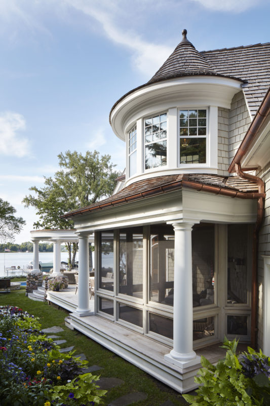
- Nantucket Re-Creation
- Mod Remodel
- City Cottage Reimagined
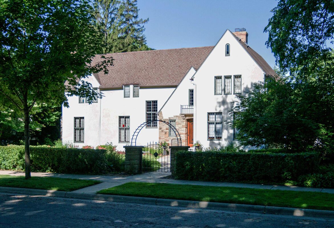
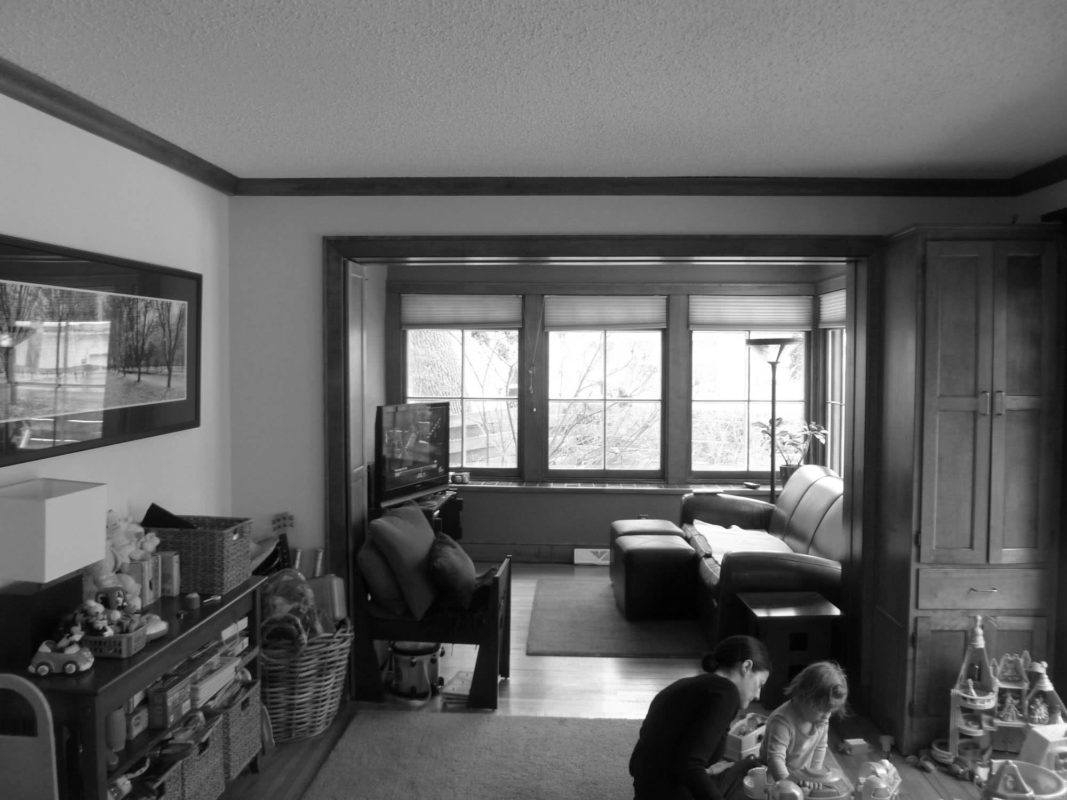
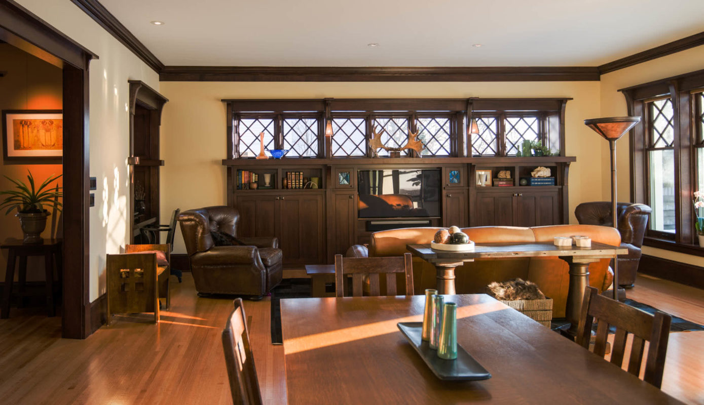
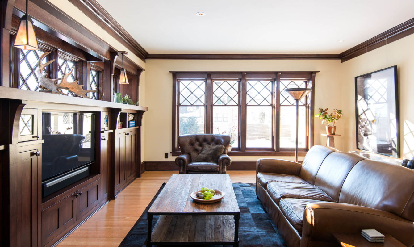
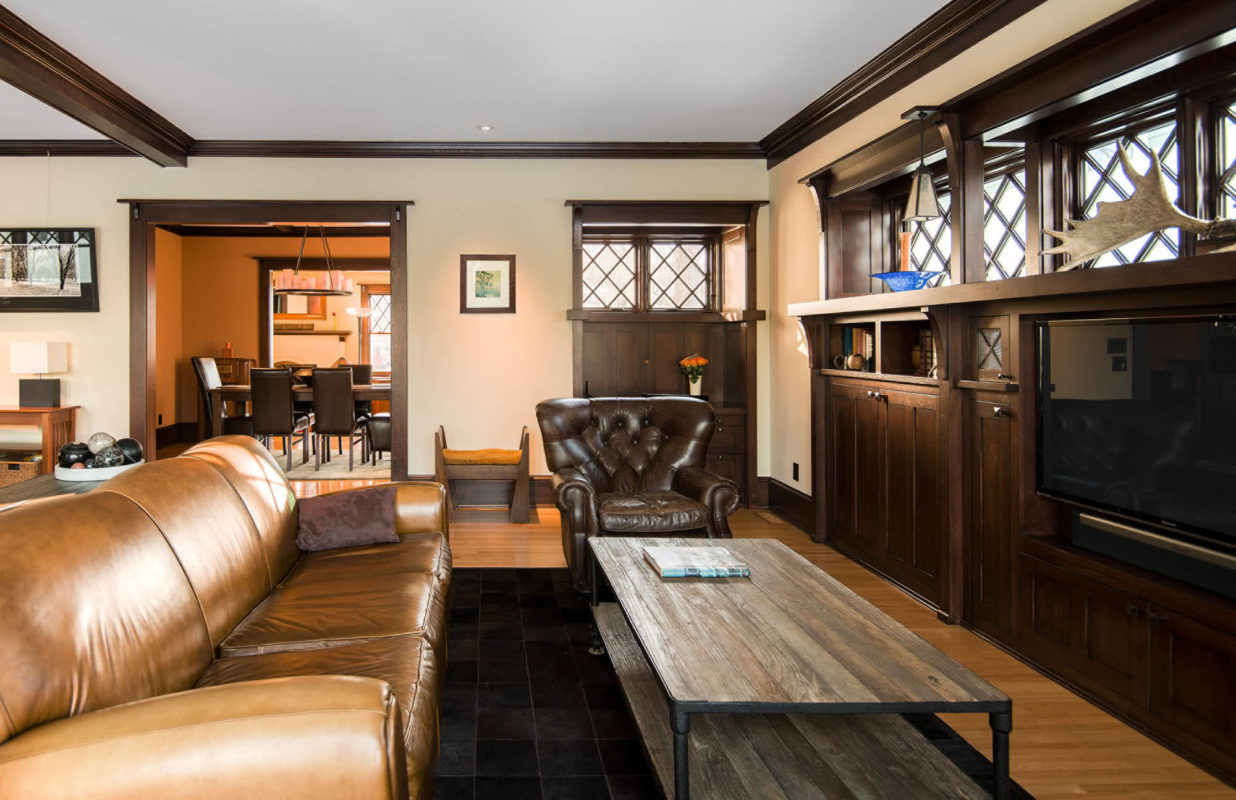
- Tudor Reawakened
- Minneapolis Oasis
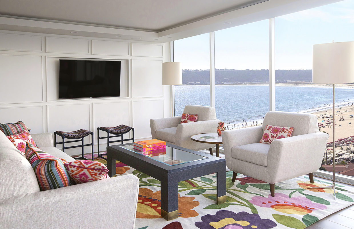
- Contemporary Coronado Condo
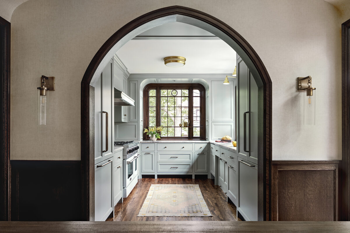
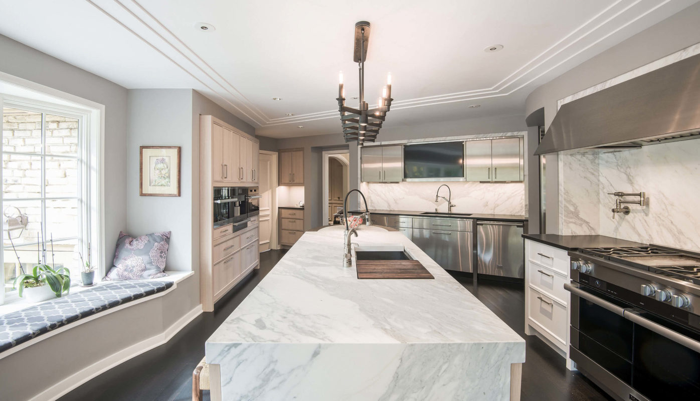
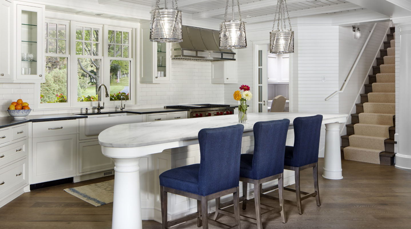
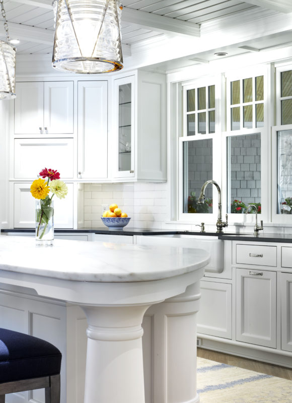
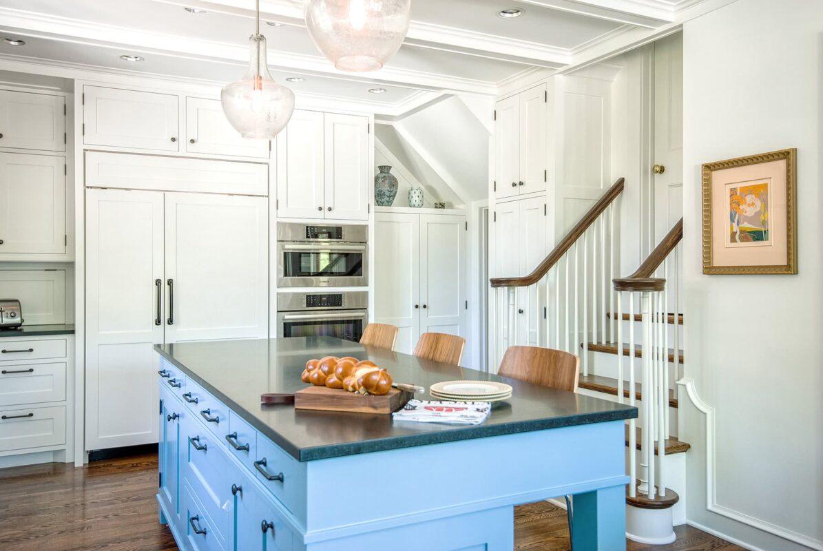
- Nouvelle French Kitchen
- Transformed Tudor
- Nautical Shingle Style
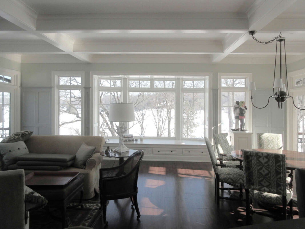
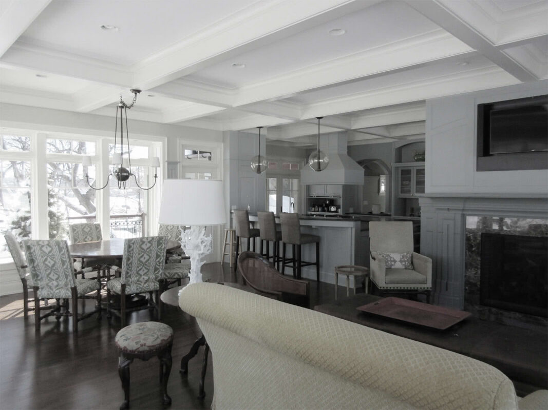
- Edina Classical
- Sunnyside Addition
- Transformed Traditional
- Gambrel Georgian Revealed
- Tangletown Addition
- English Arts & Crafts Revival
- Craftsman Addition & Restoration
- Oak Knoll Transformation
- English Country Addition
- Minnehaha Woods Renovation
- St. Paul Transformation
- Deephaven Revival
- ▪
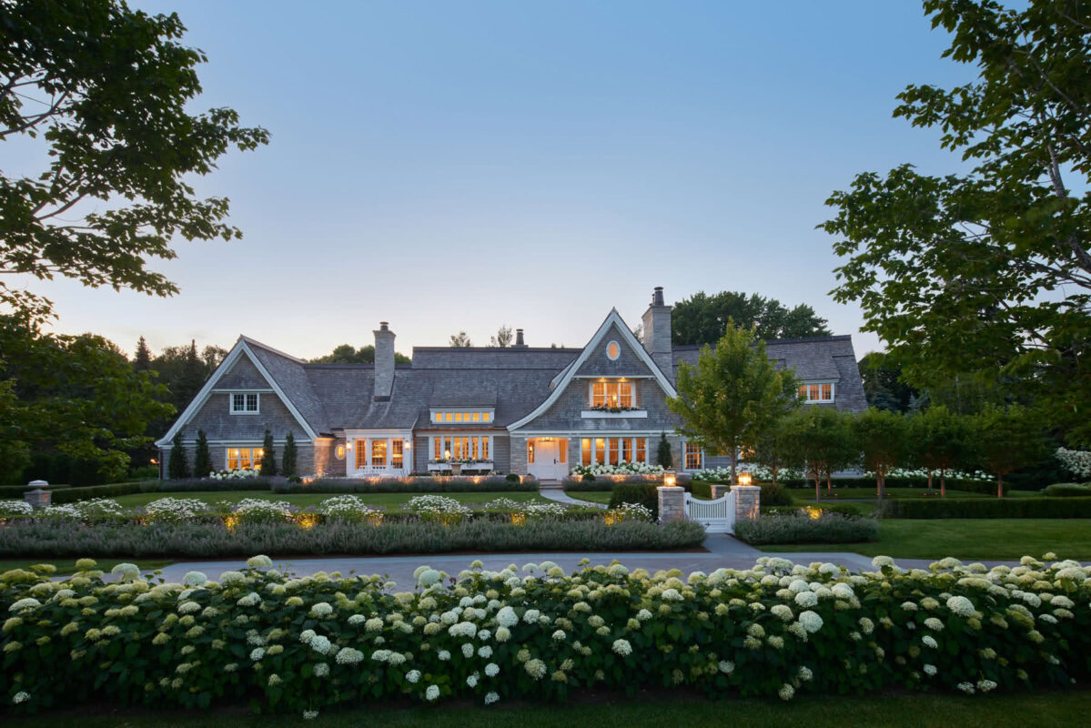
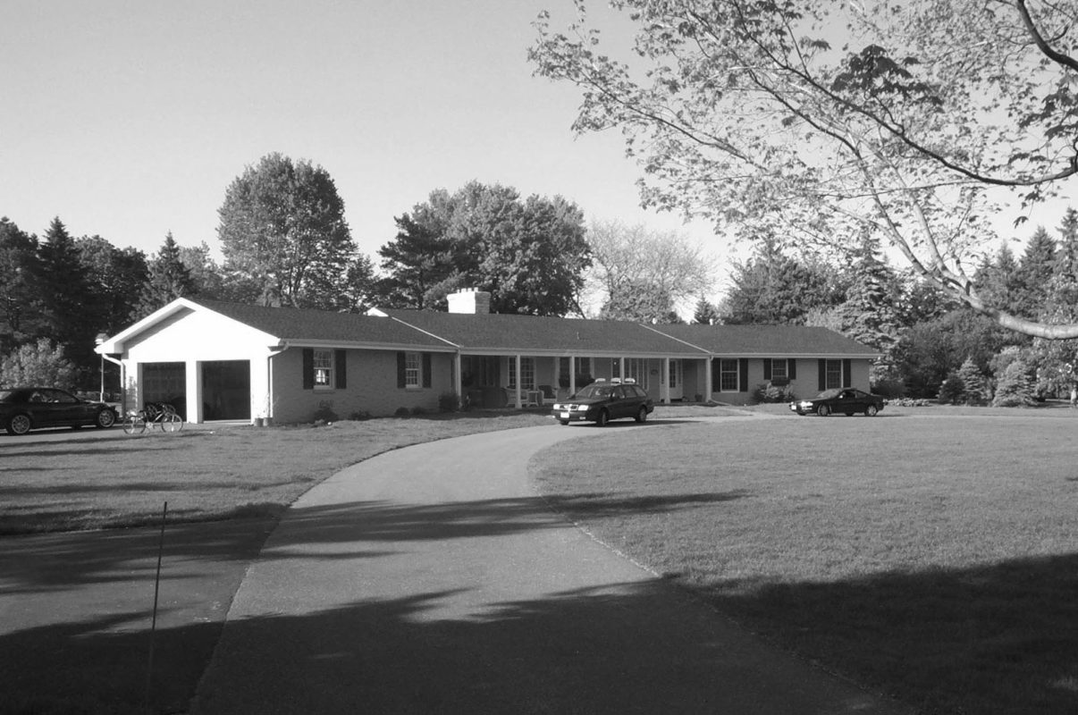
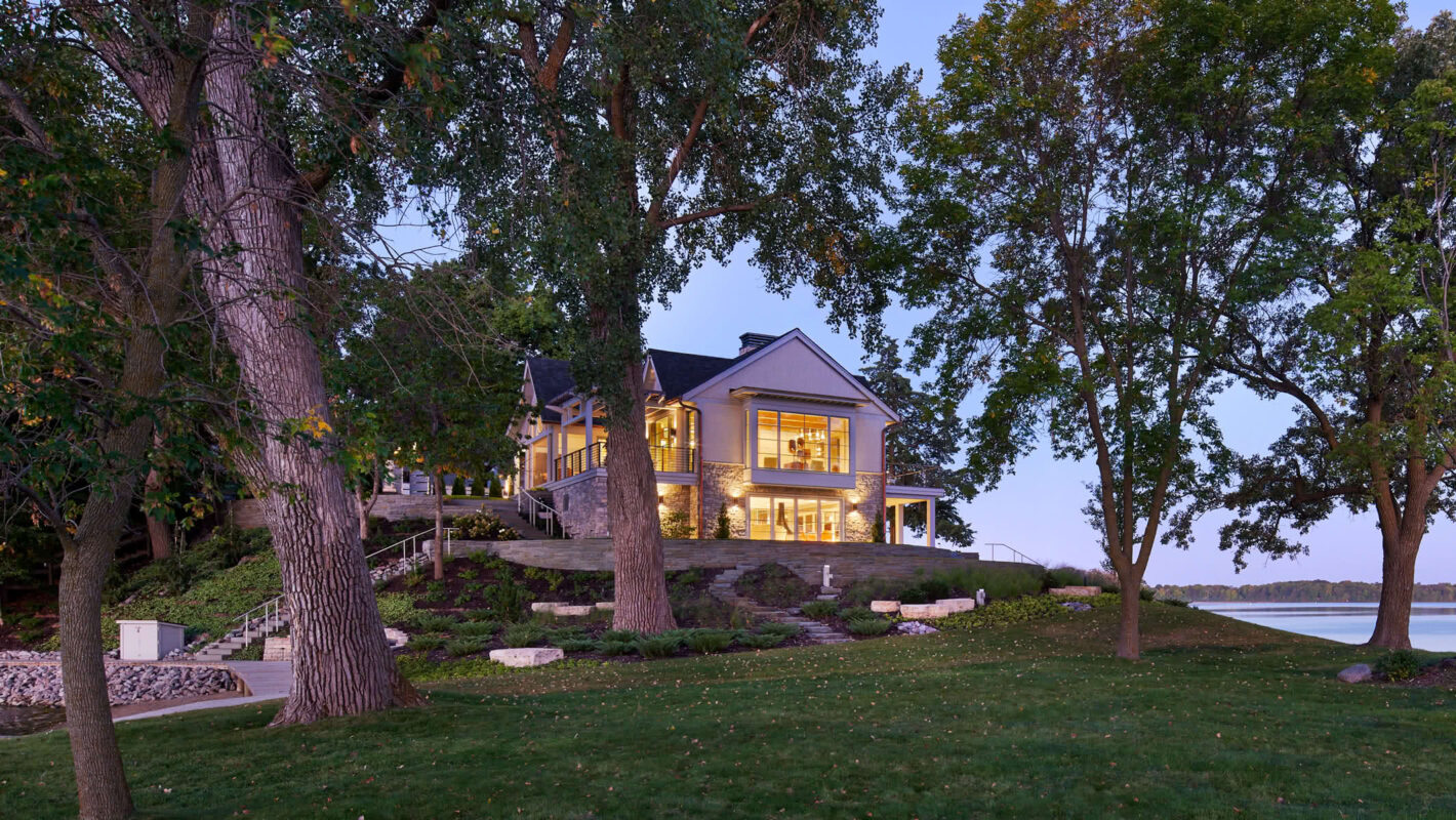
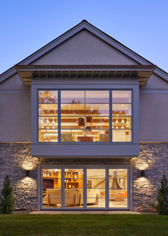
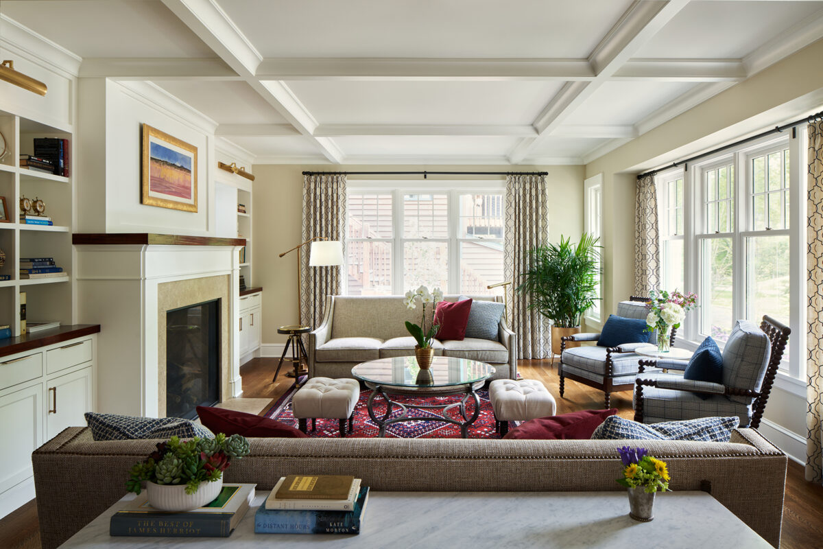
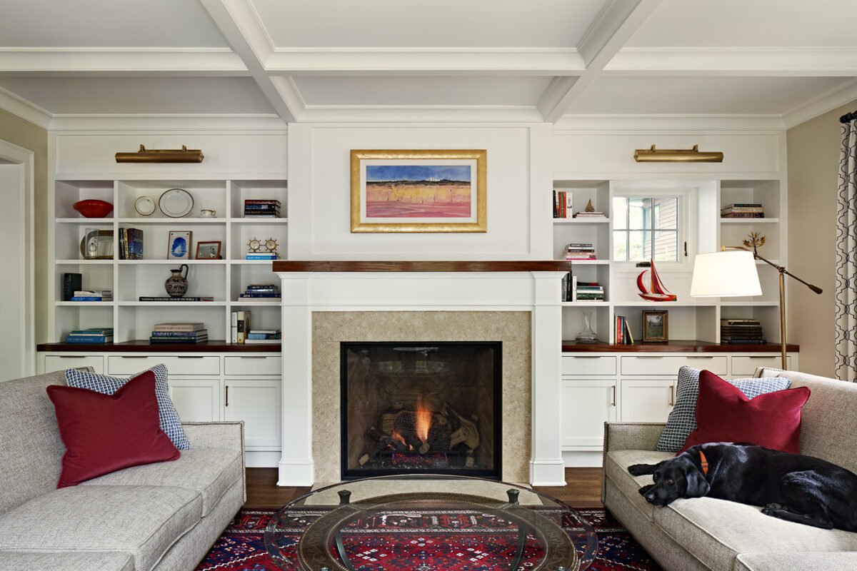
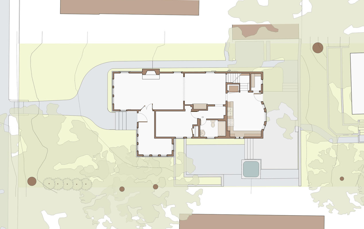
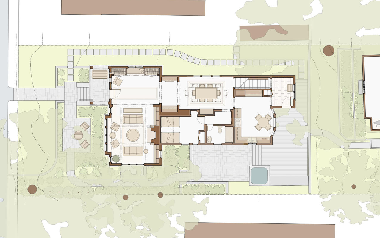
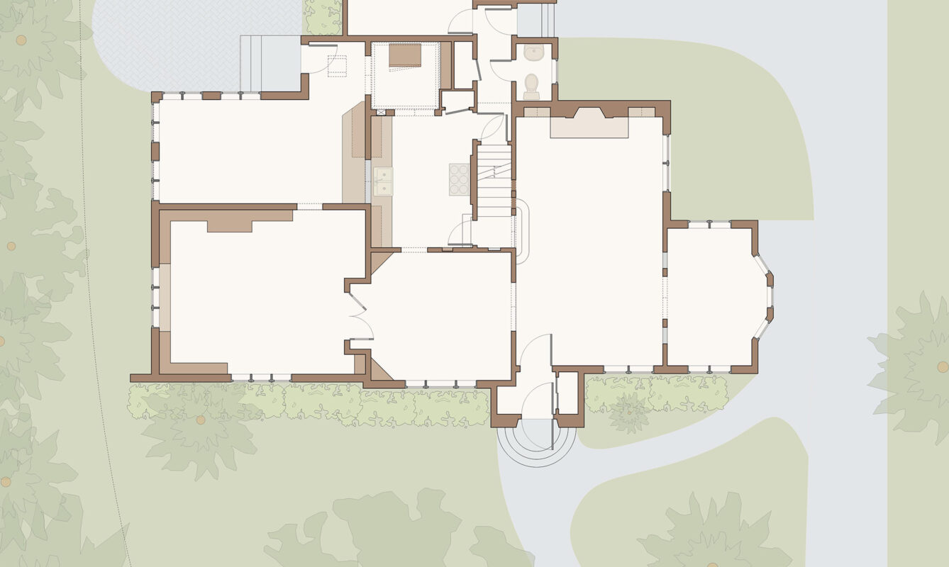
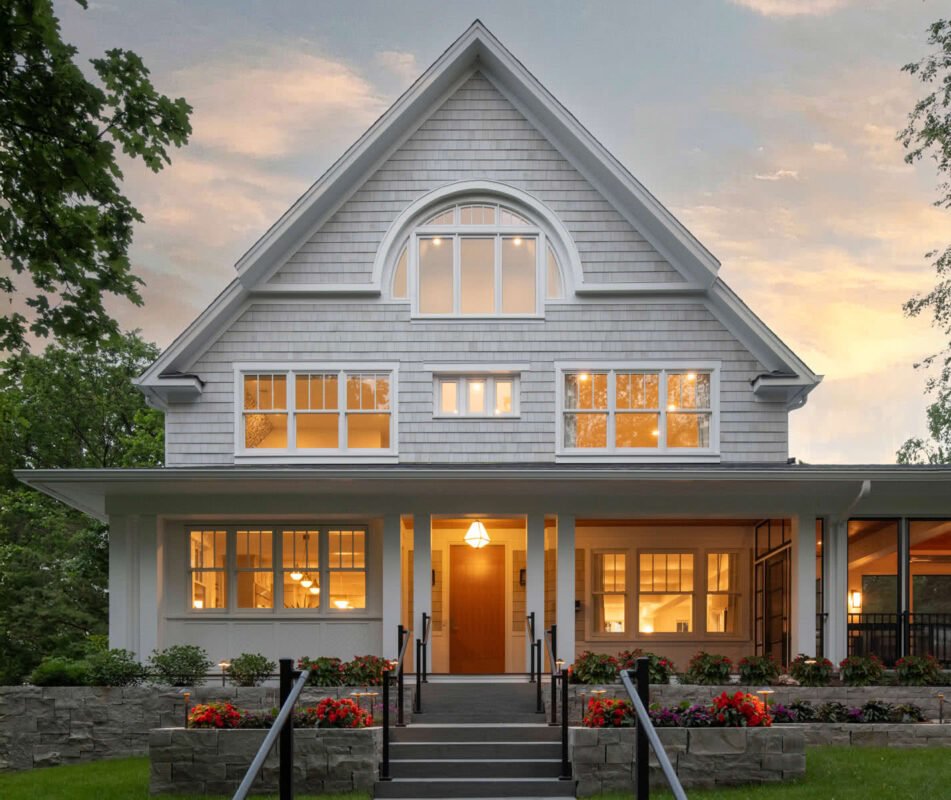
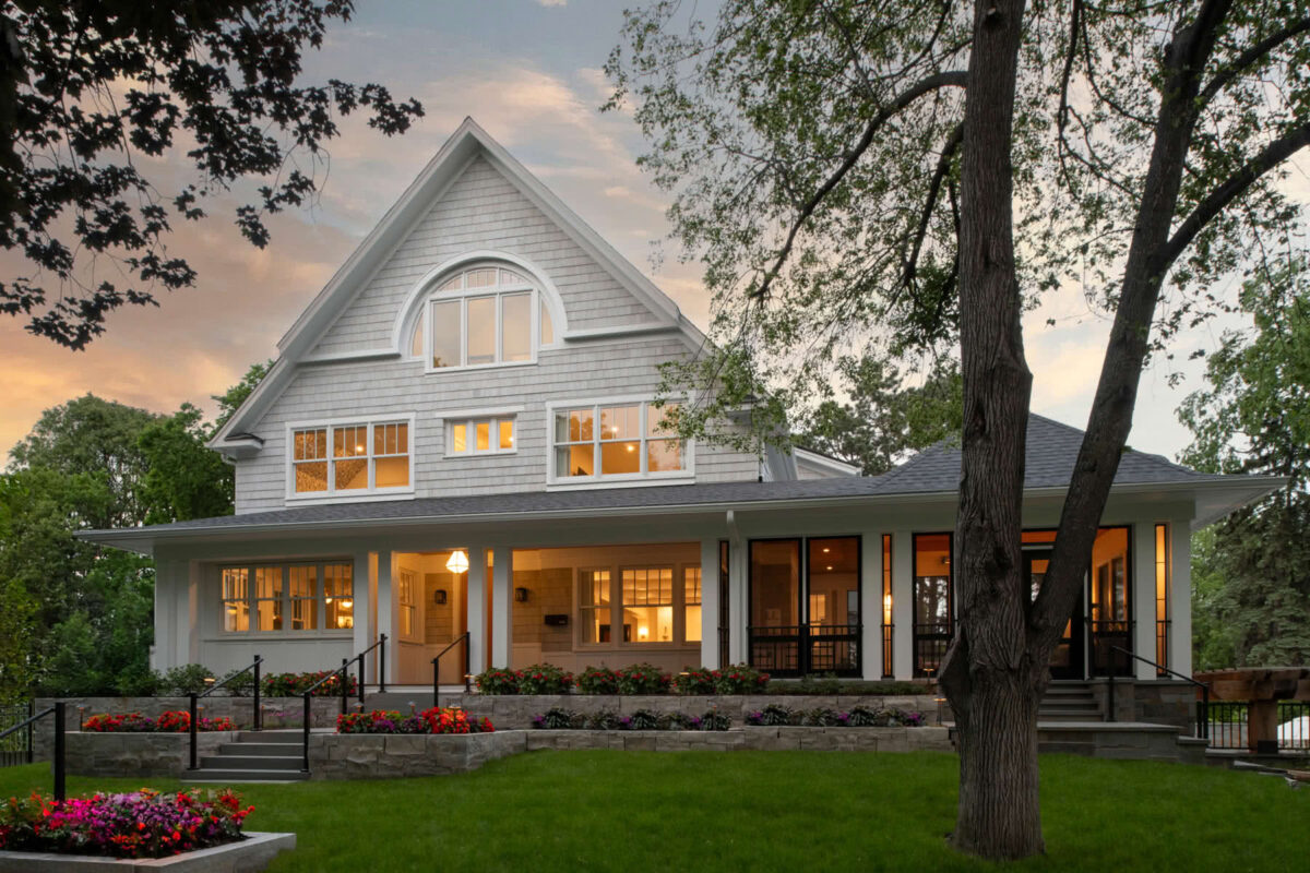
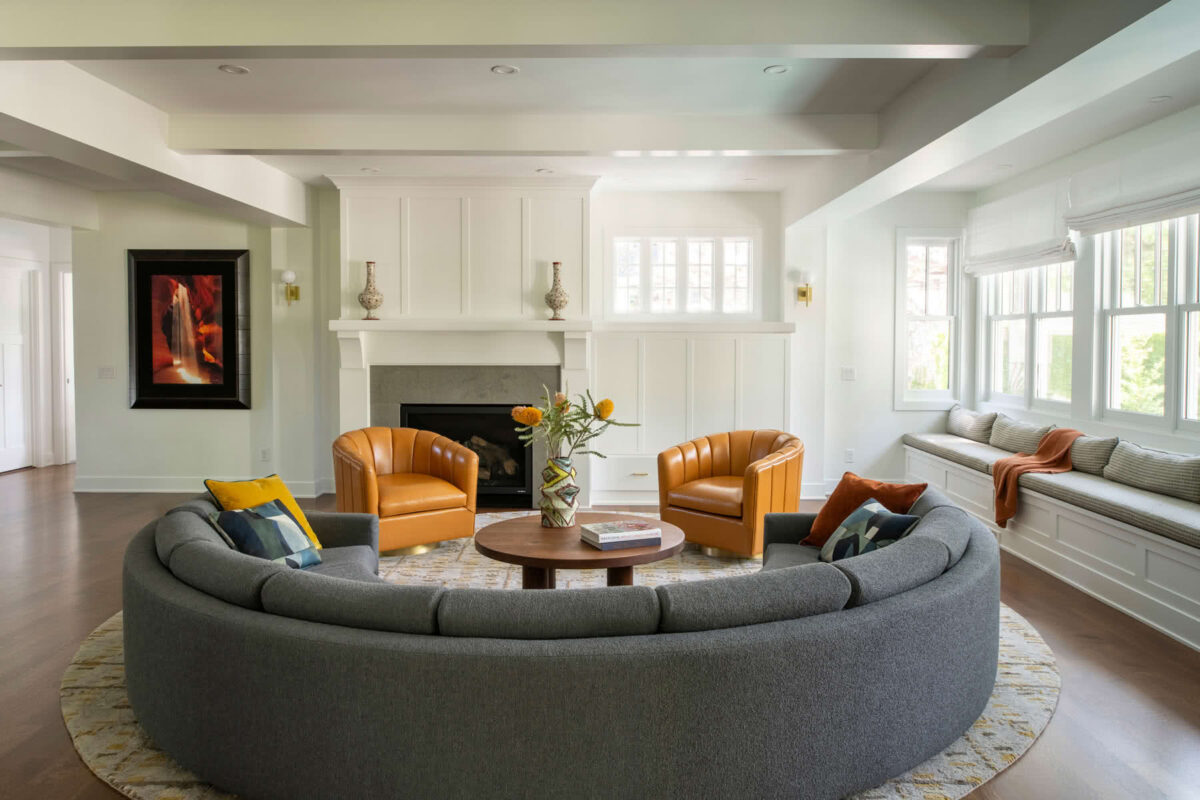
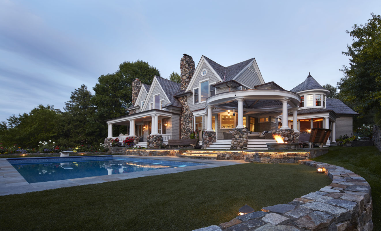
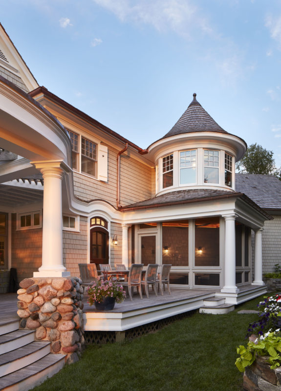
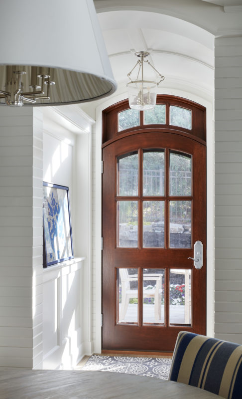
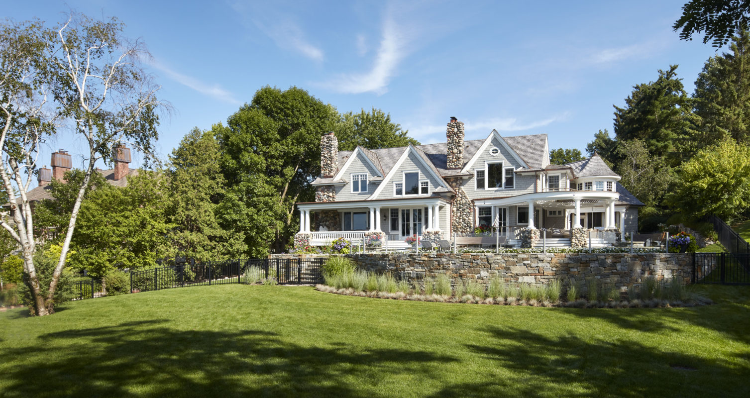
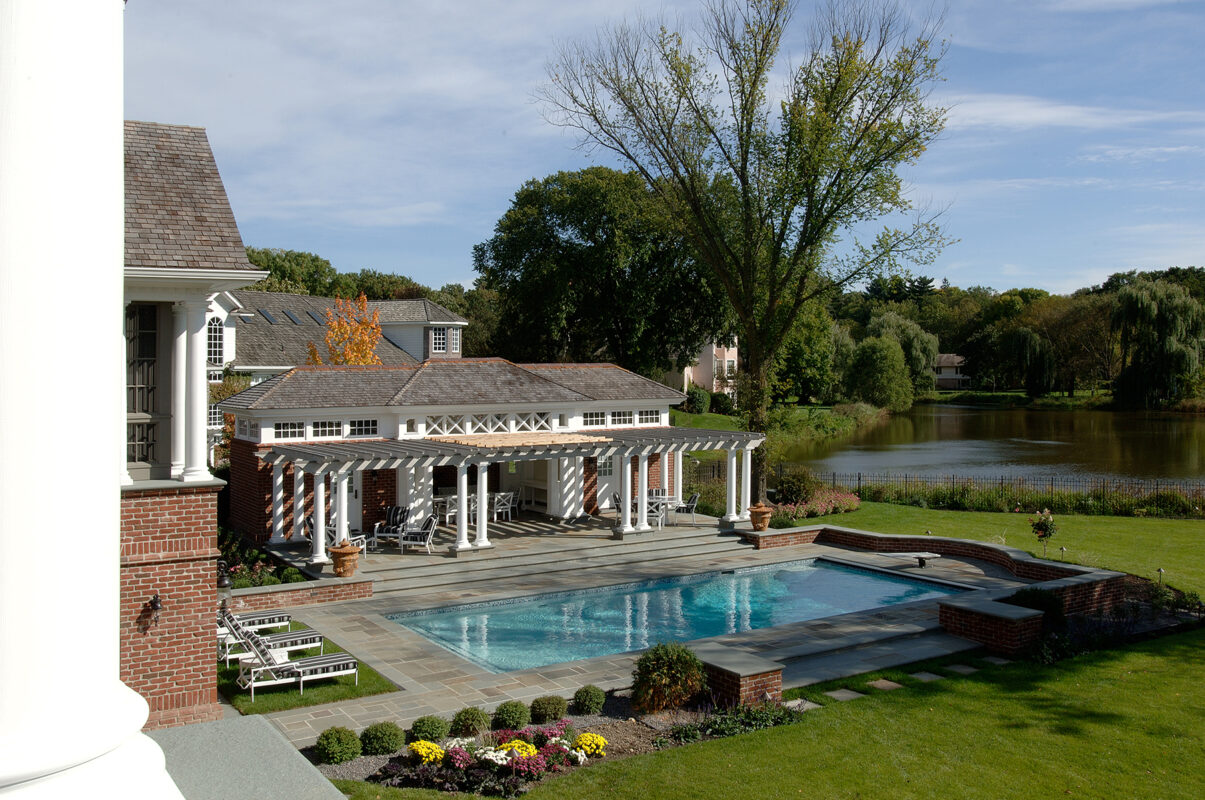
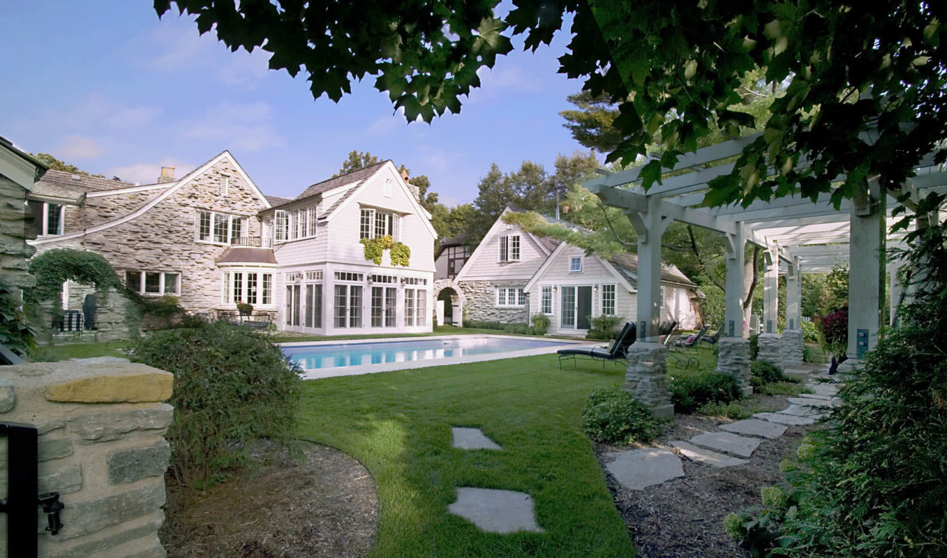
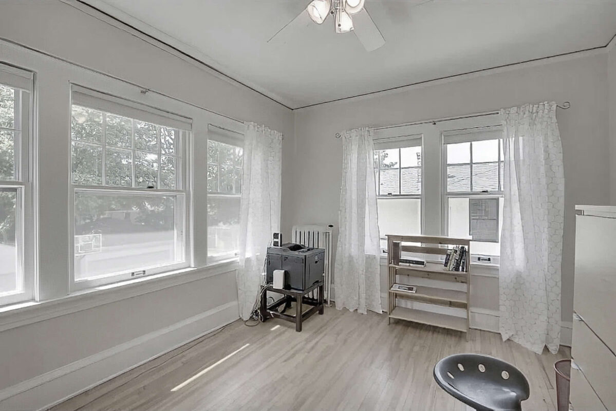
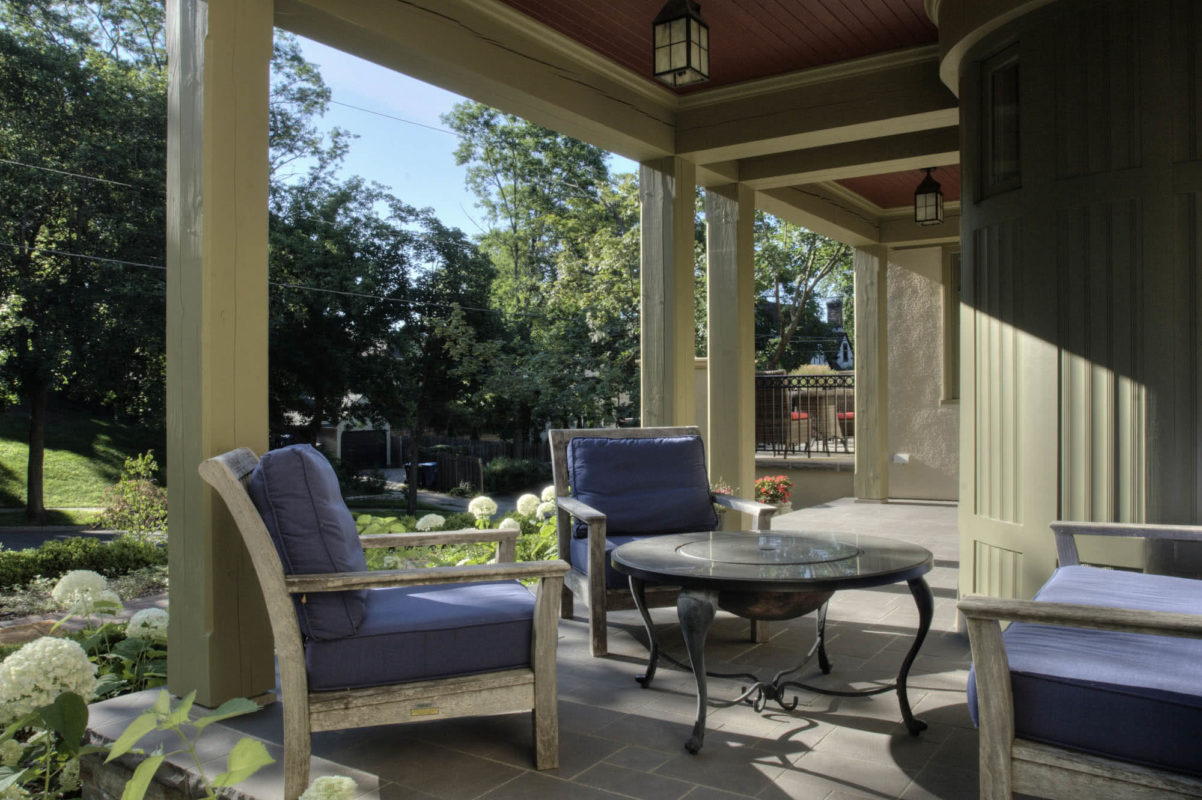
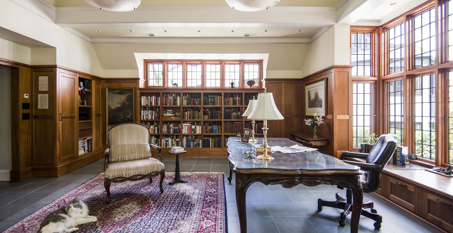
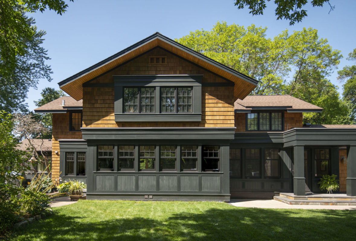
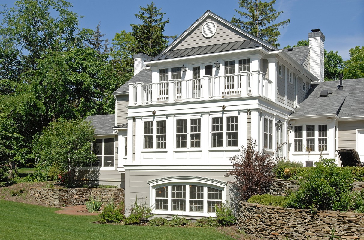
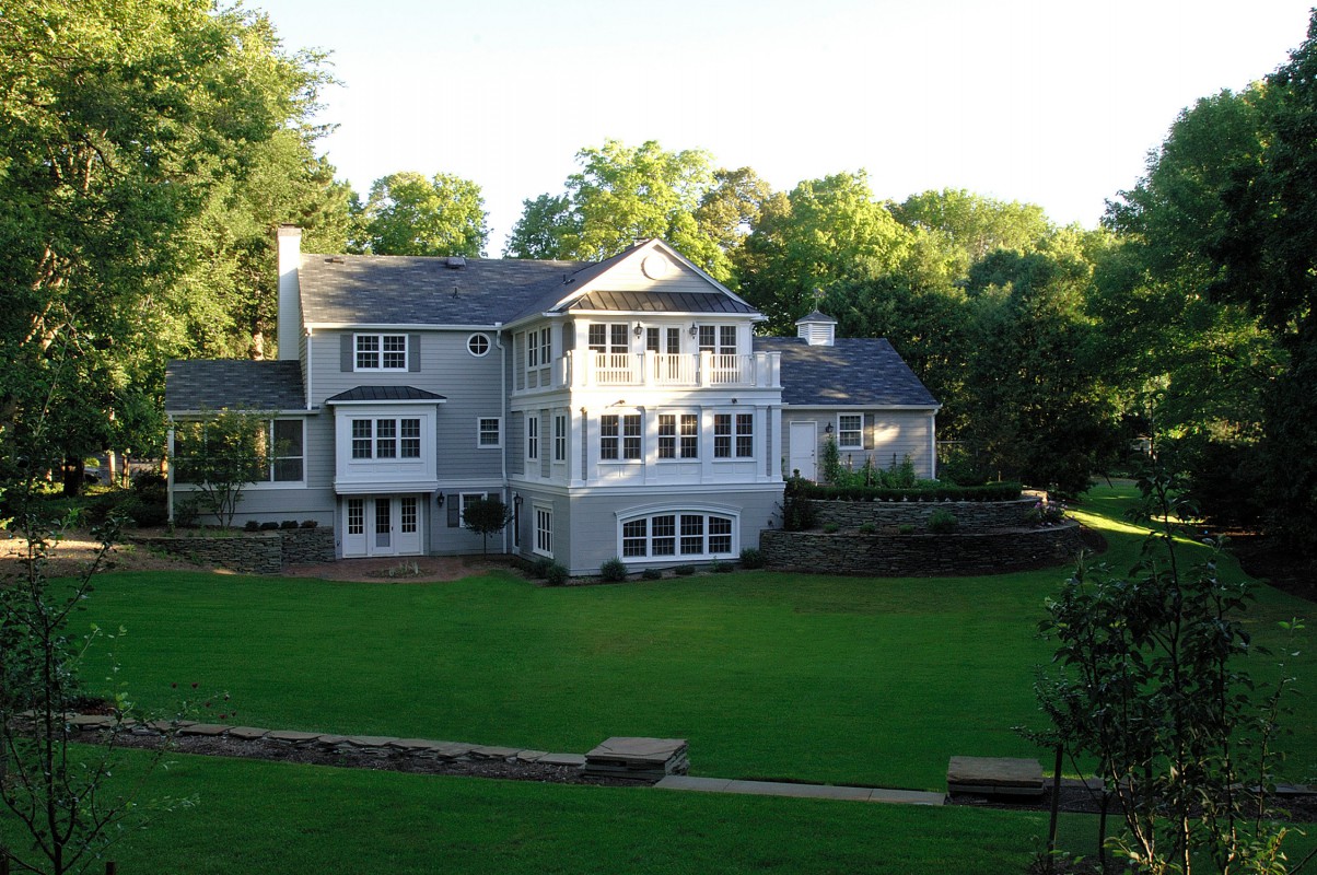
The homeowners wanted to preserve the renovated owners’ suite and lower level we designed previously, while transforming the house into a classic but unique Shingle-style home.

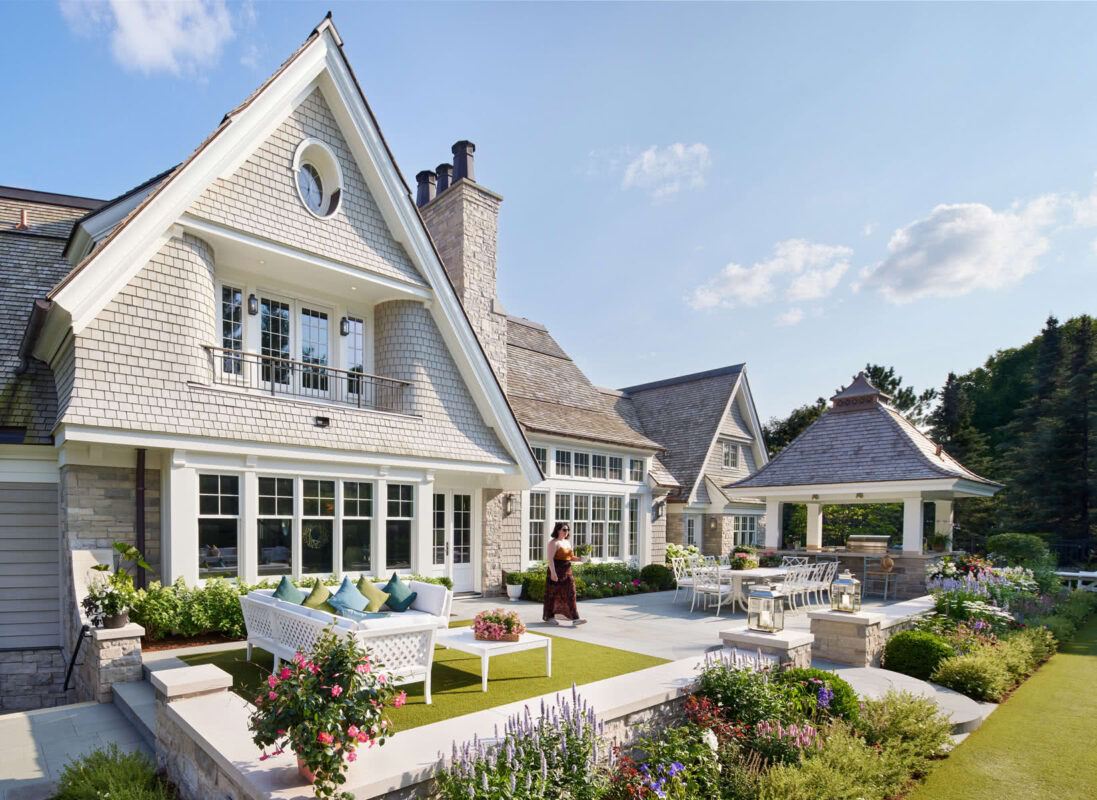
A flowing form that suits the large lot was created through a balanced yet asymmetrical approach, incorporating varied gable sizes, roof and wall sweeps, recesses, and animated architectural details.
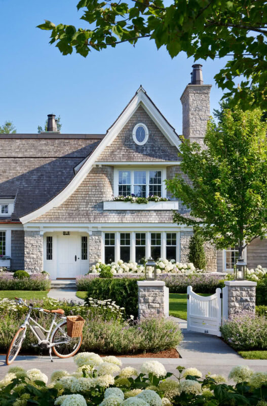
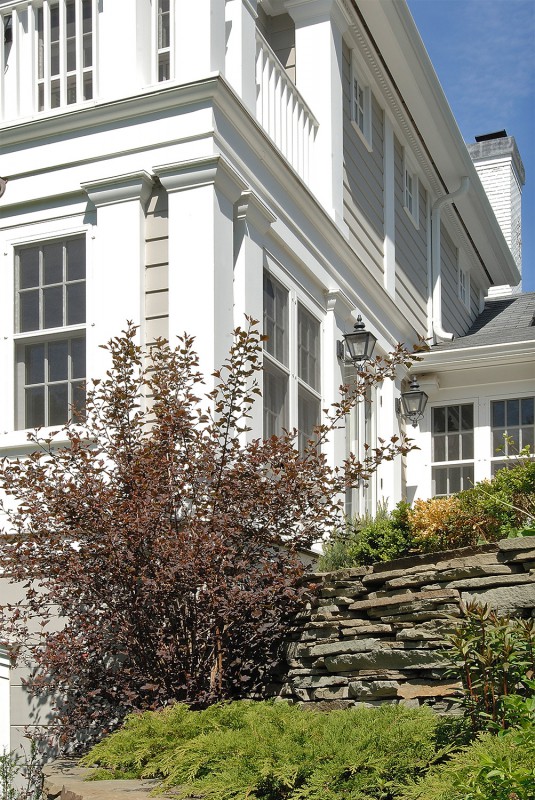
Thoughtful, well-proportioned, and crafted details, promised from the street, come into full bloom as one approaches, enriching the story of the home as one becomes more intimate with it.

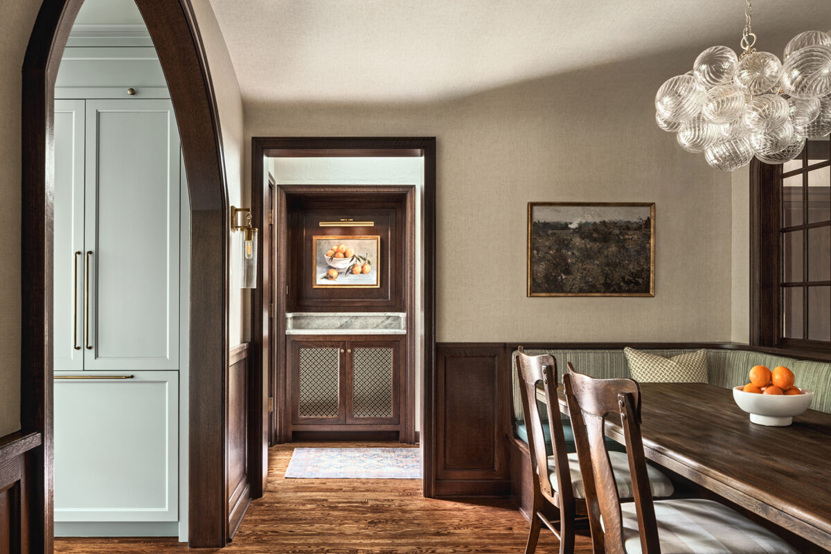
The glasswork pattern is echoed throughout the house; on front door sidelights, the “wirework” is painted and sits in front of the glass.
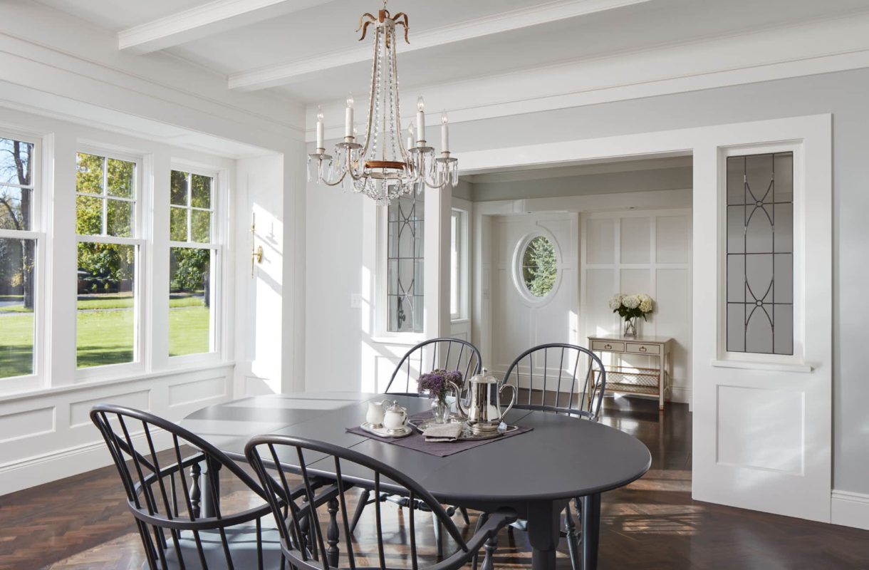
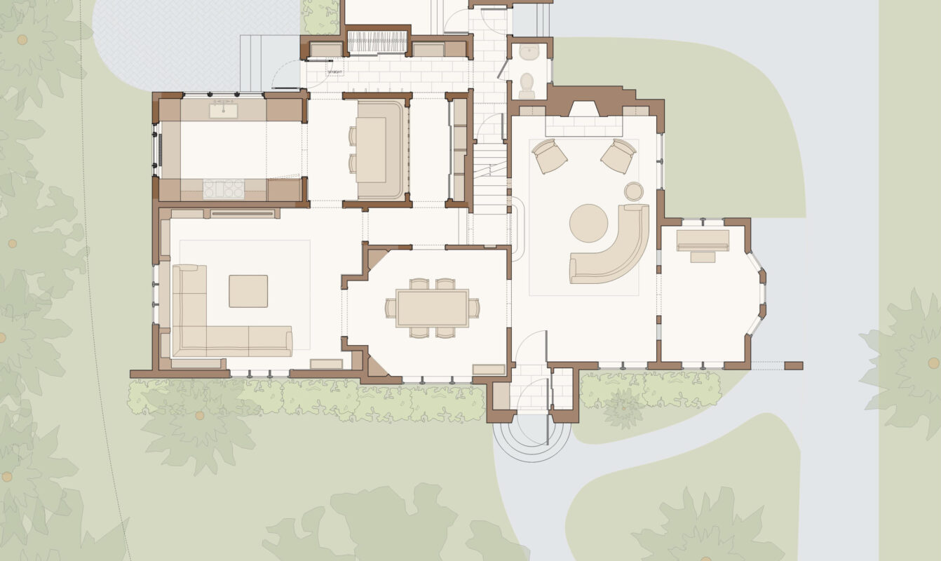
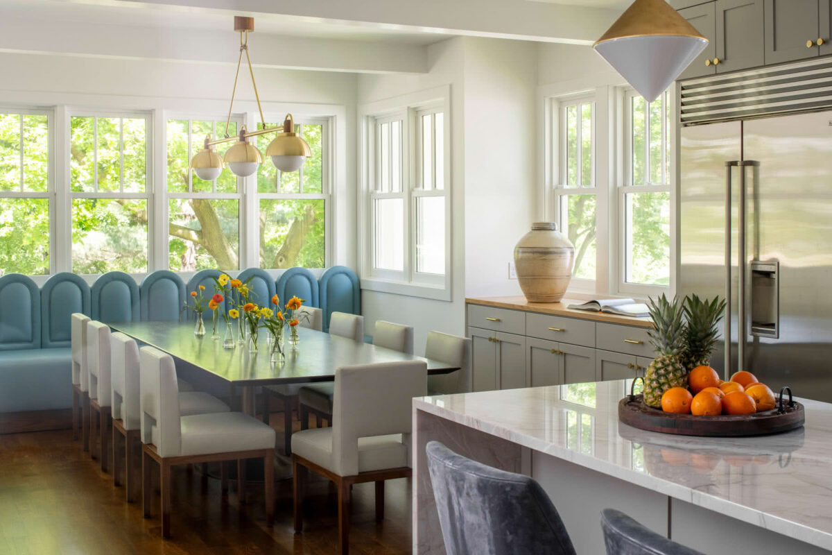
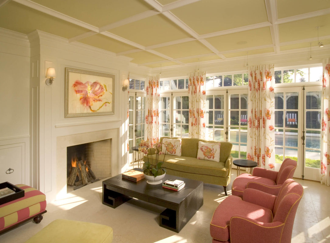
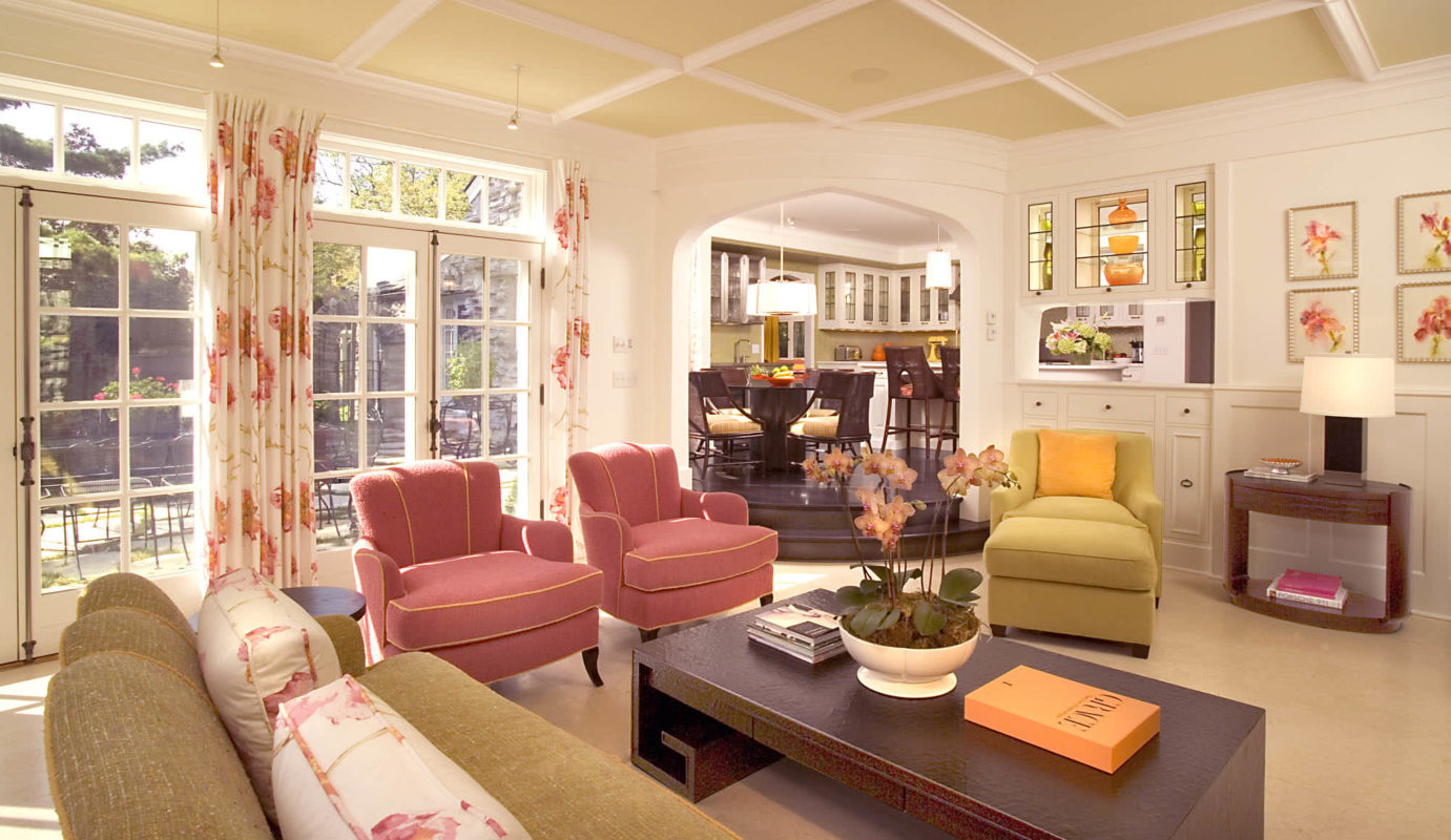
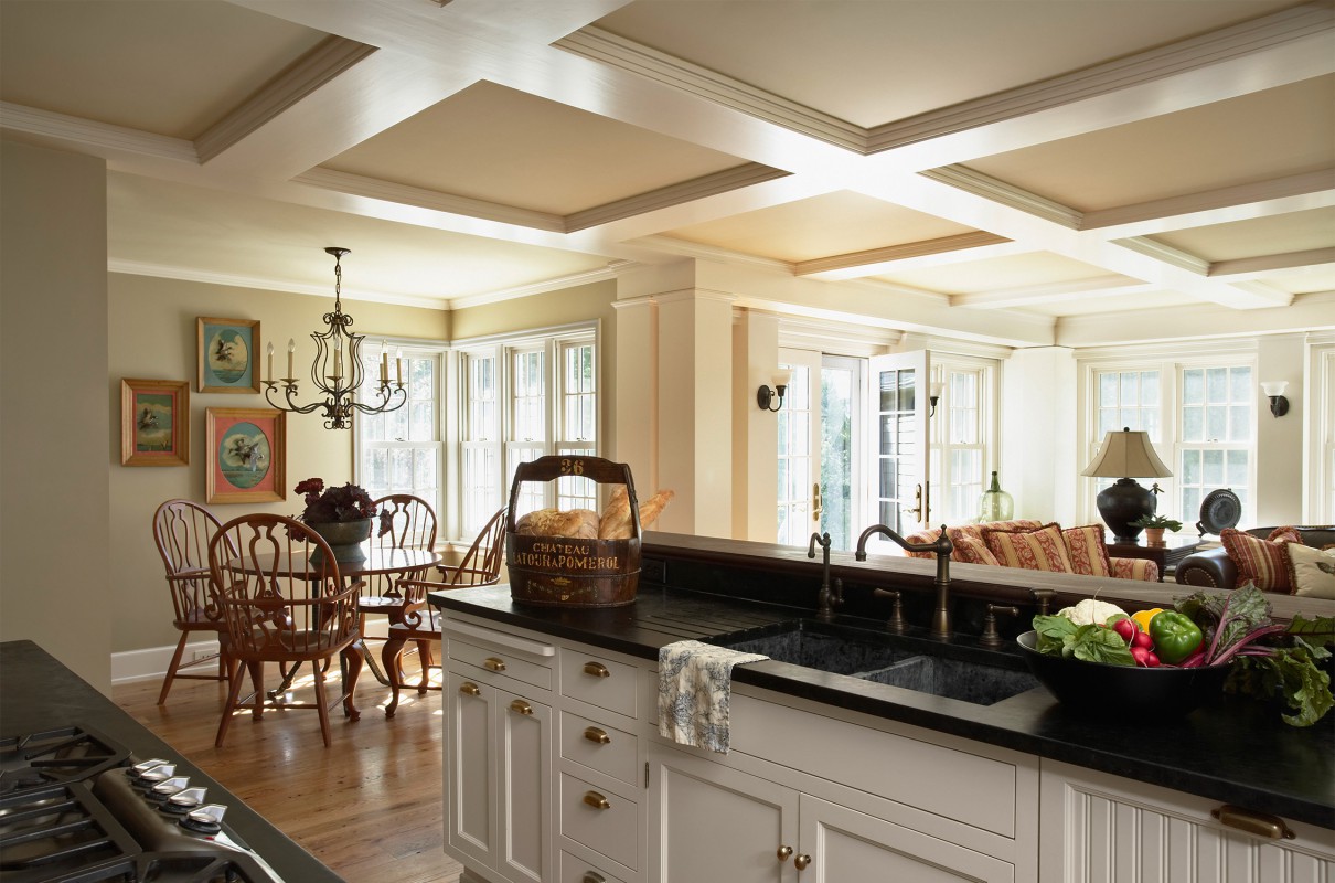
Freshness and light are juxtaposed with details and finds, like antique glass from a church. The lead-came glasswork gracefully defines and layers dining and entry spaces while allowing sunlight to bounce between both.
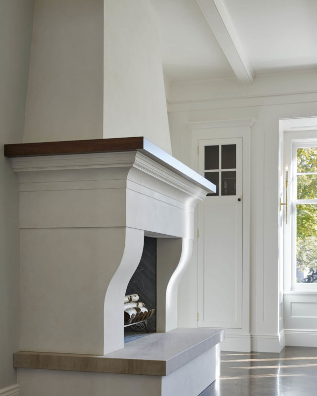
The dining room plaster fireplace, with its curvilinear haunches, was designed to create a quiet, reflective mood. Inside, a stone herringbone pattern echoes the floor.
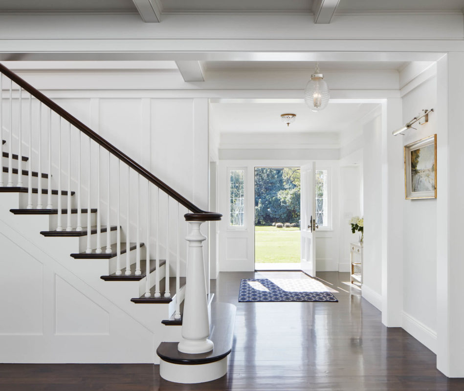
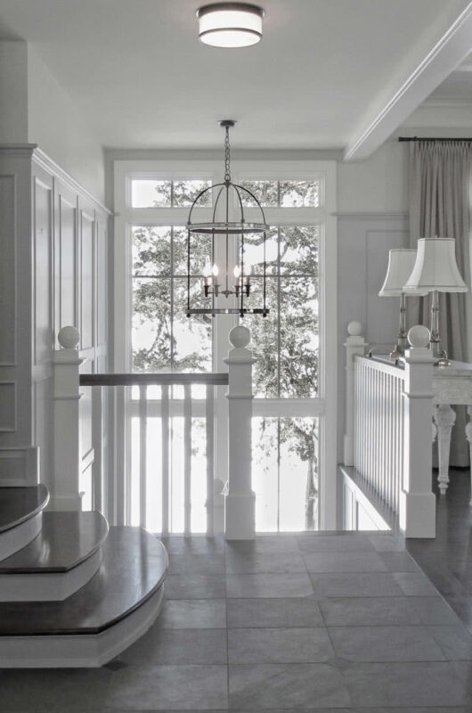
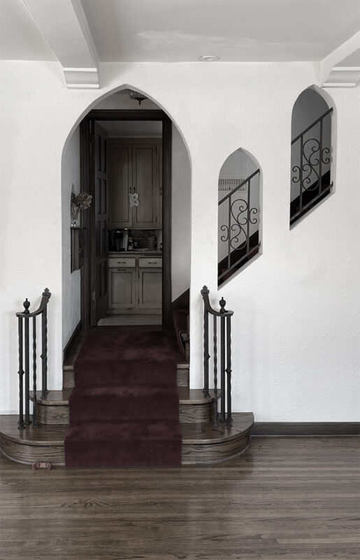
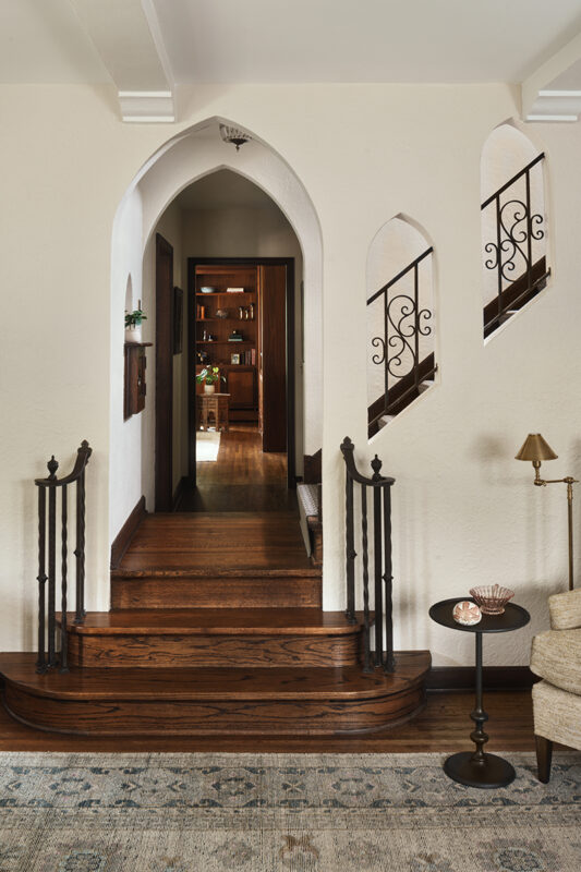
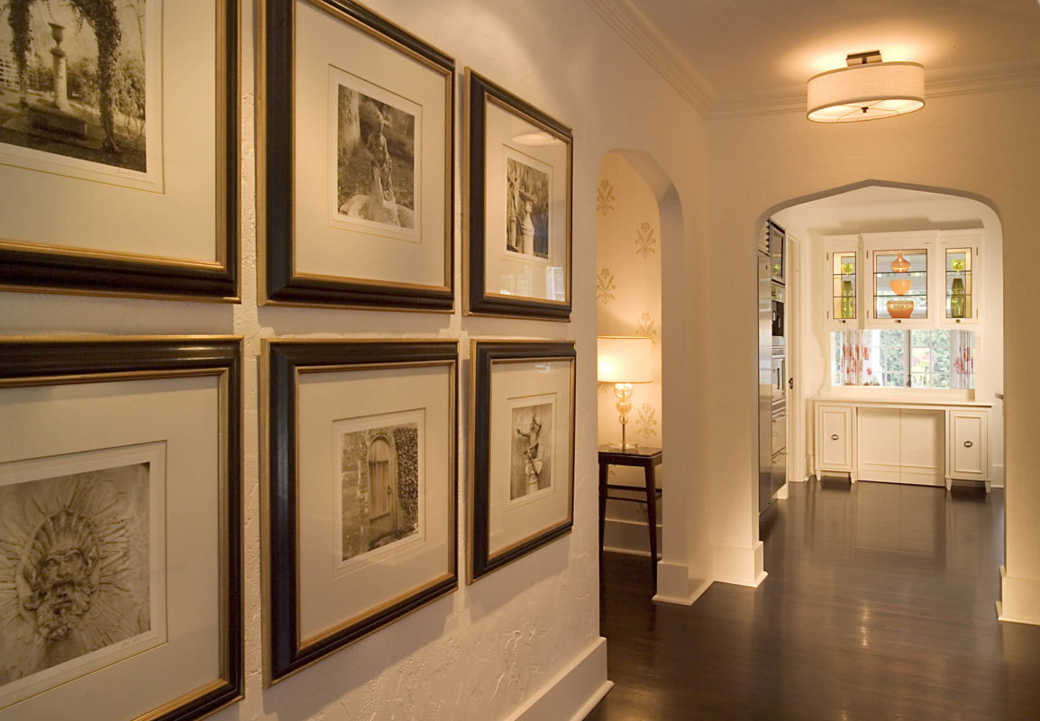
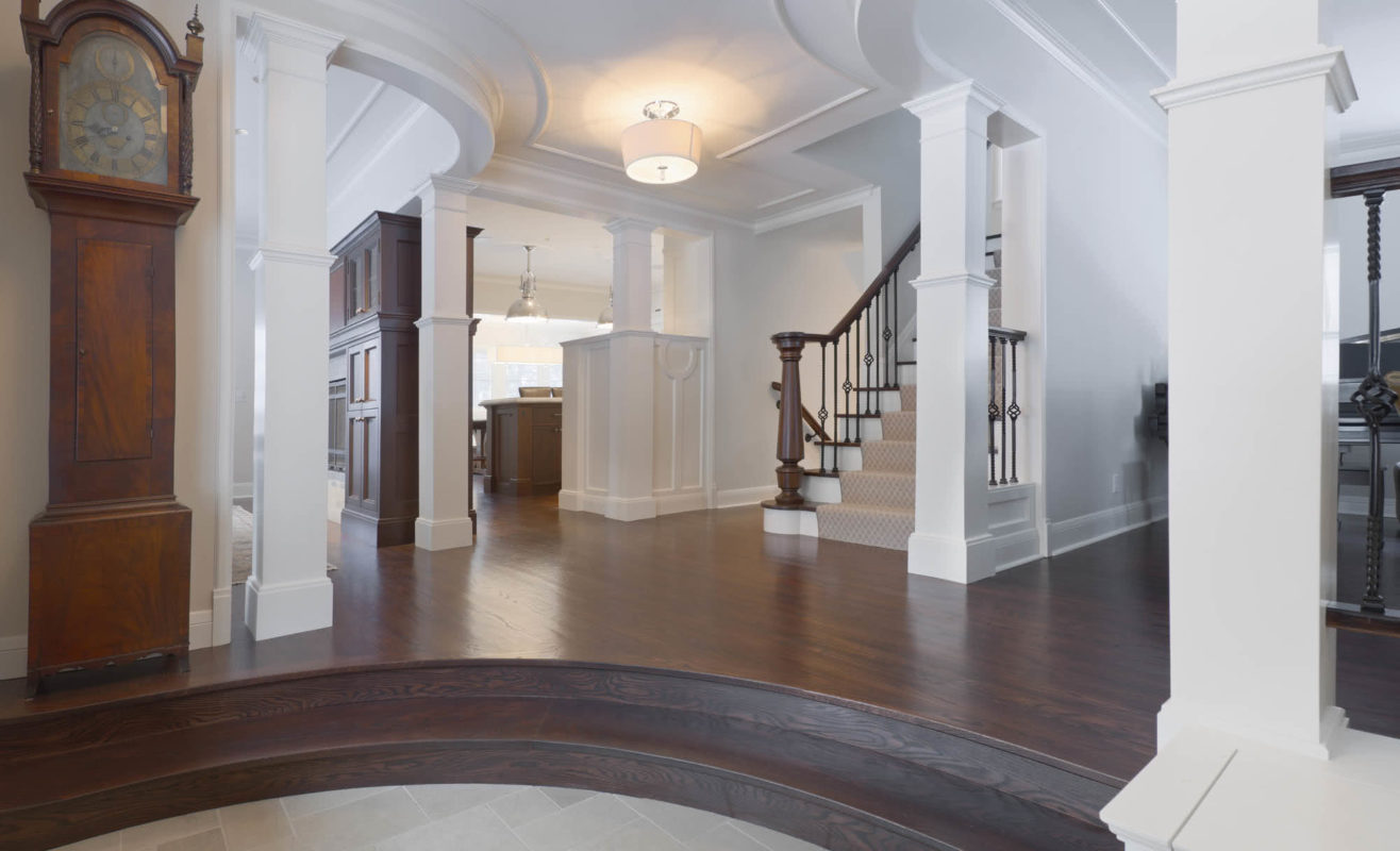
Historical research led to the entryway and stair. The newel posts and spindles were designed to feel delicate and detailed, with a nod to history yet unique in character. The newel serves as a central anchor within clearly defined passages through the home
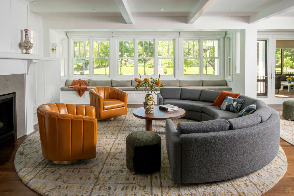
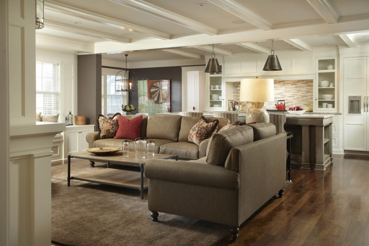
Opening up the narrow living room by removing the left wall (replacing it with a new beam) and creating a window bay gives a third side to seating and centers the newly refaced fireplace. The beams define a new, clear circulation path—previously nonexistent.
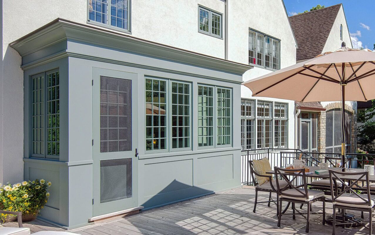
In this expansive window group, high dormer windows enliven the kitchen and family spaces with beams of south light, warmth, and shadows that change throughout the day.
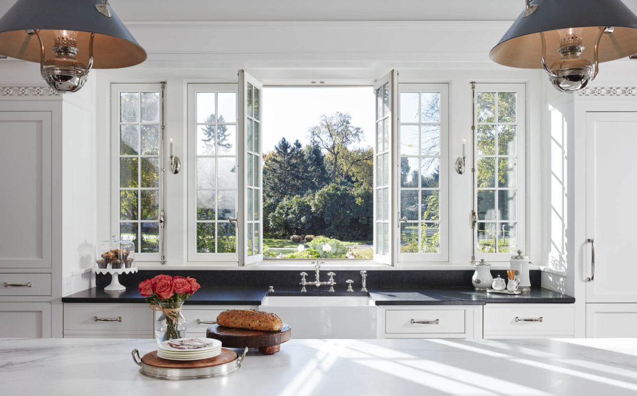
…and French windows now open to a new courtyard and garden. The cremone bolt hardware is functional as well as decorative.

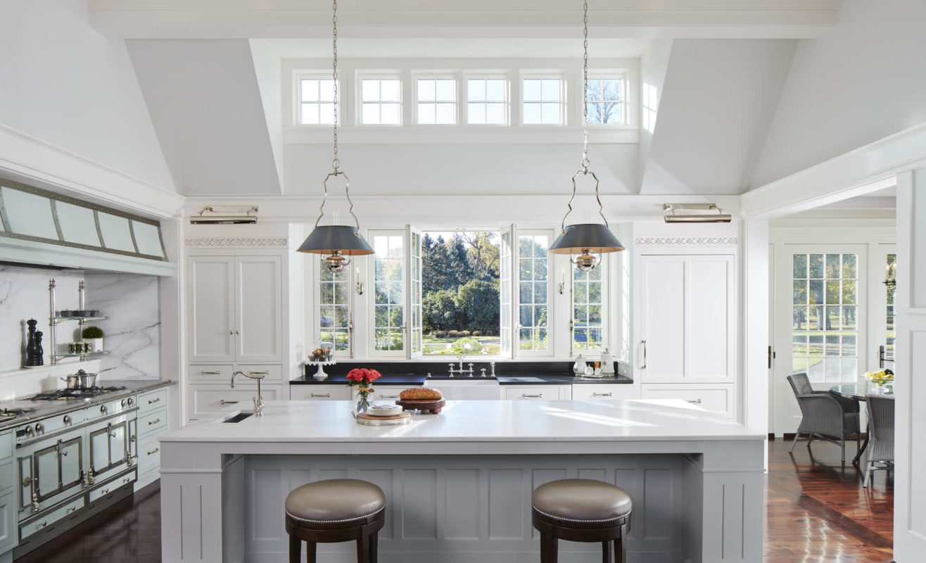
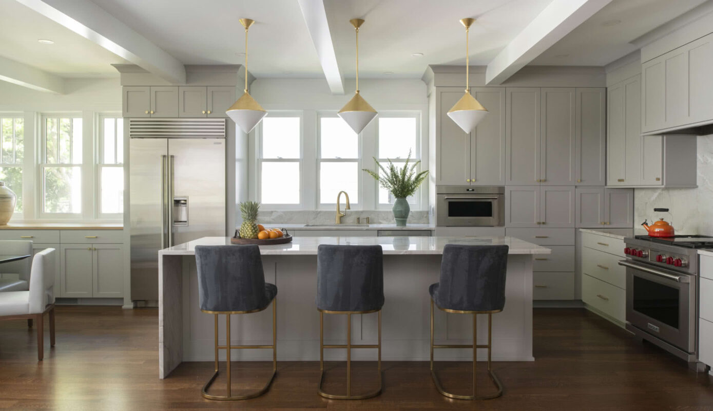
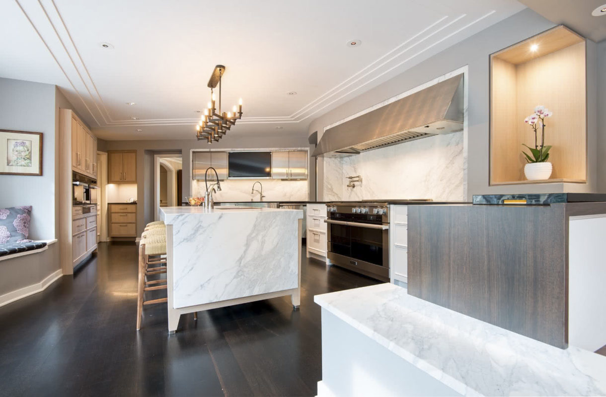
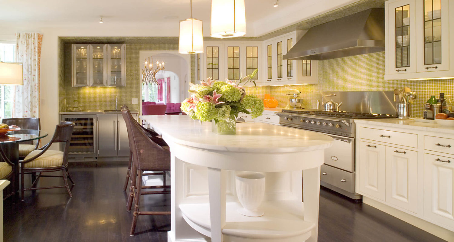
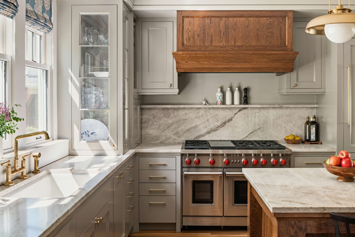
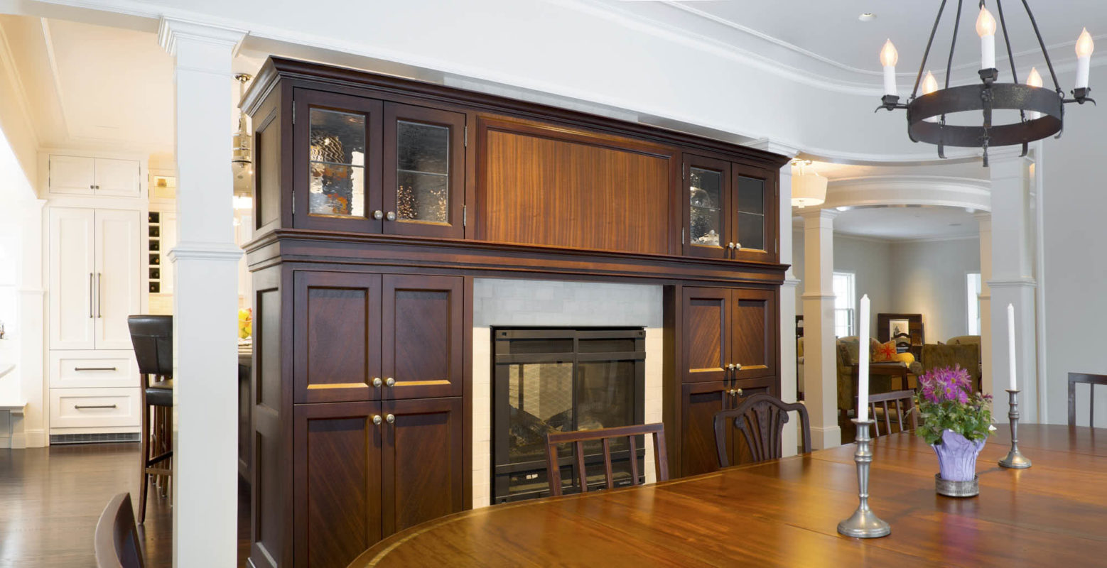
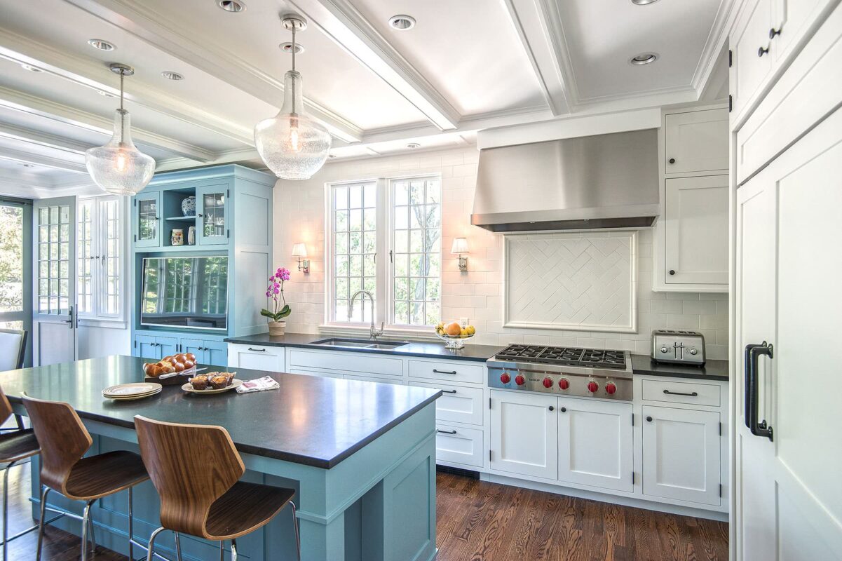
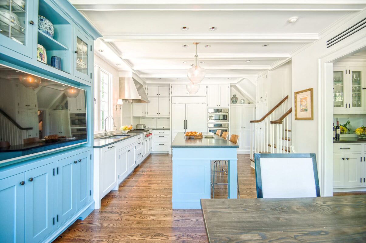
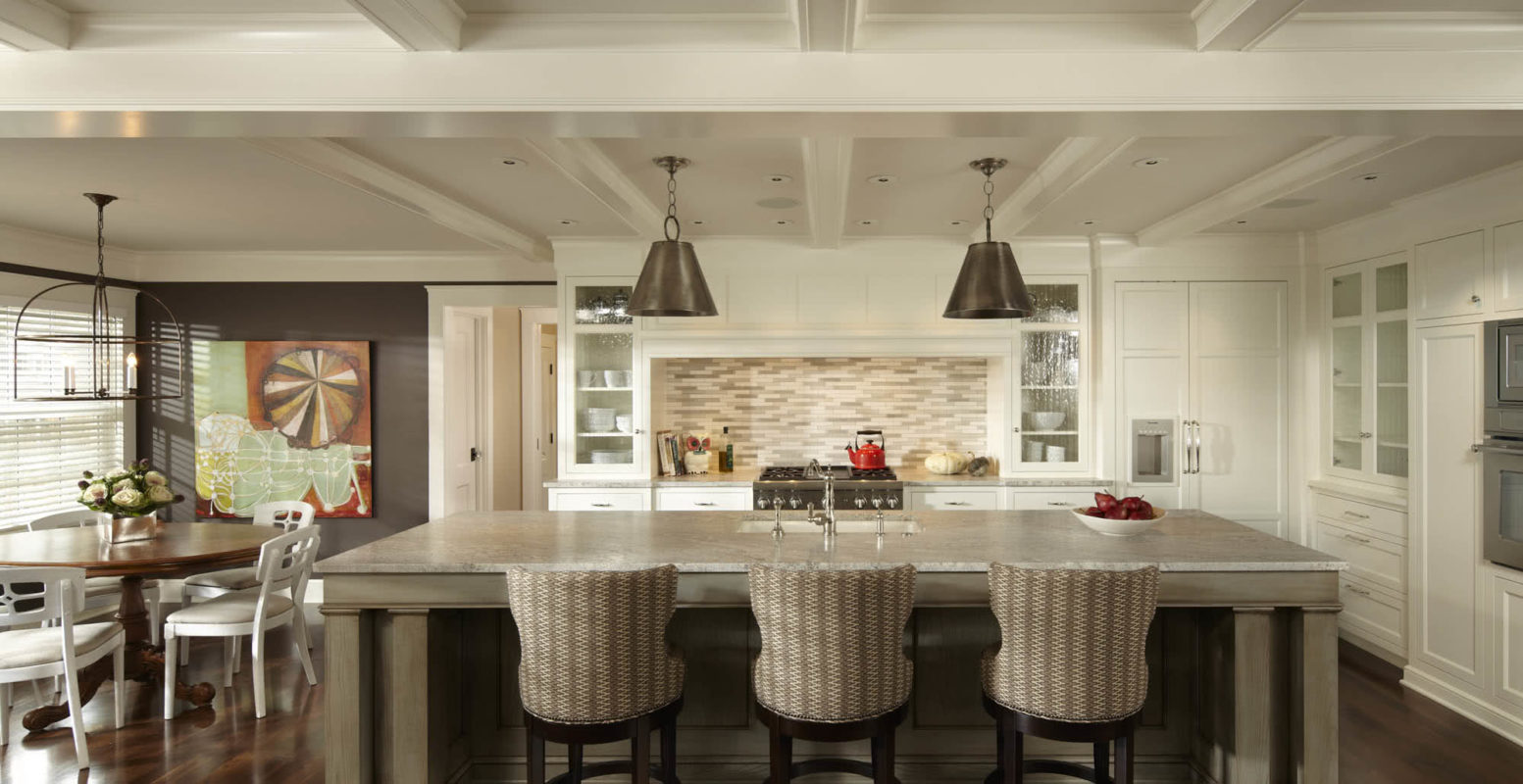
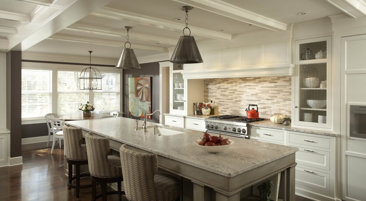
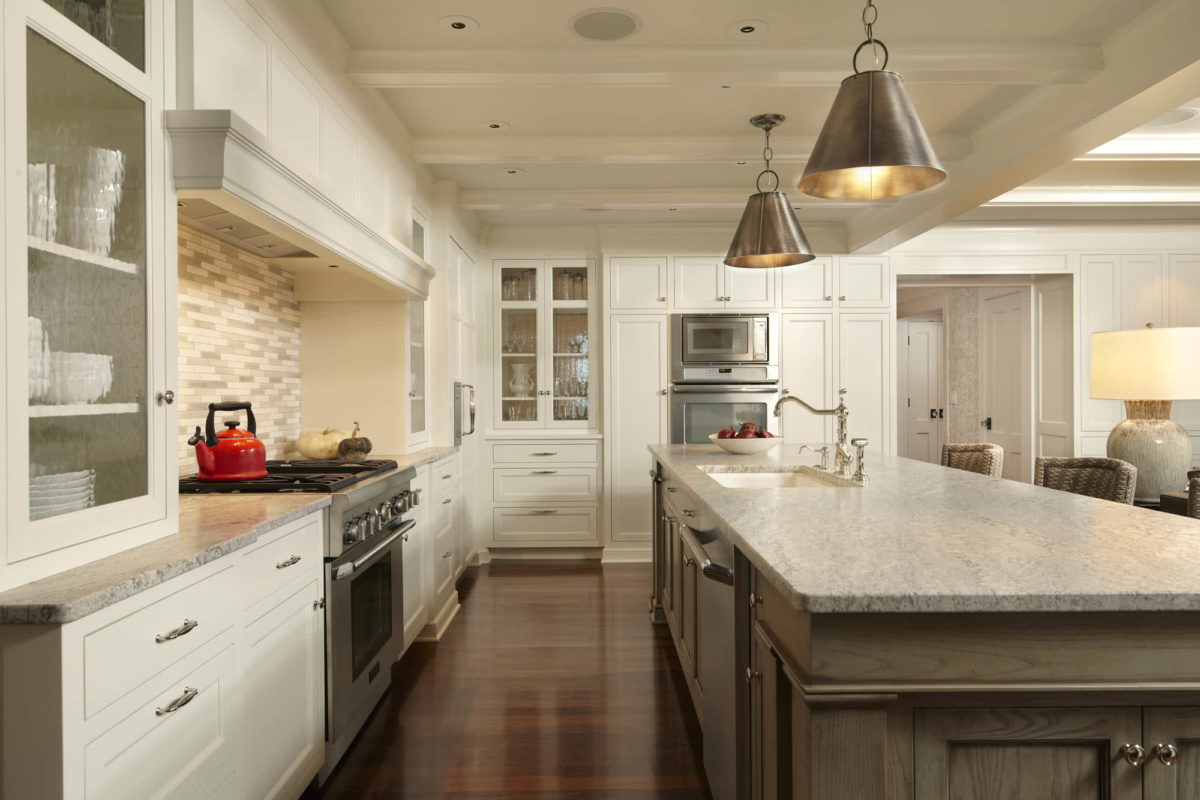
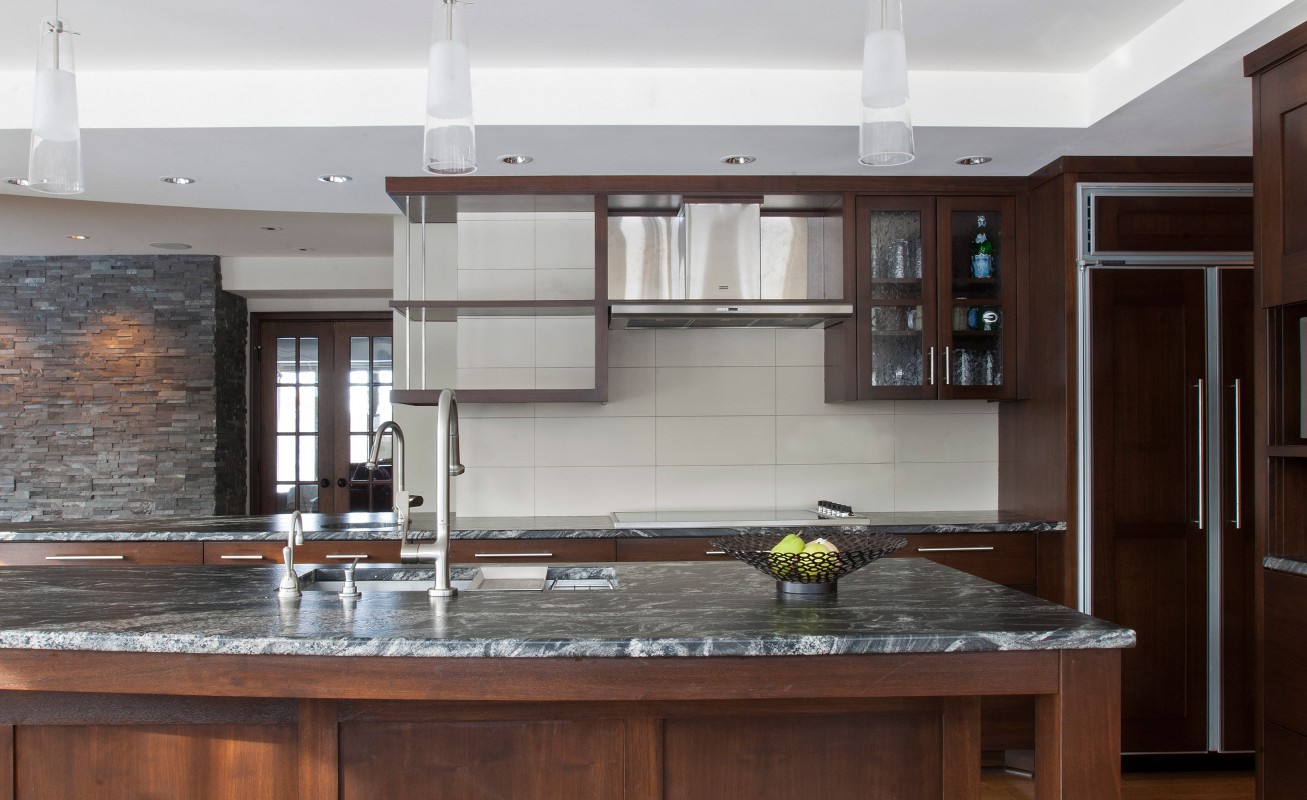
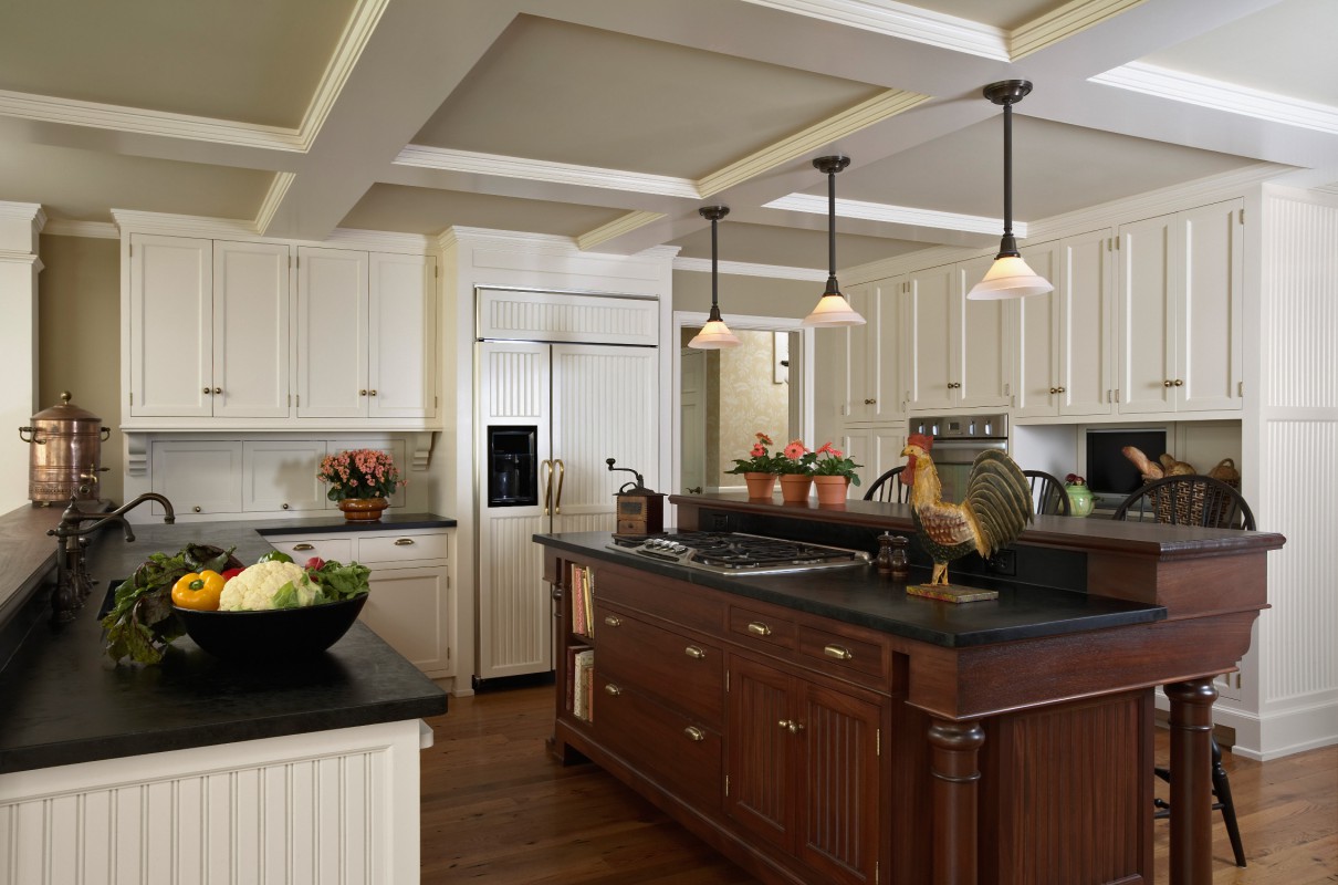
Complementary surfaces and subtle colors animate the space in a balanced way. The La Cornue French range was a dream come true for a homeowner with a passion for cooking. To create an integrated cooking assembly, we designed a complementary hood and side cabinets.
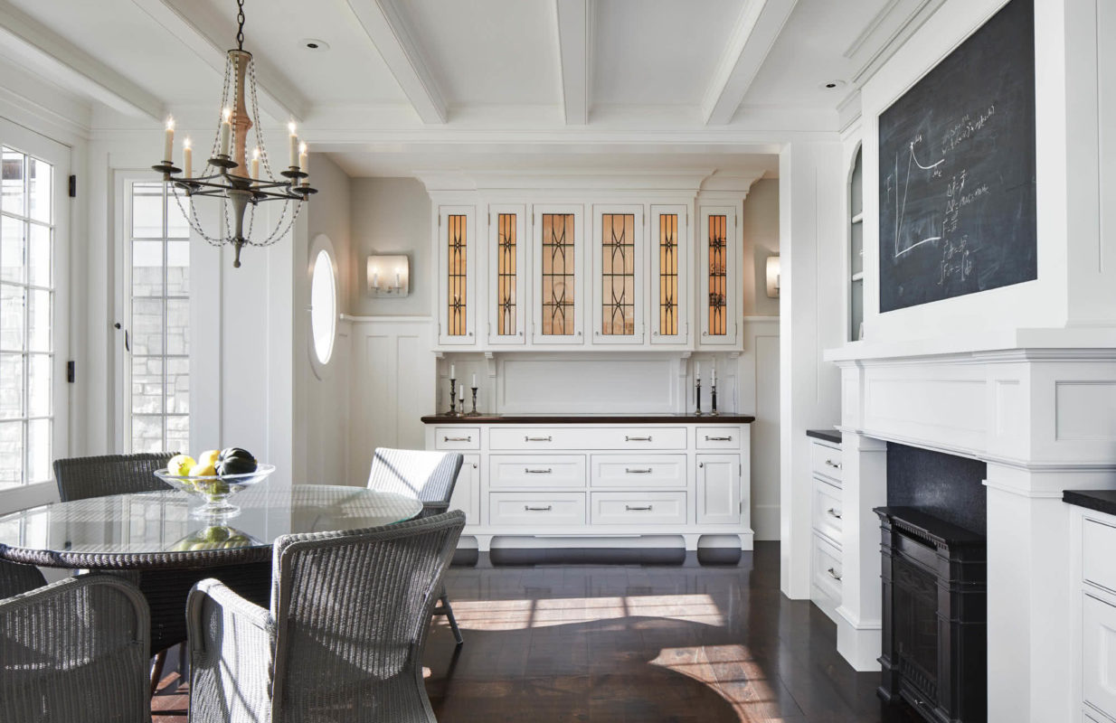
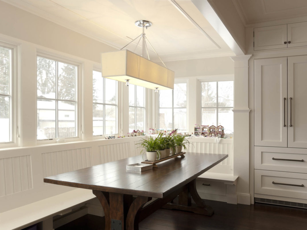
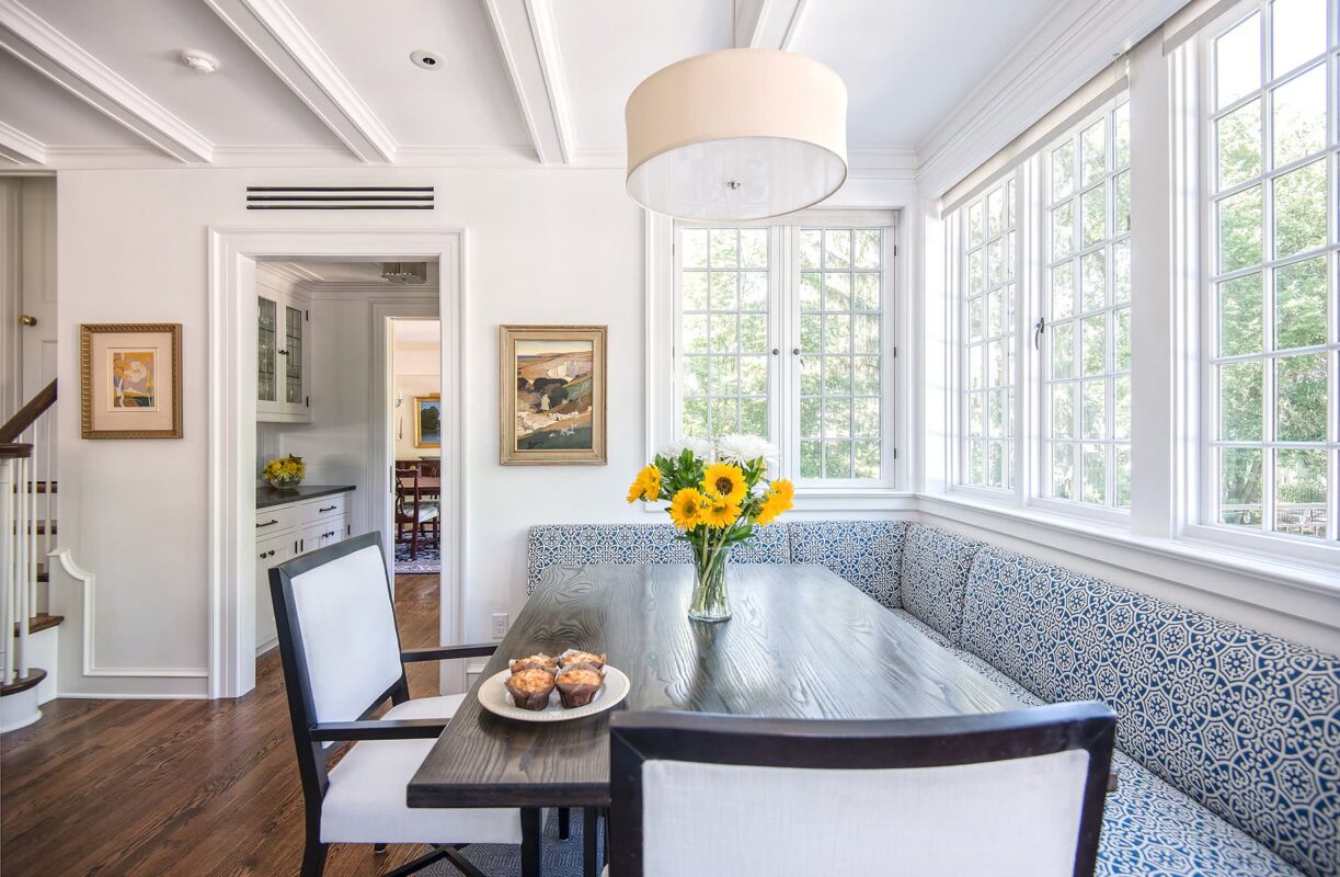
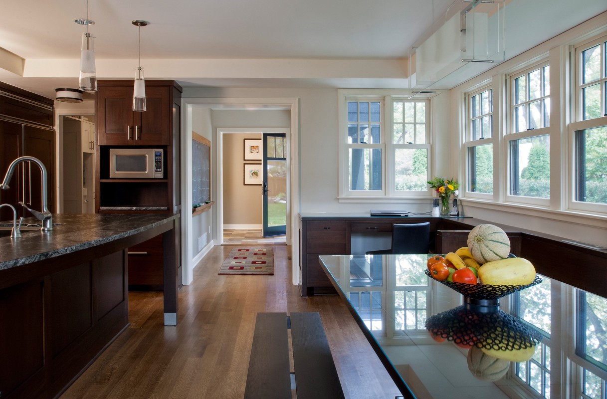
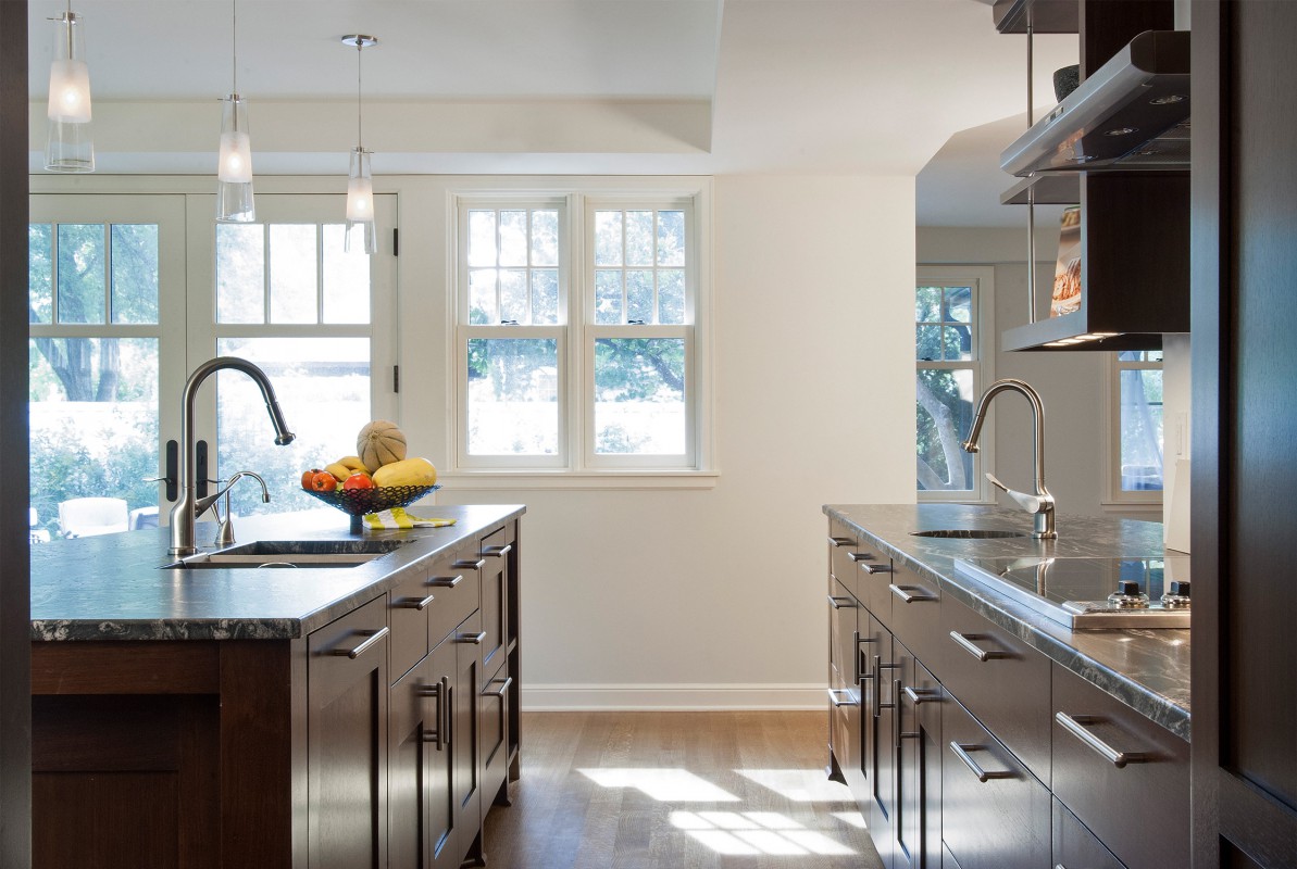
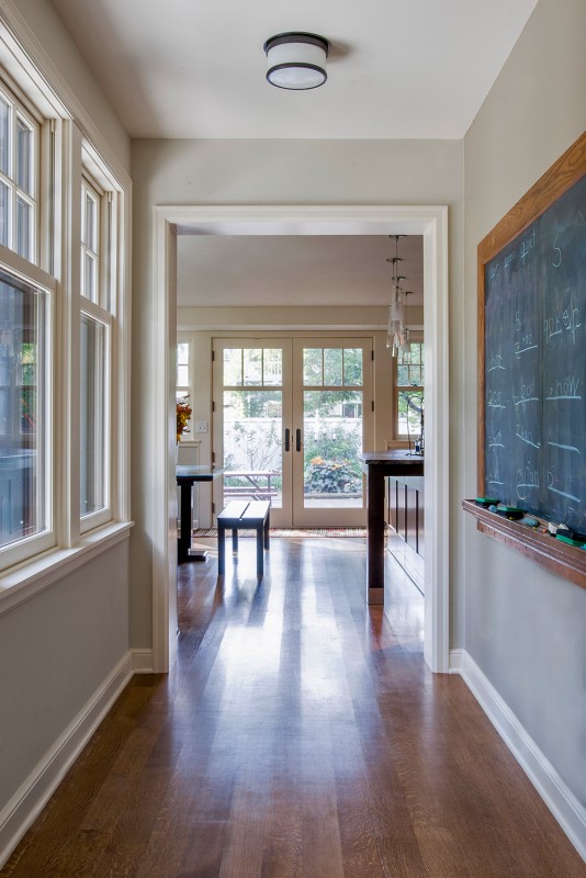
The eating area has its own sunlit bay. The homeowner wanted the house to have personality—to be full of small delights: the chalkboard over a wood-burning stove is just one example.
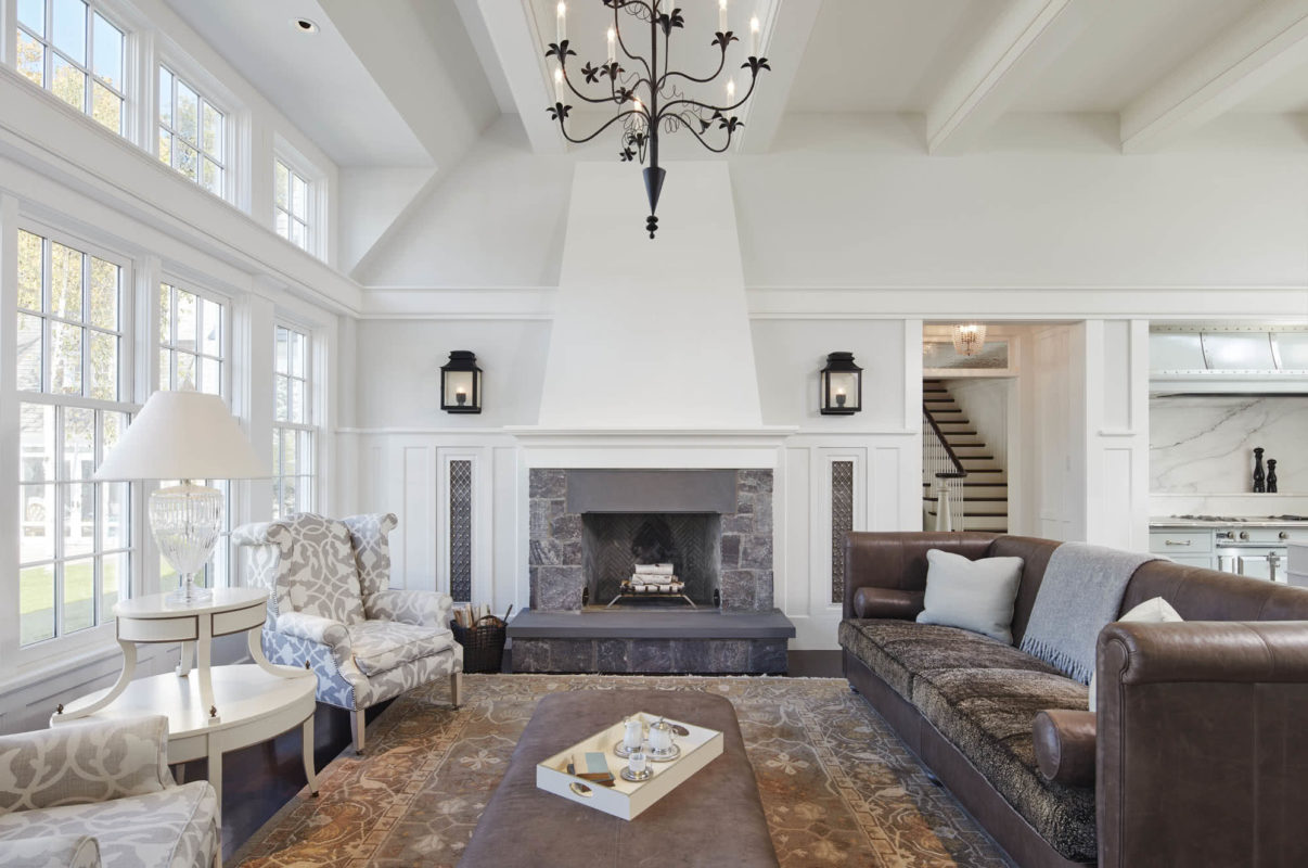
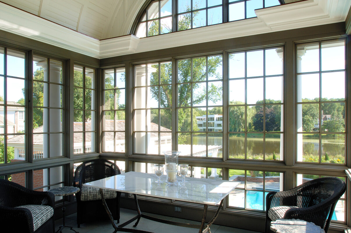
The window wall provides an expansive view of the terrace, pool, tree line, and sky. A band of millwork ties the family room and kitchen together and creates a more intimate scale by defining the living space below and vaulted ceiling above.
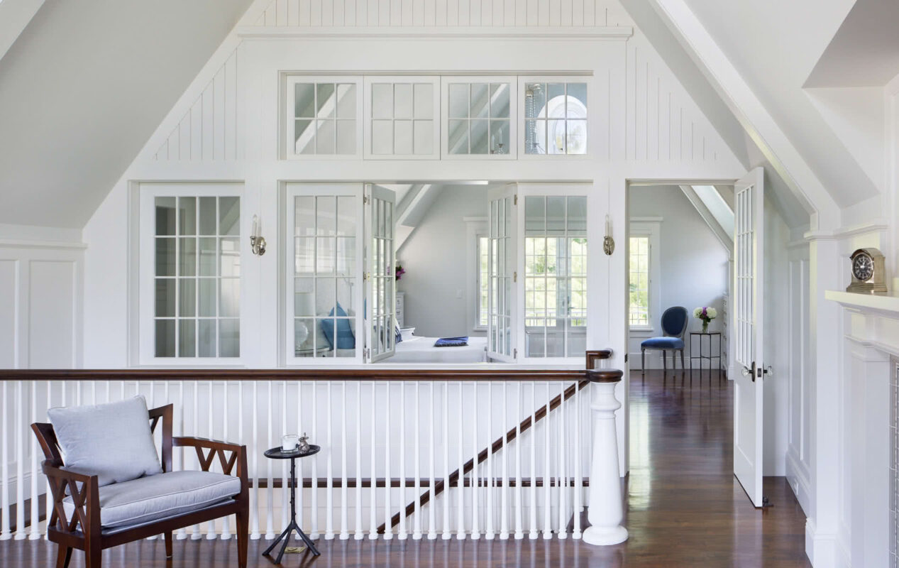
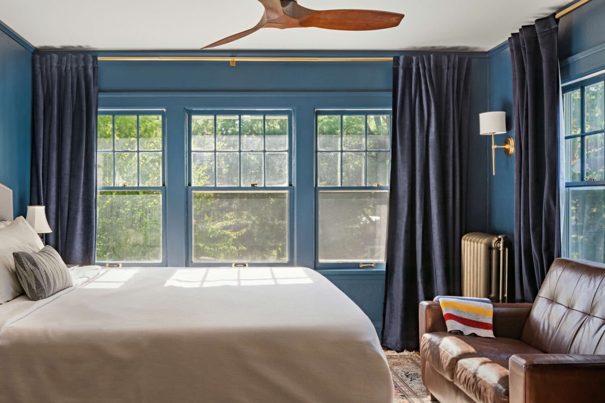
The upstairs owners' suite has a charming sitting room, offering a peaceful retreat at the end of the day. The glass wall provides sound separation from the bedroom when needed, while also allowing light and views to flow between both spaces, adding a dynamic, unique charm to each.
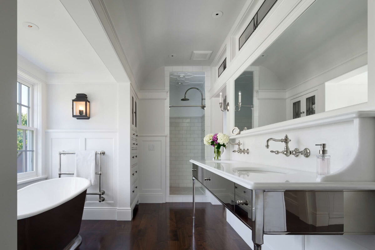
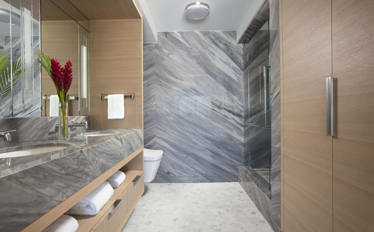
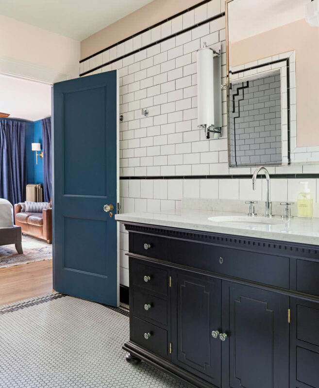
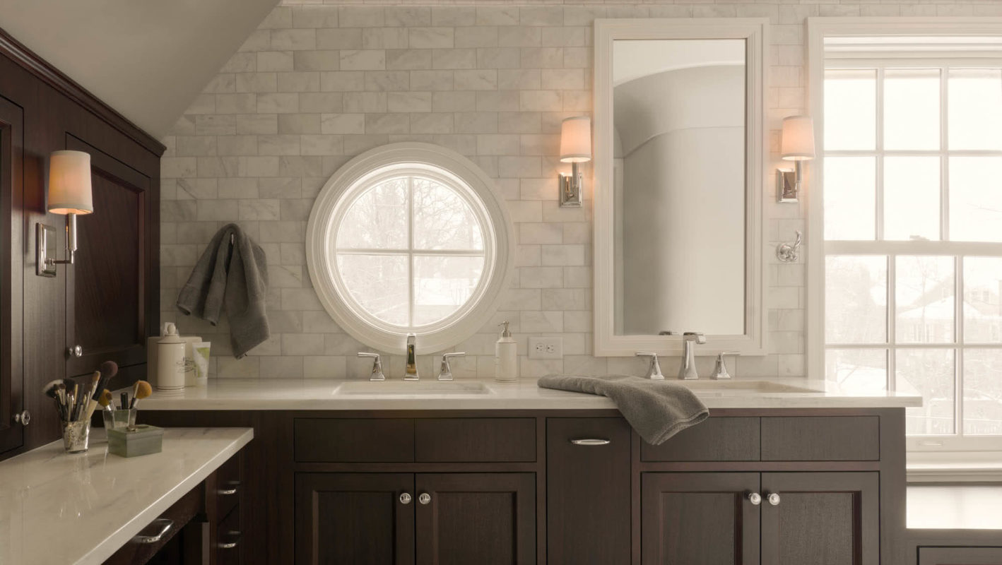
The owners' bath features custom-designed vanities that blend charm and function. Transoms above borrow light and allow the bath (and dressing room on the other side) to visually "breathe." The shower also has a delightful touch — a patterned, water-resistant plaster ceiling.
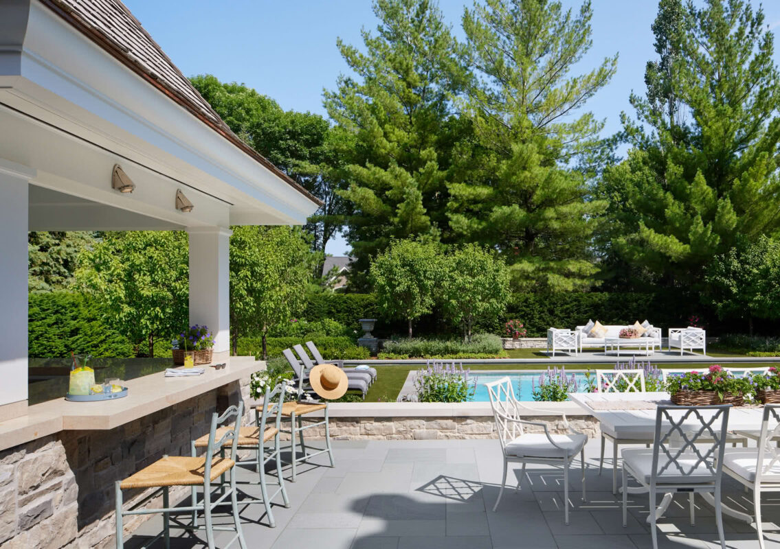
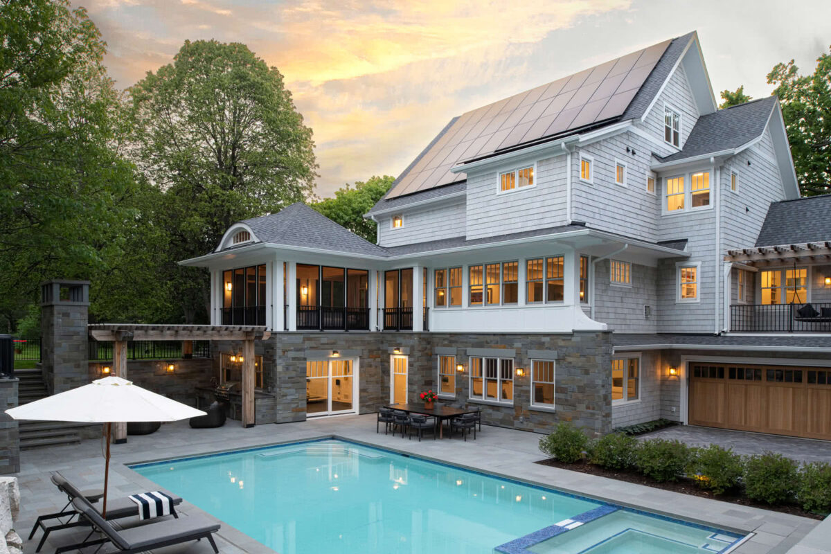
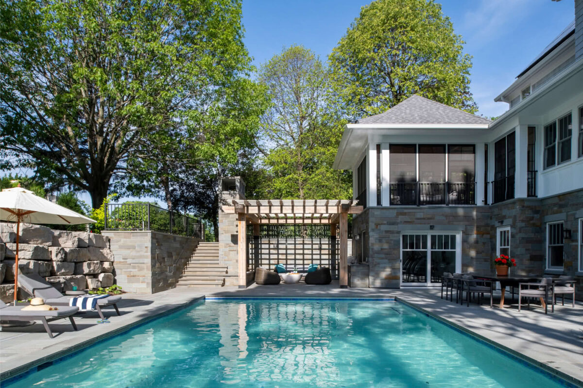
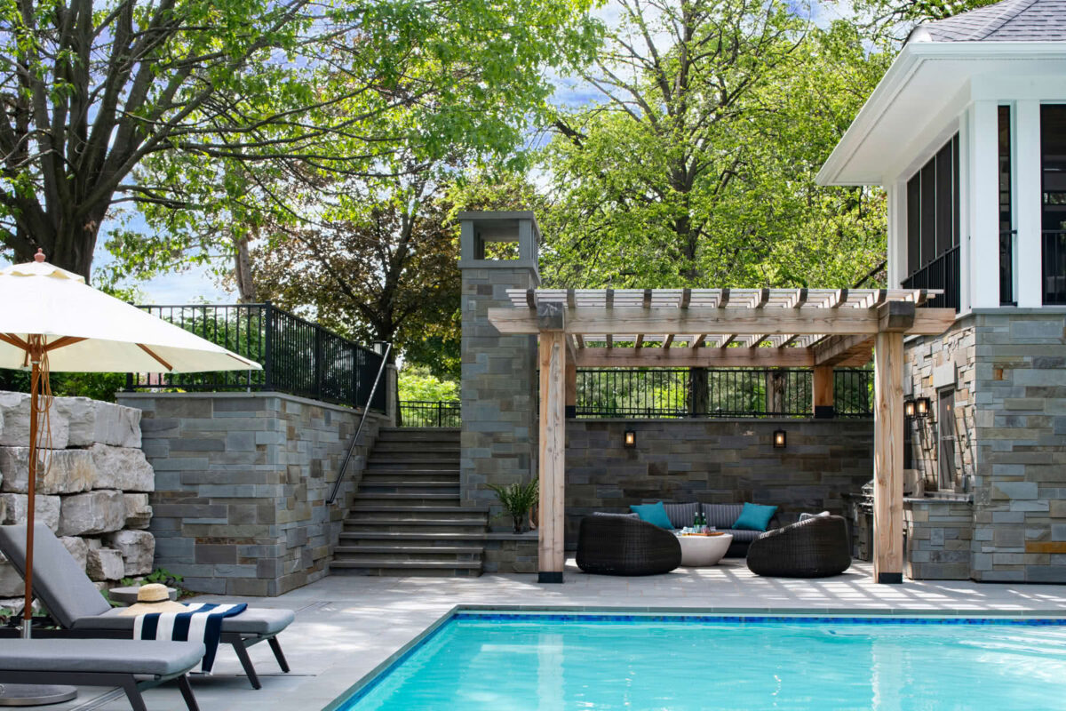
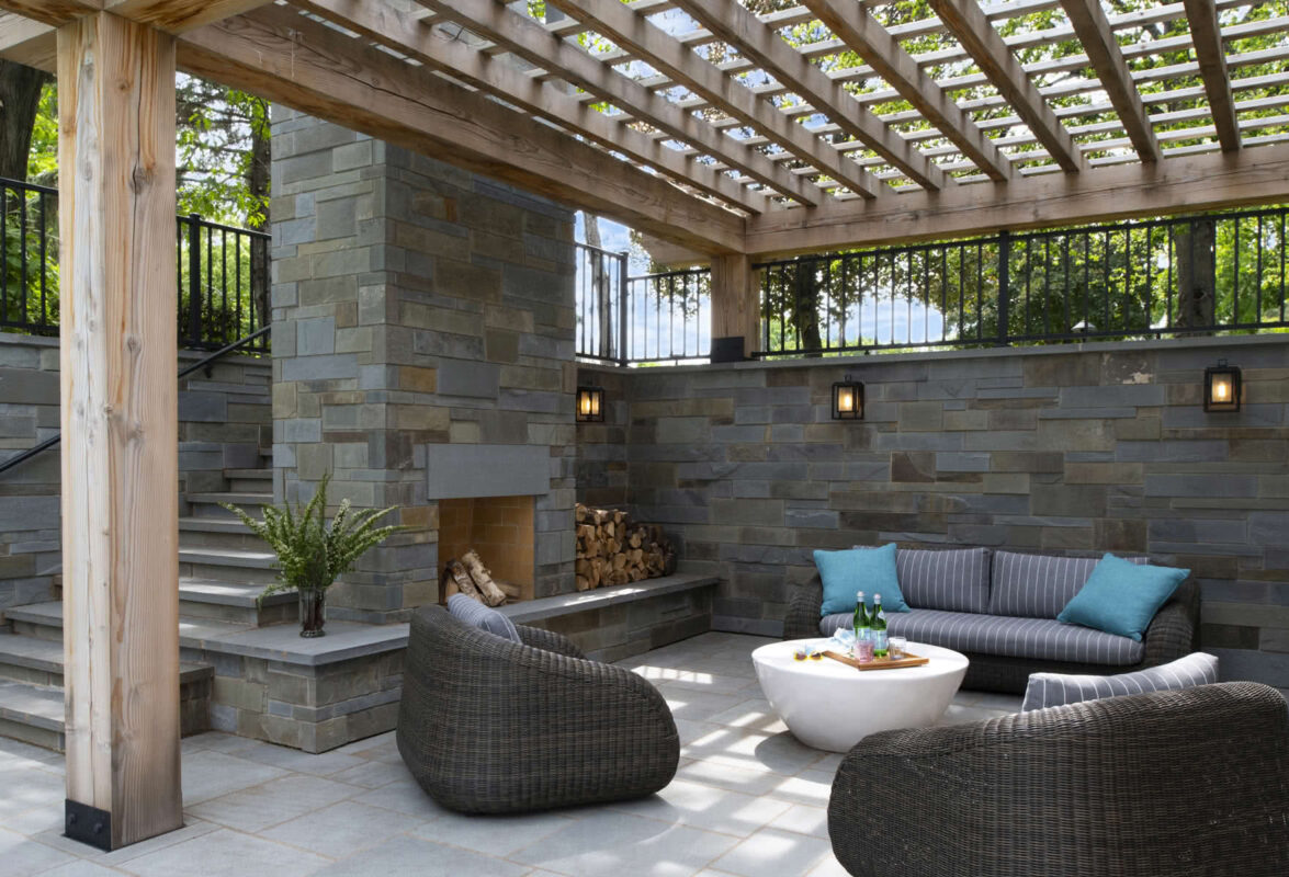
The subtly raised terrace creates an outdoor room and gives prospect over the pool area. Across the seating, dining, and outdoor kitchen pavilion, it provides both soft and hard surfaces for different activities, creating a cohesive, inviting, human-scaled environment.
Outdoor entertaining is beautifully supported, with dining close by and counter seating under the roof eave.
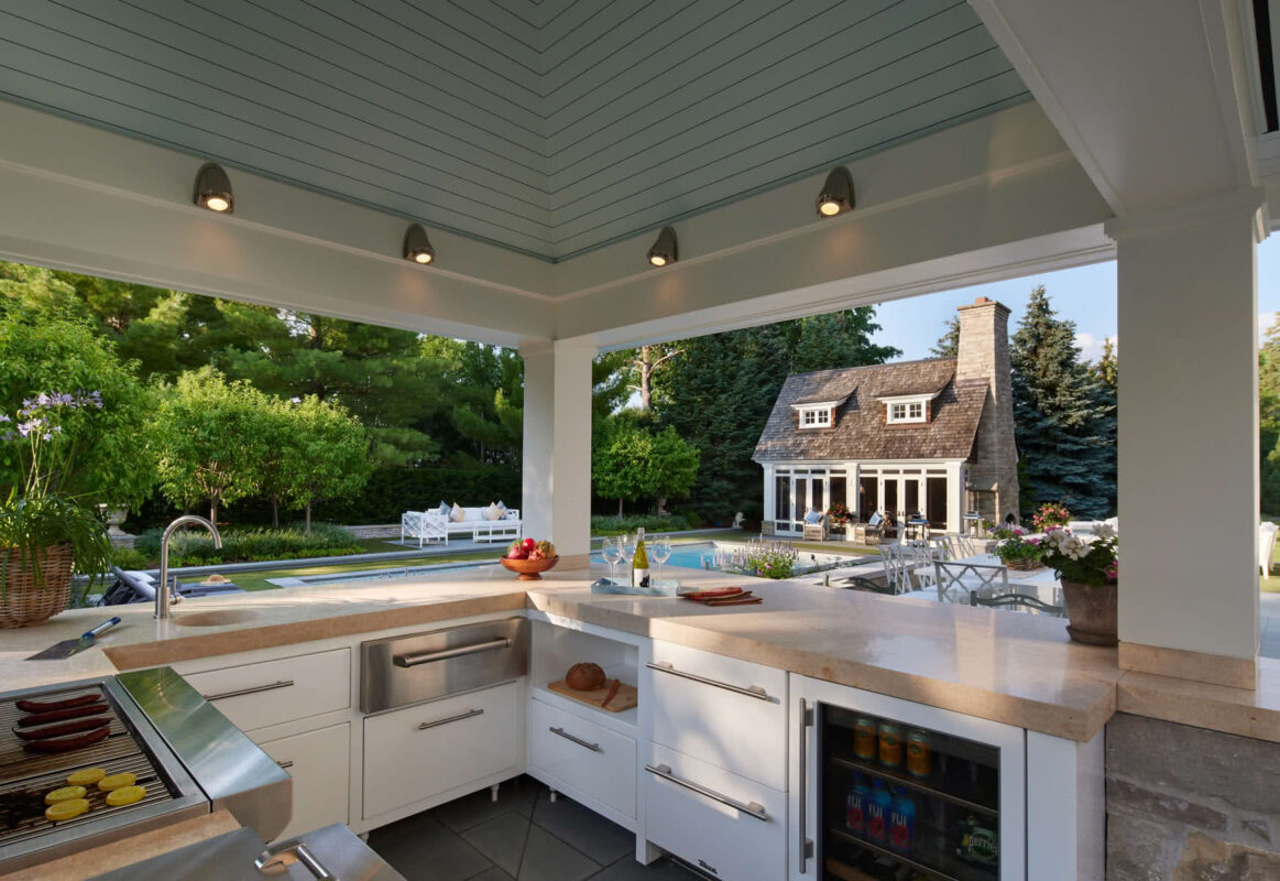
The chef (homeowner) is not isolated in this design, with views of all the activity and a sheltered stage for cooking and presenting alfresco fare.
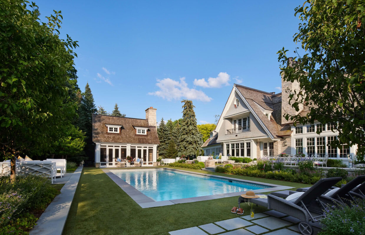
The pool porch from an earlier design phase serves as the end focal point and fourth wall of the outdoor pool “room.” The space offers multiple places to relax, in sun or shade, creating a rich, enveloping environment around the water.
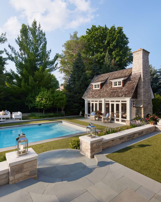
The circular landing and steps create a welcoming passage from upper terrace “room” to the lower pool “room.”
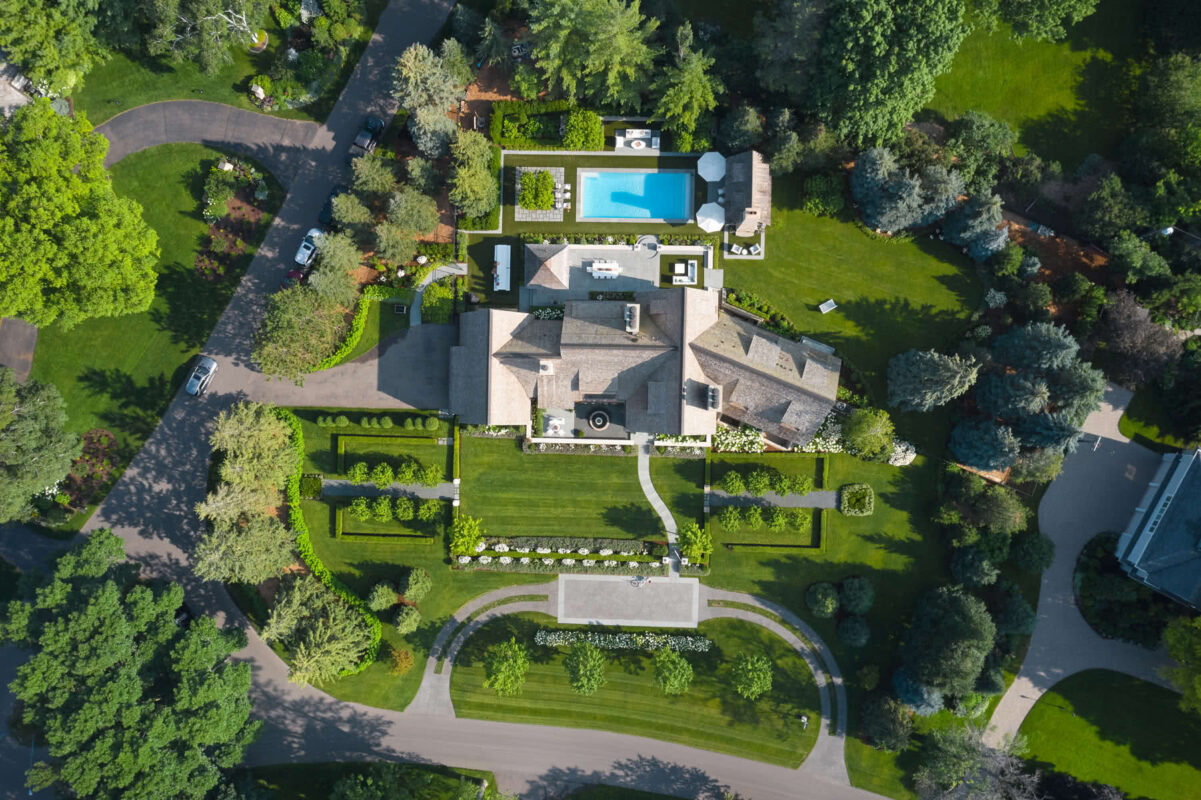
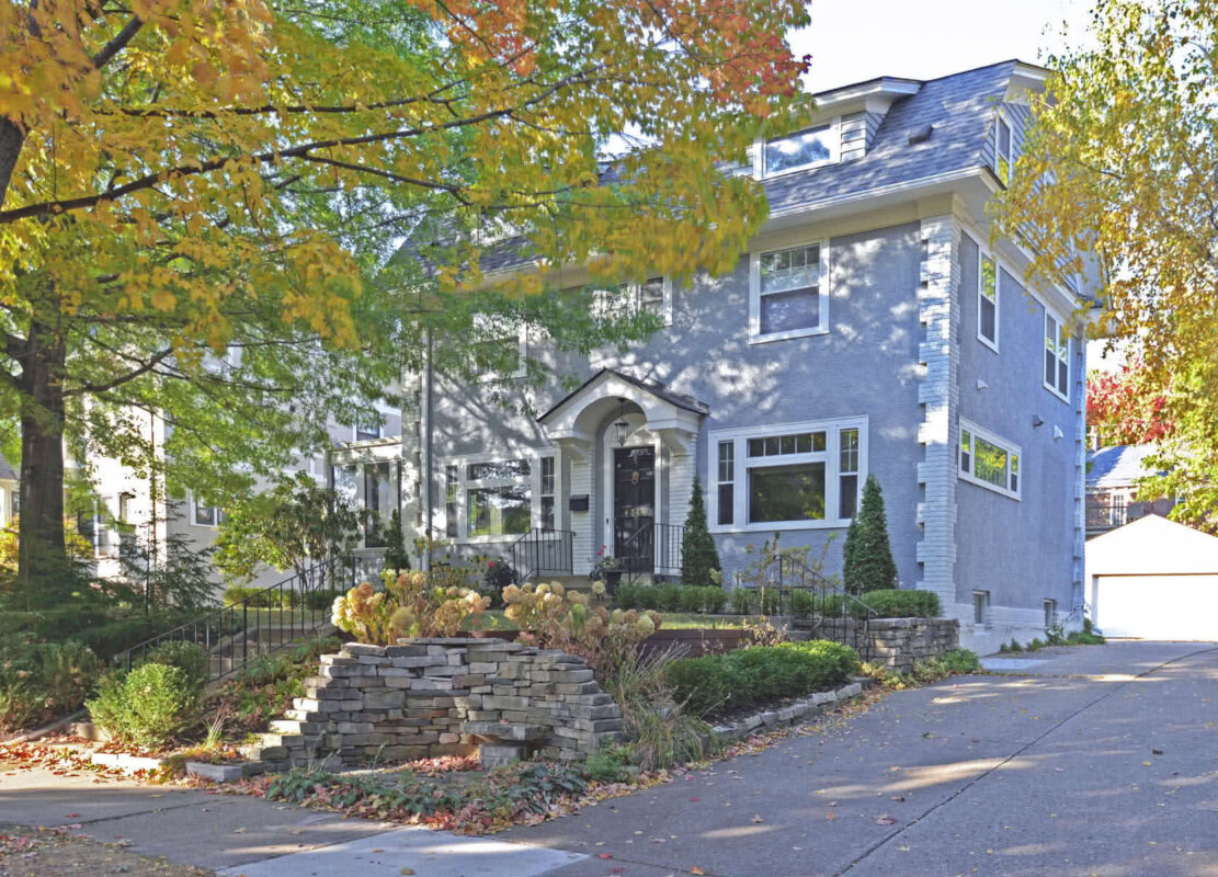
Our clients had a plan to completely transform their home and property over several years, and we have been fortunate to be part of it every step of the way. It is now beautifully complete, with a new landscape design—with rich layers, edges, and spaces for inviting outdoor living and dining.

What was once an undeveloped open yard is now a richly layered forecourt of flowering trees and shrubs, stone piers, raised lawns. The sense of invitation and intrigue is completed by the ribbon drive and parking court.
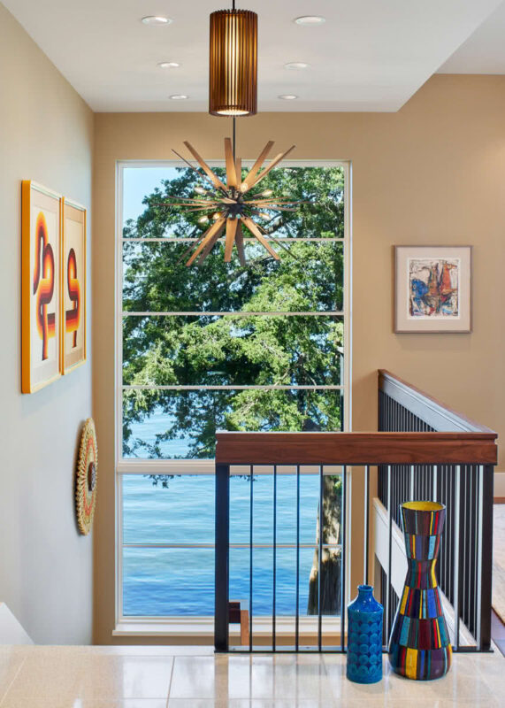
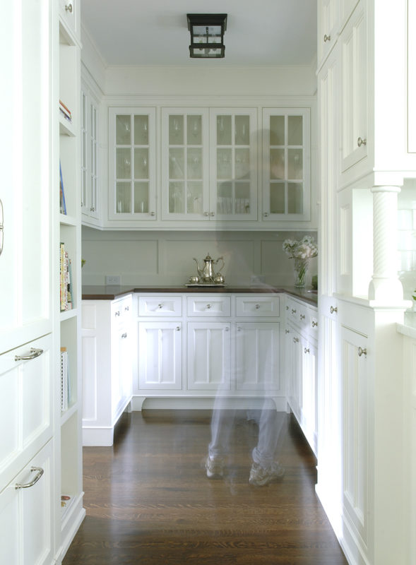
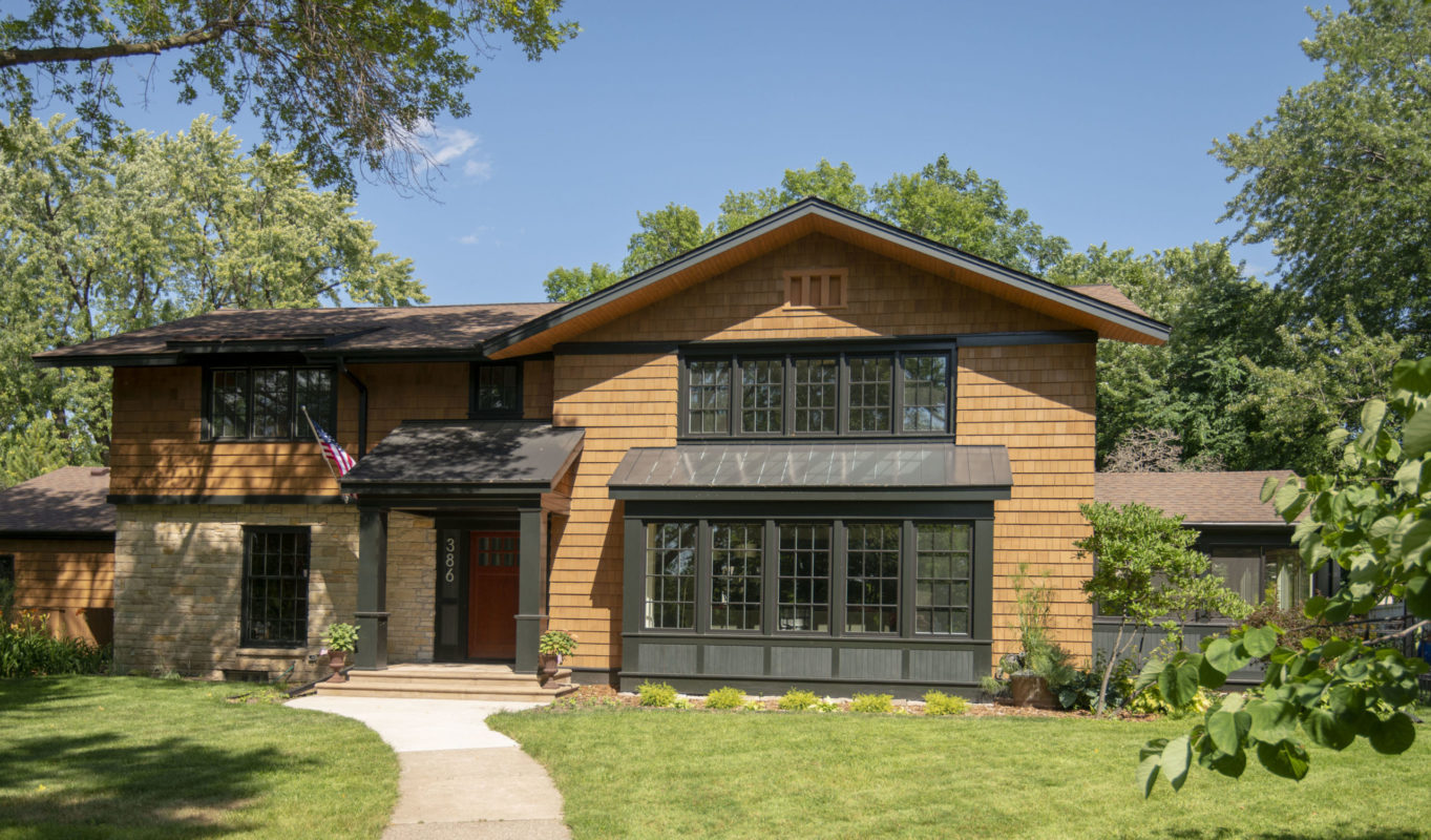
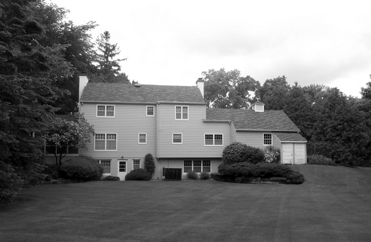
Nantucket Re-Creation
Minnesota
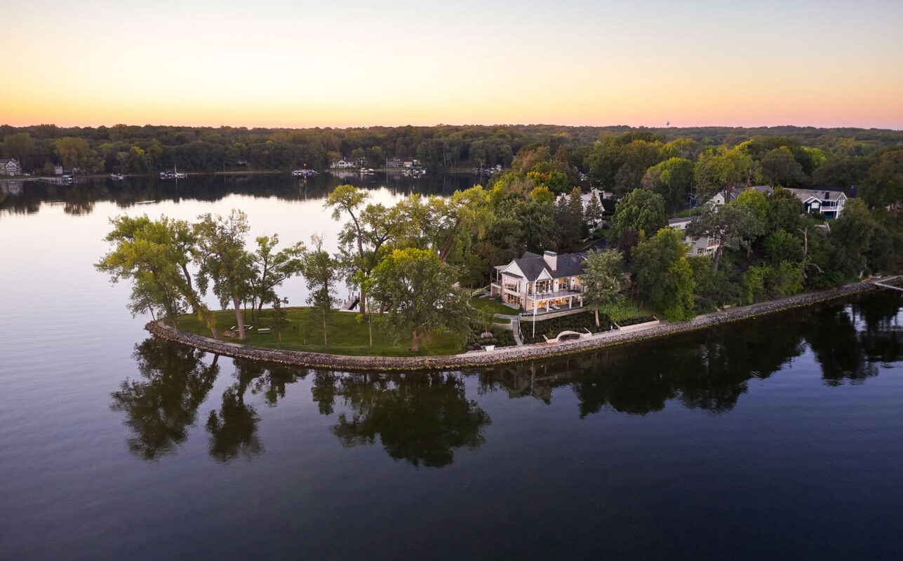
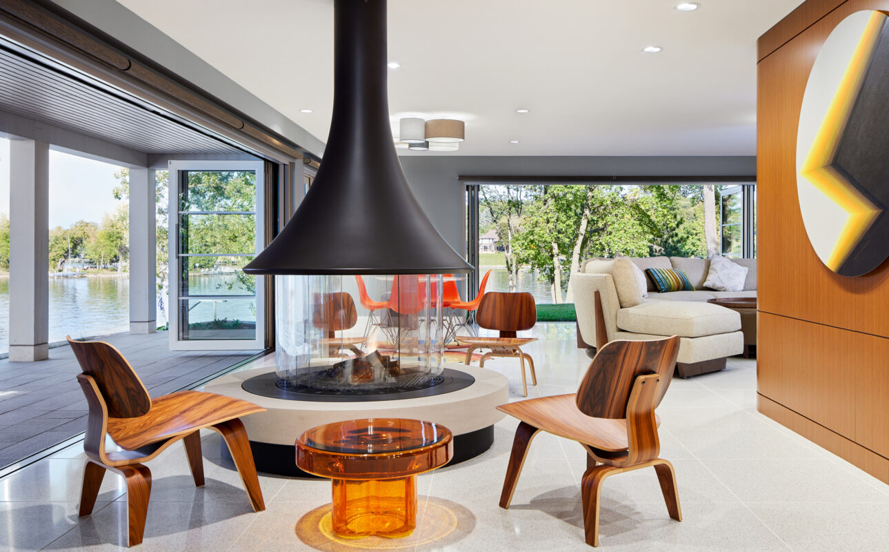
The renovation aimed to breathe new life into a dated home, transforming it with a unique and fun early ‘70s-inspired mod aesthetic. With three sides surrounded by water, the renovation also focused on strengthening the home’s relationship to the lake, a connection that had been previously overlooked.
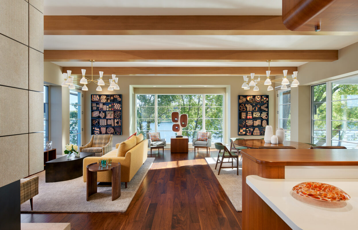
Large window bays—now squared off with glass extending to the floor—bring the living room closer to the lake, creating a more dramatic and direct connection to the outdoors. Reorganized furniture groupings, along with thoughtful placement of furniture and art, bring balance.
The original fireplace felt like a solid wall—dividing the space and reading more as a barrier than feature. In the spirit of '60s and '70s Modernism, where space is meant to flow, the redesign reimagined it without changing its location.
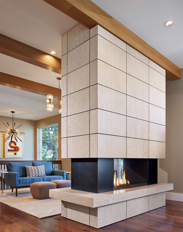
The new version lightens the mass: the stone above the firebox is cantilevered, and the hearth floats, creating a sense of air and special movement around it. Clad in vertically striated limestone, the two-sided fireplace reads as a sculptural, four-sided form—more art piece than obstruction.
The overall kitchen layout was largely retained due to the compact footprint, but the space felt dated and static. A bulky central hood blocked views and light, and the lighting throughout needed significant improvement.
TEA2 designs interiors as an extension of the architecture, with integrated cabinetry and millwork that create a seamless, cohesive whole. Here, 1970s-inspired cabinetry with hand-selected veneer, curved corners, and a suspended open shelf adds a sense of lightness and sculptural quality.

While the kitchen serves as a centerpiece, it's part of a cohesive vision in which architecture and interiors are designed as one. Exposed beams, custom millwork, clear sightlines, and expansive horizontal glazing create an animated interior and a seamless visual and physical connection to the porch and lake beyond.
Multi-slide doors open the kitchen to the screened porch, enhancing the sense of space and visually expanding its shallow depth. Oriented to the east, the porch offers a serene spot to enjoy morning coffee with views of the lake.
The original entry hall had an interrupted view, with a heavy railing and newels, and a multi-paned window obscuring the lake beyond. A few steps to the primary suite also limited the hall’s potential openness.
The stair was reversed to open up the lower level, while a single large window and a simplified, modern railing transformed the entry into a transparent, light-filled space with a direct view to the lake. The steps to the primary suite were discreetly tucked back to create a more open hall.

The original lower level was dark and compartmentalized. By removing walls and concealing the new, more expansive structural elements, the space was opened up to create a generous new family room.
Taking advantage of the existing fireplace flue shaft, a new in-the-round fireplace anchors the new layout and style. It defines a more open, fluid flow, transforming what was once a conventional space into something more dynamic and connected.
Previously broken into small, shadowy rooms, the lower level has been transformed into a spacious family area by clearing out interior walls and structural barriers, bringing in light and openness.
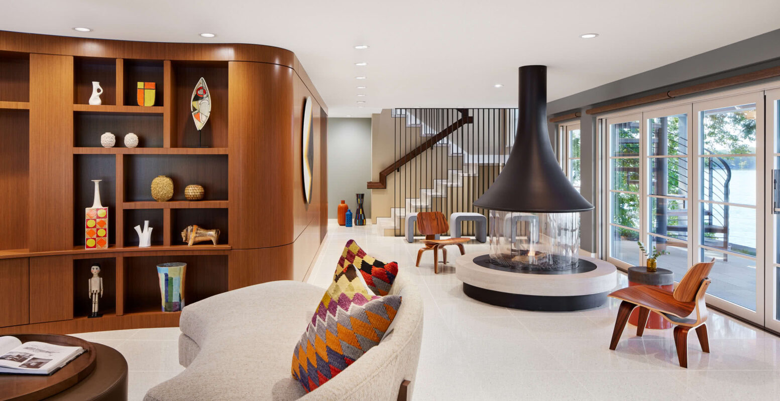
In the L-shaped room—a common design challenge—a curved cabinet and seating area were created to soften the stagnant inner corner, add a sense of movement, and draw the eye outward toward the lake, reinforcing the overall flow through gentle, sculptural forms.
The house was transformed without significant tear-offs or additions. A view from the end of the peninsula captures the change: a squared-off bay, layered decks, and a pergola that frames the outdoor space. Expansive windows animate the structure, giving the home a stronger presence within its dramatic setting.
The original home was a simple, boxy rectangle with cottage-style additions that didn’t reflect the client’s vision. The redesign introduced clean lines, refined elegance, and a new color palette to dramatically change the exterior without major changes to the form or roofline.
The east side features key updates: a new mudroom bay, a striking front door, a remodeled screened porch, and a pergola that adds shade and architectural interest. Larger windows with strong horizontal lines further modernize the aesthetic and strengthen the exterior connection.

The new front door replaces a plain entrance with a sculptural, Mondrian-inspired solution. Peekaboo windows and custom hardware integrated into the doors’ geometry create an intriguing entry experience.
The original bay window, with its curved form, smaller panes, and side windows, cluttered the view and left no wall space for complementing art. The lower-level windows limited access to the site.
A new squared-off bay with floor-to-ceiling glass opens the room to the lake, while eliminating side windows allows for art walls. Below, large bi-fold doors create a direct connection to the garden. The new window design creates a cleaner, crisper—and more visually dramatic—aesthetic.
Mod Remodel
Lake Minnetonka, MN
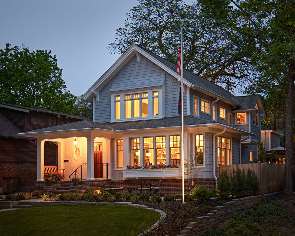
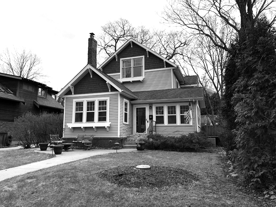
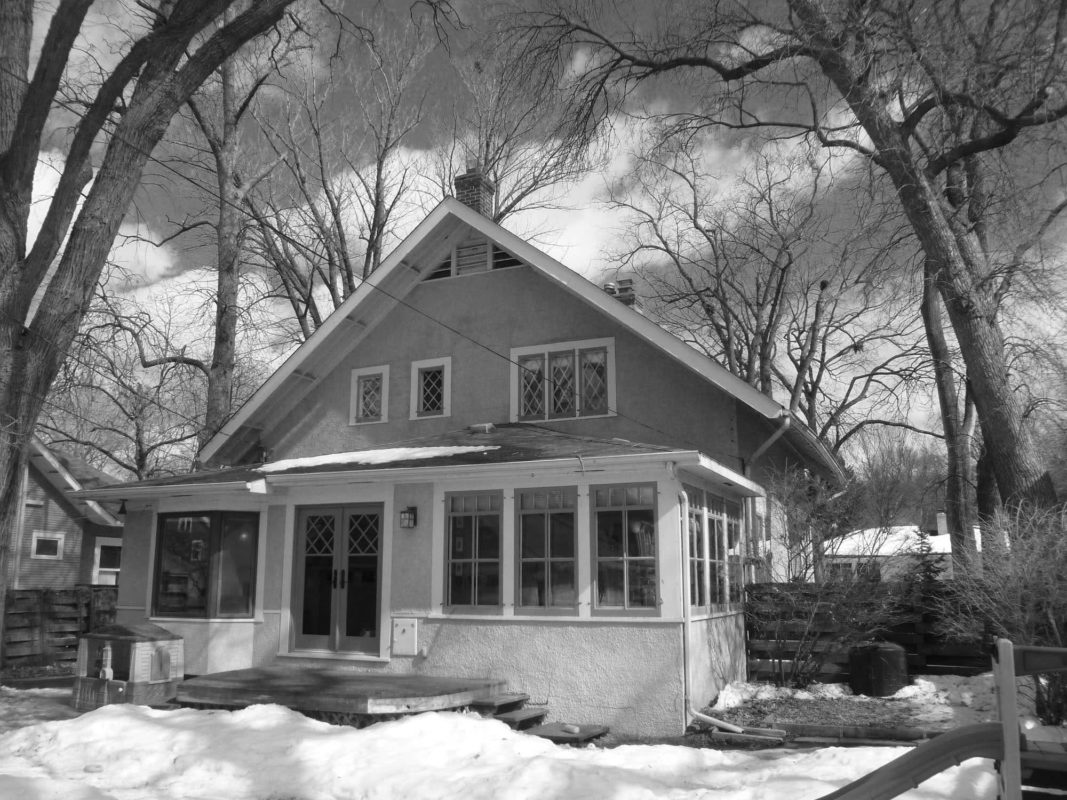
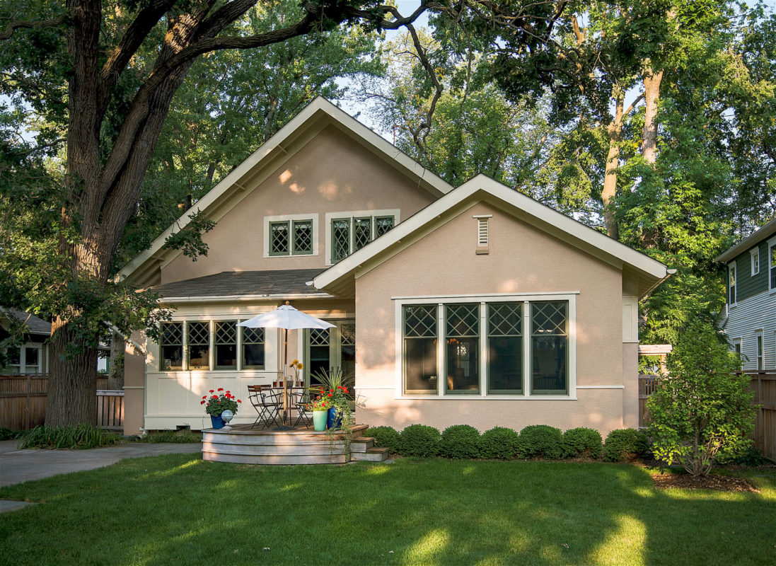
Initially built as a summer cottage in 1901, this home had been “re-muddled” many times, leaving lots of small, awkward spaces. But the owners loved their home and neighborhood; instead of demolishing, they wanted to re-invent the structure holistically, preserving its charm and history.

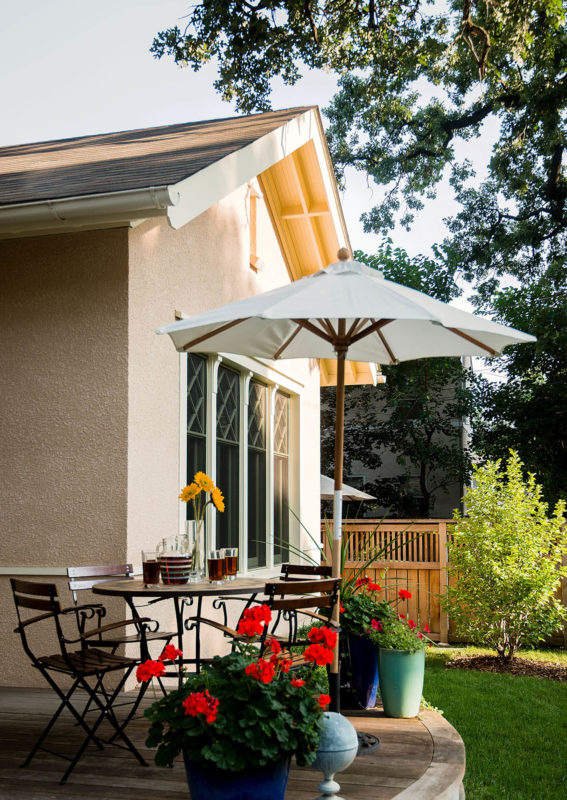
An addition along the front of the house re-situated the entry door and transformed an odd-shaped porch into a spacious, light-filled living room. The new entry porch, second-floor bay window, and shingle siding pay tribute to the home’s cottage-style roots.
Before: The original porch was narrow and mostly unusable—and opened into a cramped, maze-like interior.
Beams add subtle detailing to the new living room created by the addition. The homeowners’ love of sailing is reflected throughout the home—here with touches of brass and high-sheen mahogany.
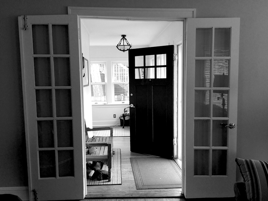
Before: The original living room, now the entry porch and foyer.
A new layout and broader openings create a layered flow, and a house that “breathes.” The entryway is now gracious and inviting, nodding to classic Shingle-style architecture with first-impression details like the oval window.

The entry hall becomes the fourth wall of the living room, defined by window seats and custom-cabinetry closets. More hints of the nautical: a window that feels like a porthole, and a mahogany-topped window seat.
The Kasota stone-wrapped fireplace is new but feels timeless. (The original fireplace was located where entryway cabinets are now.) The integration of fireplace, cabinetry wall with shelving, and beamed ceiling adds rich texture to the room.
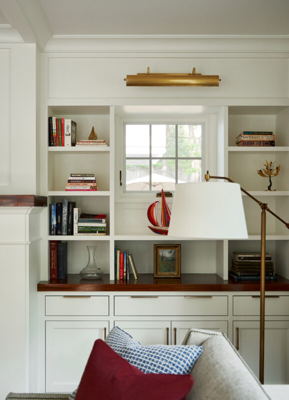
The new design provides display areas for collectibles, and windows with different exposures, brightening the room from all sides.
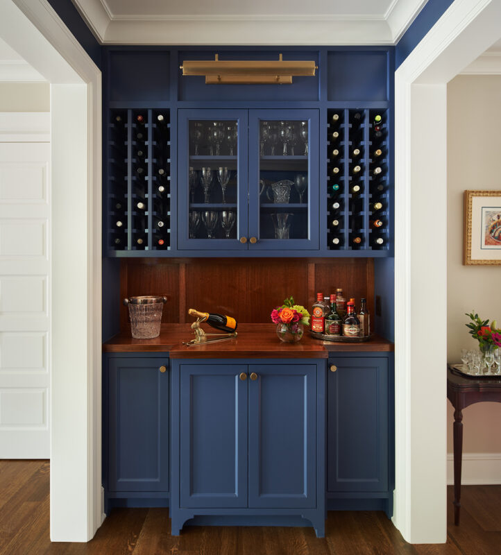
The former, cramped layout made entertaining difficult. Now, a nautical-inspired bar area invites and accommodates—while separating entry from dining area. New floors of stained oak suggest they were here since the beginning.

The shape and design of the kitchen changed very little, but new cabinetry, windows and fixtures refresh the cooking and dining experience.
The original basement was mostly crawlspace. By digging a deeper space below the new addition, the homeowners gained not just a full-height, usable basement, but a true entertainment hub.
A shelf and small spotlight behind the turntable highlight what is currently playing.
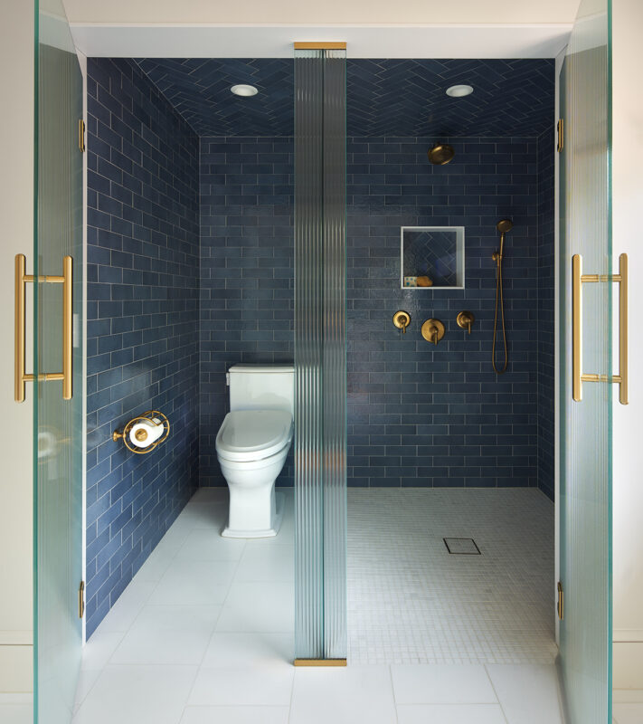
The design of the primary bath makes innovative use of the space, with reeded, opaque glass separating wet and dry zones.
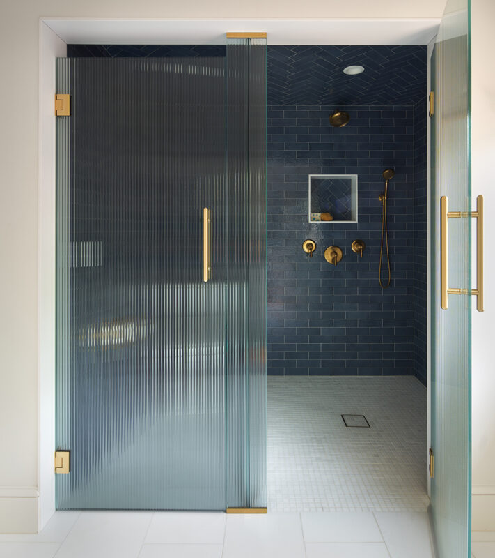
Nautical blue tile (note the change to the herringbone pattern at the ceiling) and brass fixtures add drama and echo the color themes throughout the house.
A new section of roof over the addition allowed for the installation of a tray ceiling¬–and lends a special “crow’s nest” feeling to the primary bedroom.
Sometimes, the very best home is the one you already have.
Before
After
City Cottage Reimagined
Minneapolis, MN

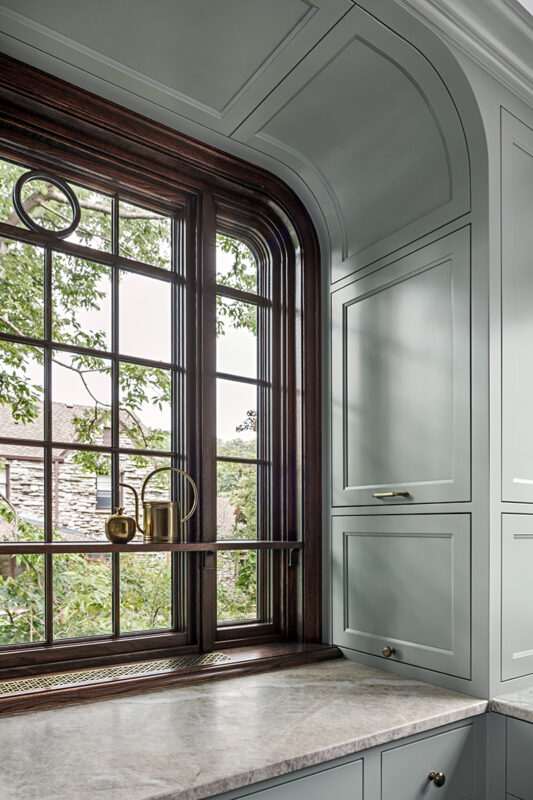
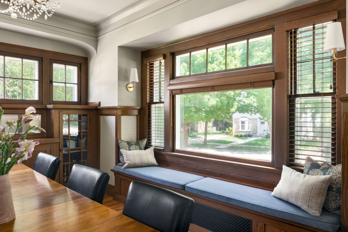
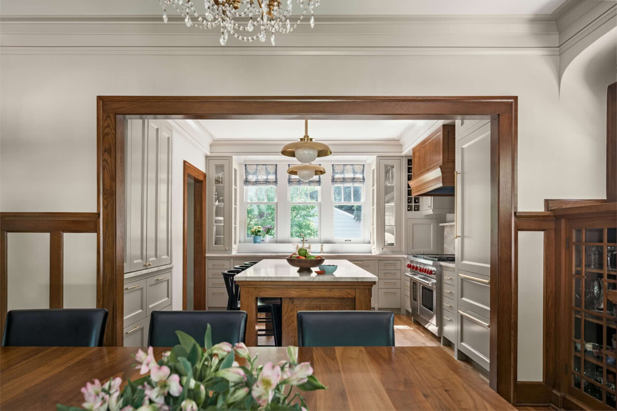
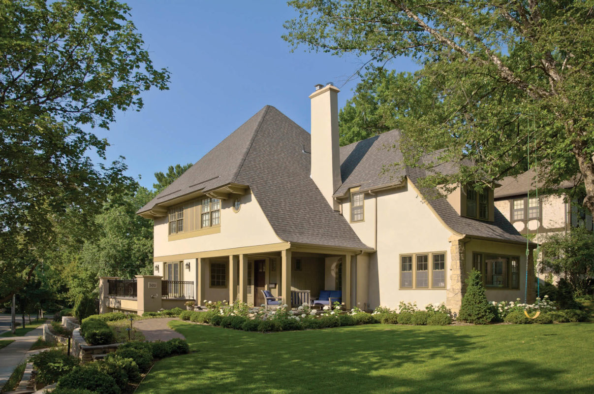
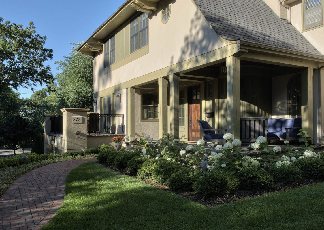
The 1930’s Tudor had a great deal of character until a 1980’s addition compromised its charm and layout. The homeowners wanted to improve circulation, livability, and restore authenticity. To achieve this, spaces were repurposed within the existing footprint.
Tudor-style arches frame the new rooms, creating layers of inviting spaces. Dark-stained oak wainscoting and trim connect rooms as well as features, like the custom rounded-corner window — on what was the solarium wall (previous photo).
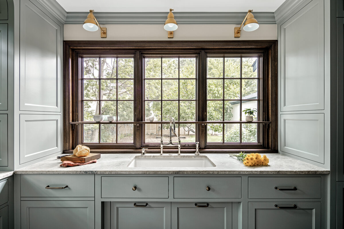
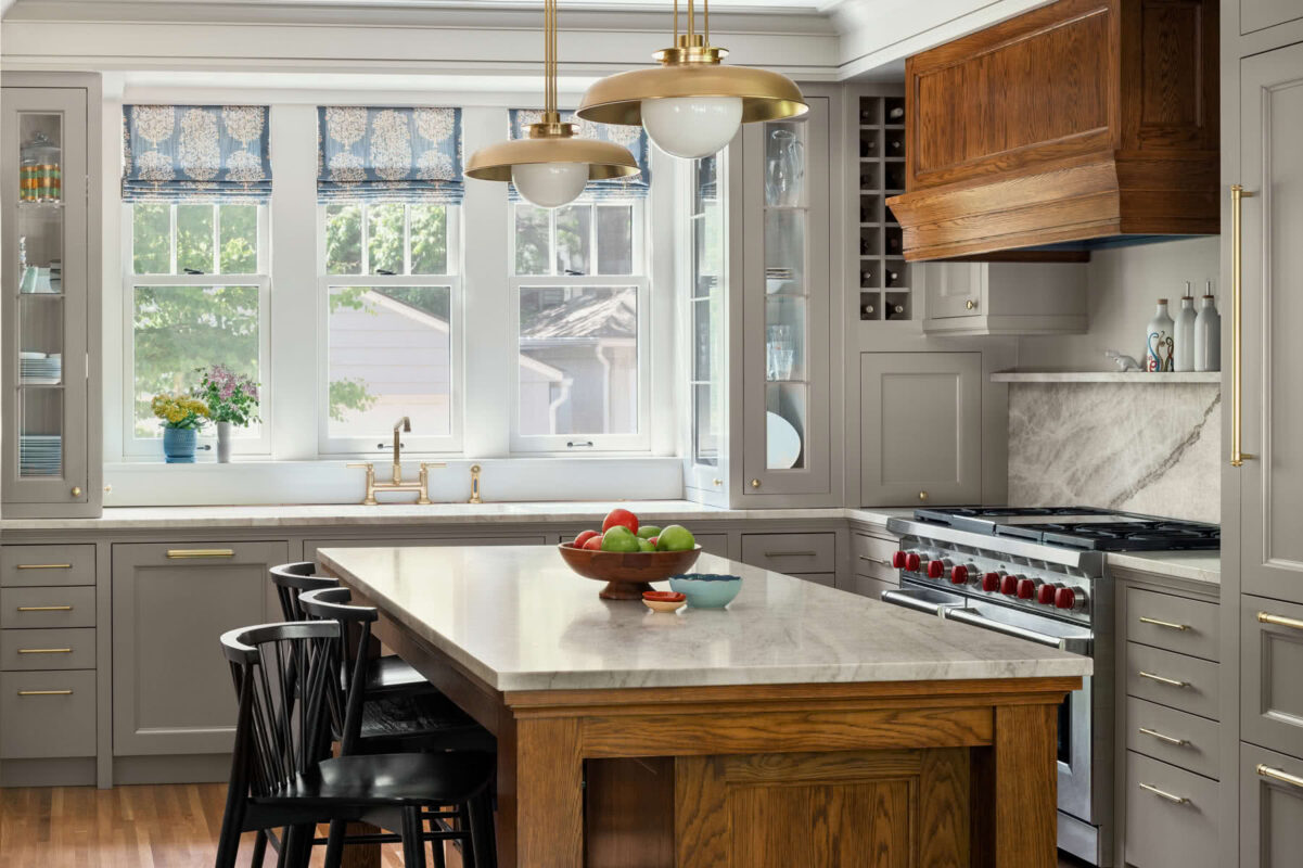
Though the kitchen is fairly small, it feels very open. The large windows, without upper cabinets, provide views in three directions. Shelves integrated into the windows provide charming nesting spots for plants and objets d'art.
Cabinetry is transformed into architecture, with full-height, functional storage built into the corners, framing views and workspaces.
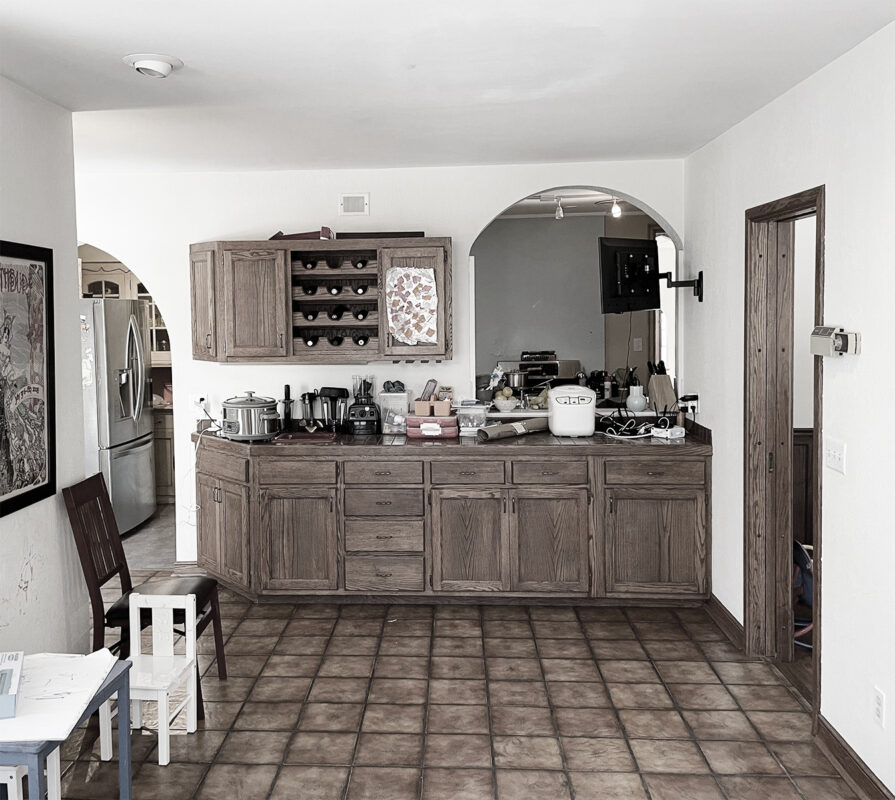
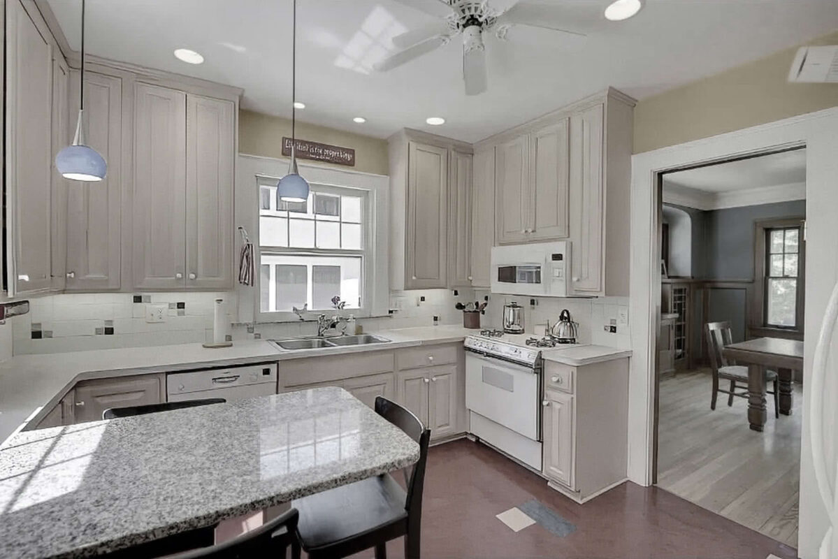
The 1980's addition buried the kitchen seen through the pass-through, making it windowless. A common issue with subpar additions is the negative impact they can have on existing rooms.
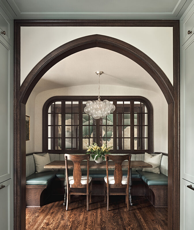
The homeowners wanted the renovation to be undetectable to visitors. Here, the Tudor arch and vaulted ceiling resonate with original character. An interior window creates another layer of depth, with a view to mural-covered closet doors.

Facing north: The passageway between the back door and the old kitchen (right). With no closets, the kitchen also served as mudroom.
The same view now: Adding north-south circulation, focal points, and layers of space creates easy and enjoyable flow throughout the home.
A highway of foot traffic conflicted with the kitchen's work triangle, creating a chaotic and non-functioning work area.
The old kitchen space has become both a banquette area (left) and an important central passage linking garage, mudroom, and main living spaces. Hallway glass allows a glimpse into the new kitchen as well as light from it. The mural-covered doors hide new pantry and mudroom storage.
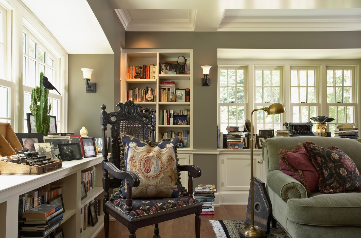
The original living room had details worth preserving – as well as features that begged to be re-imagined, like the understated fireplace and mantle shelf.
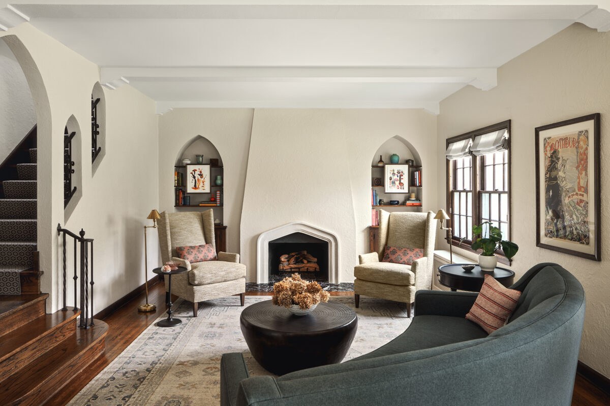
Instead of a flat wall with an orphaned mantle, the fireplace was brought forward with a tapered plaster wall. The flat stone surround was replaced with a deeply carved custom profile. Together they create the needed larger, central form to balance the beautiful existing bookcase niches.
The existing stair landing had mismatched door archways, while the original kitchen blocked sight lines through the house.
With the redesign, the stair landing now leads to the dedicated corridor, original dining room, and refreshed den.
The homeowner had a sentimental connection to the cabinetry and cabinet maker (a childhood friend had grown up in the house) but needed a much larger TV than could be accommodated. The general contractor was enlisted to expertly salvage and reuse existing paneling with discreet new pieces, preserving the character of the room.
Before: A 1980’s addition buried the kitchen, making it windowless. The kitchen also served as the central thoroughfare and mudroom.
After: The old kitchen space is now a banquette area and hallway, linking main living spaces, a new mudroom, and garage. The 1980’s solarium space was transformed into a kitchen—with new windows, views, and authenticity.
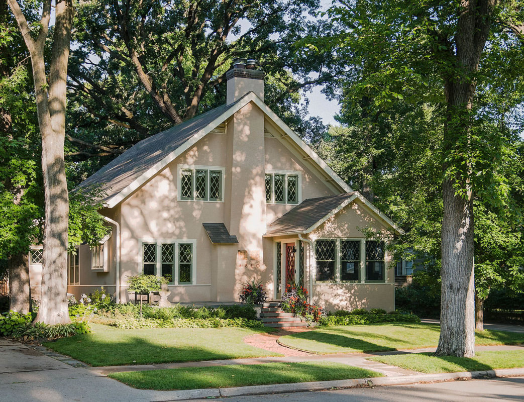
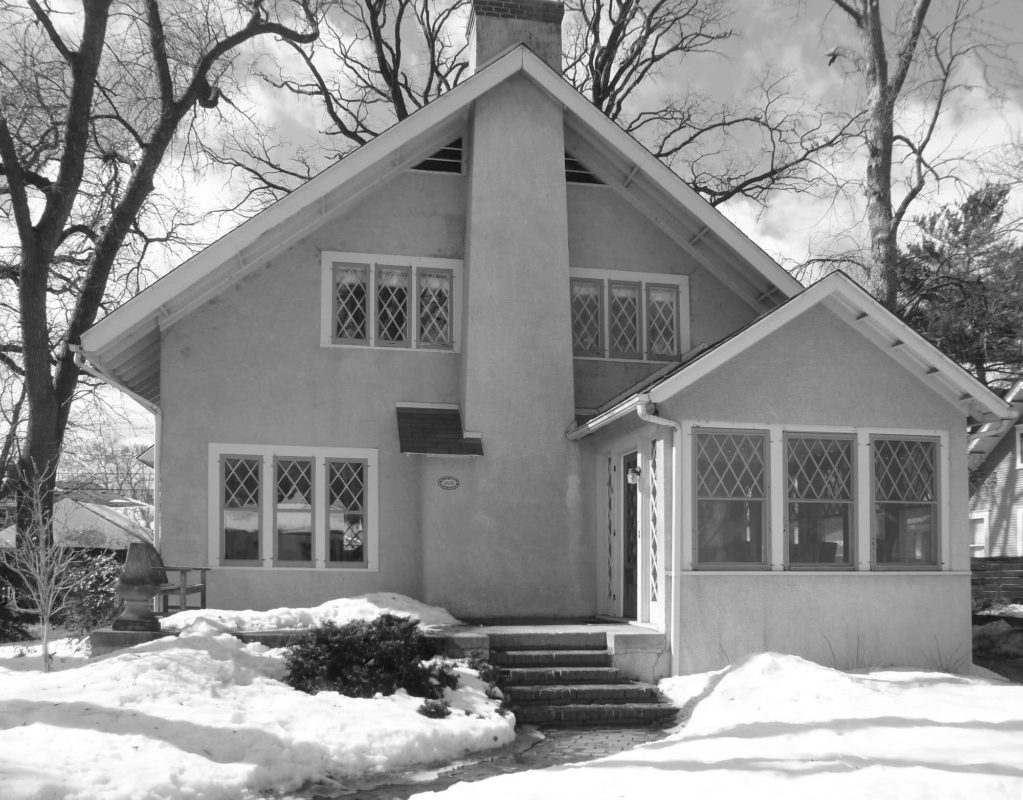
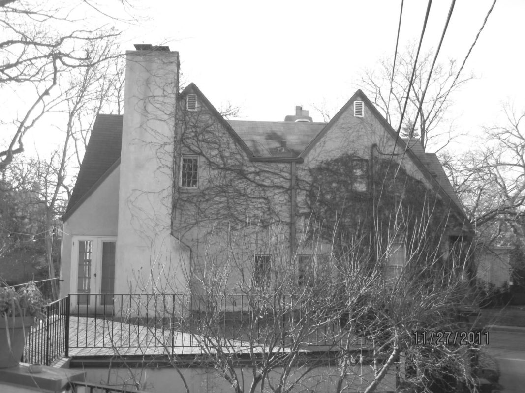
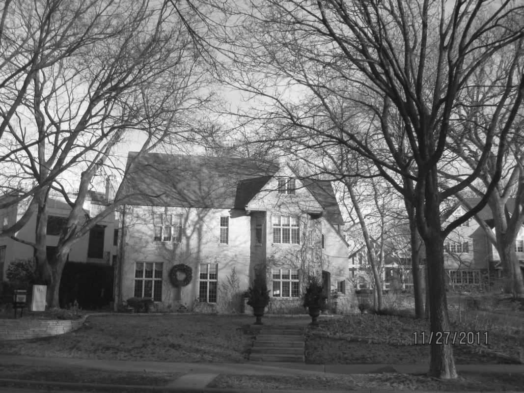
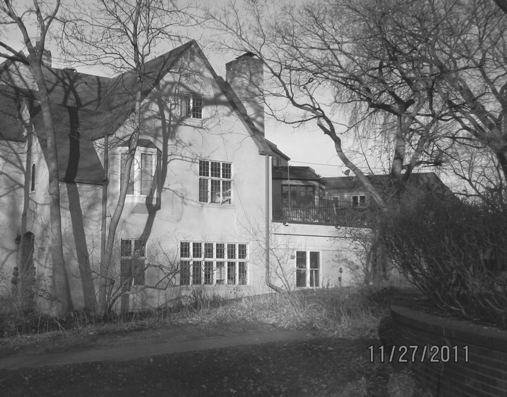
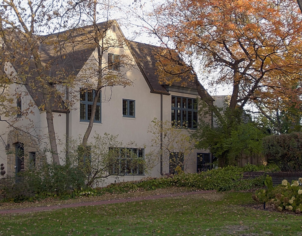
Tudor Reawakened
St. Louis Park, MN
Minneapolis, MN
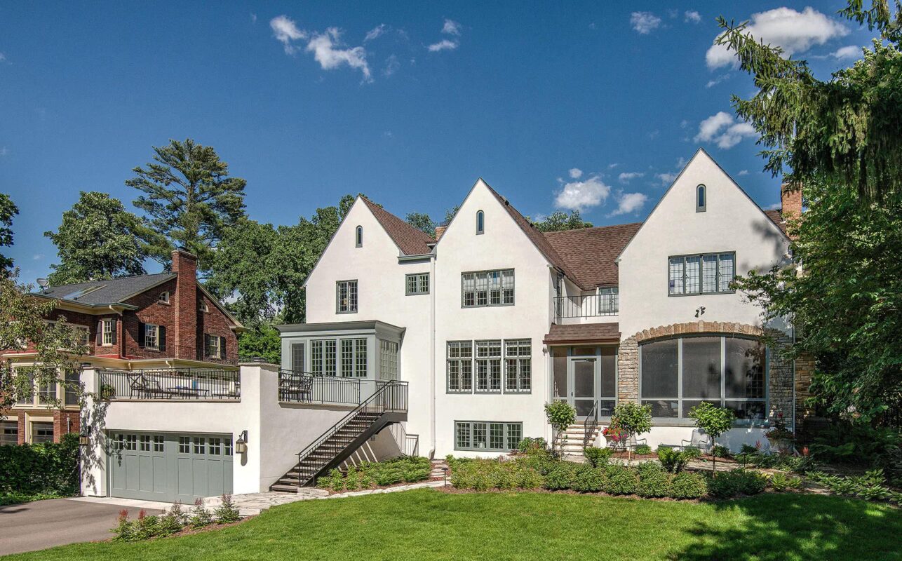
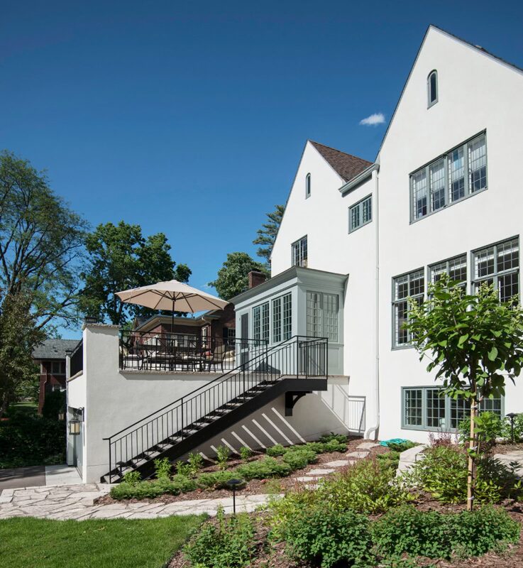
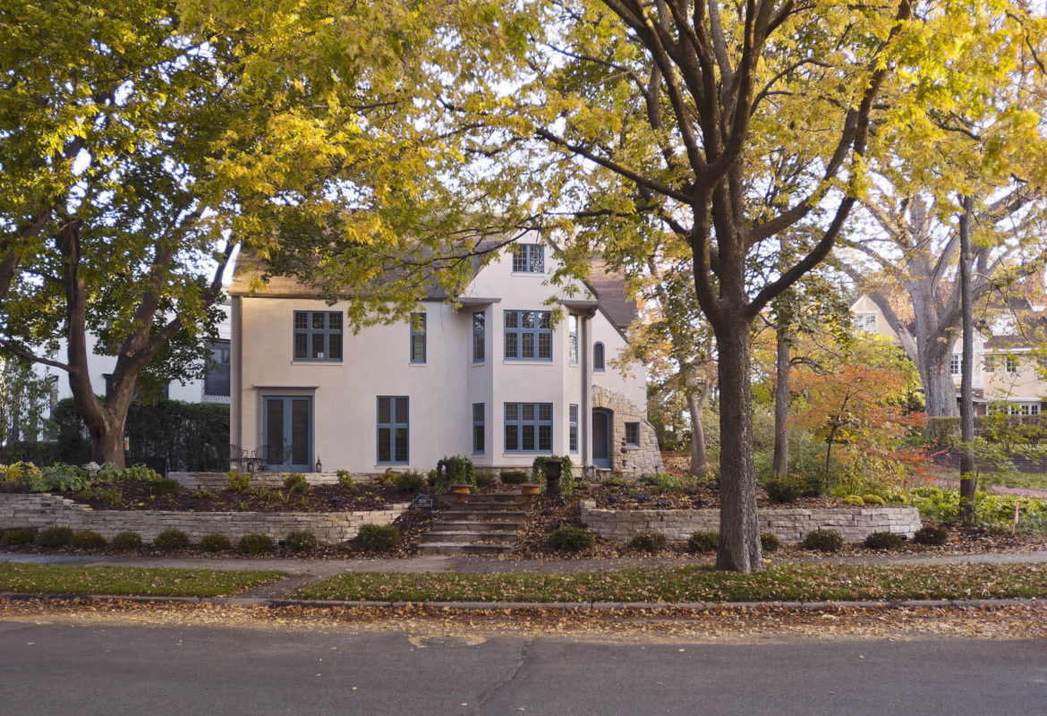
This home fit our clients’ needs in size—but not in spirit. Its ’90s suburban aesthetic felt out of place in a historic neighborhood, lacking scale, detail, and connection to the exterior. They asked us to create both a home and a retreat—ideal for hosting multigenerational gatherings, connected to the landscape, and cohesive throughout.
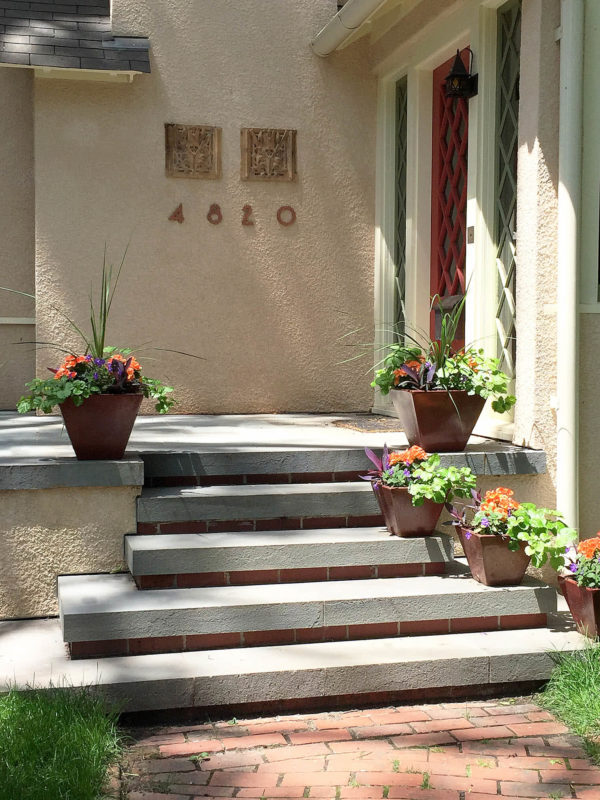
We transformed the house outside and in, unifying its form and function. Expansive windows, shingle siding, articulated eaves and returns, and a gracious new porch add depth, texture, and a timeless presence.
The existing house was too tall and boxy for its surroundings. Despite ample space, the home lacked character, articulation, and any relationship to its corner lot or side yard. We saw an opportunity to add character unify the exterior and connect it meaningfully to the landscape.
New stone veneer at the lower level and paneling wrapping the first floor help reduce the home’s scale, creating a more intimate setting around the new pool. The extended front porch now overlooks the pool, connecting the house more fully to the landscape.
The large side yard sat as an awkward, unused slope—its potential hidden by grade and exposure. On a prominent corner lot, we saw an opportunity for private outdoor living waiting to be unlocked.
We transformed the slope into a sunken, self-contained retreat. Framed by stone walls and plantings, it feels private and protected—despite its proximity to a busy residential corner.
Stone walls shape a series of outdoor rooms around the pool. Spaces for lounging, dining, and relaxing support different aspects of family life, while maintaining a cohesive, connected design.
At the far end of the pool, a fireplace, stone retaining wall, and timber pergola form a shaded, sheltered haven.
Inside, the existing fireplace and cabinetry on the south wall blocked light and views to the large side yard and planned pool area.
By relocating the kitchen and shifting the fireplace and cabinetry, we made space for a new band of south-facing windows. Daylight now floods the core of the home, and French doors (next photo) open directly to the screen porch and pool beyond.
A new family room occupies the former kitchen footprint. A built-in window bench expands seating and frames views of the pool. Overhead, a grid of beams and purlins animates the ceiling and helps define the open-plan layout.
The new screen porch wraps the southeast corner of the house and overlooks the pool. Its vaulted ceiling and eyebrow window fill the space with daylight, offering a breezy perch for relaxation or conversation.
Additional seating in the new family zone connects the porch to the relocated kitchen and dining areas. This open social core allows the home to flex easily for both small gatherings and large multigenerational get-togethers.
Bands of windows in the relocated kitchen bring in soft northern light. The kitchen opens to the dining area to the west and family room to the south—supporting both cooking and conversation.
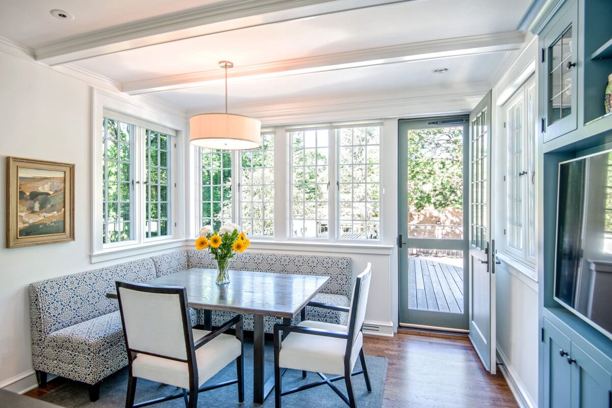
Once a front porch, this space was seamlessly transformed into a light-filled eating area with wraparound glass and a custom banquette designed for large gatherings. A built-in buffet adds storage and balances the room.
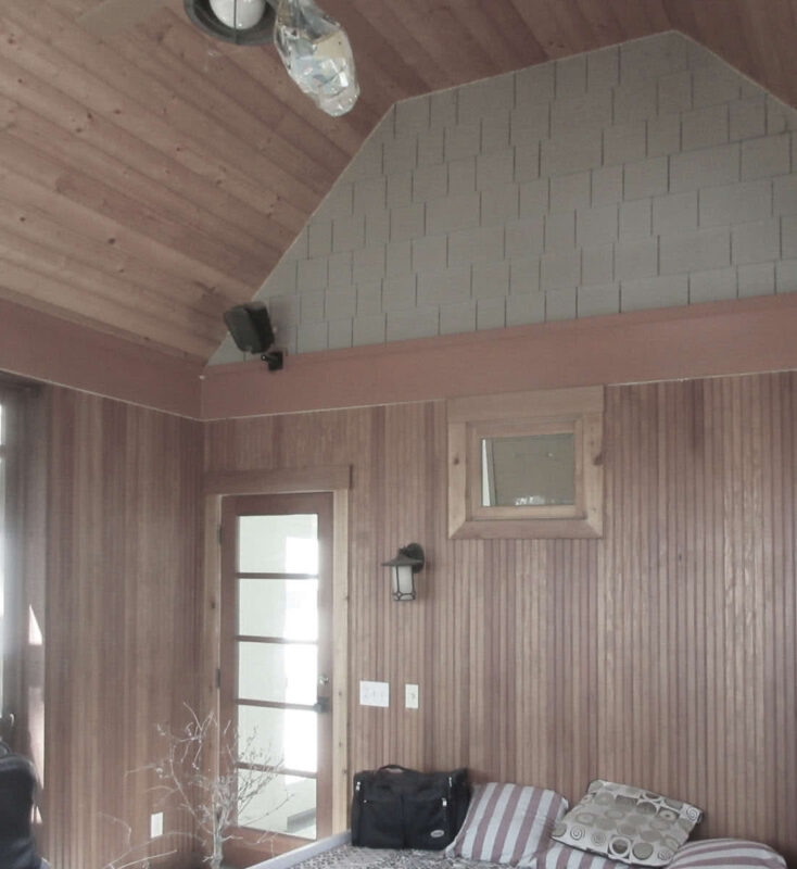
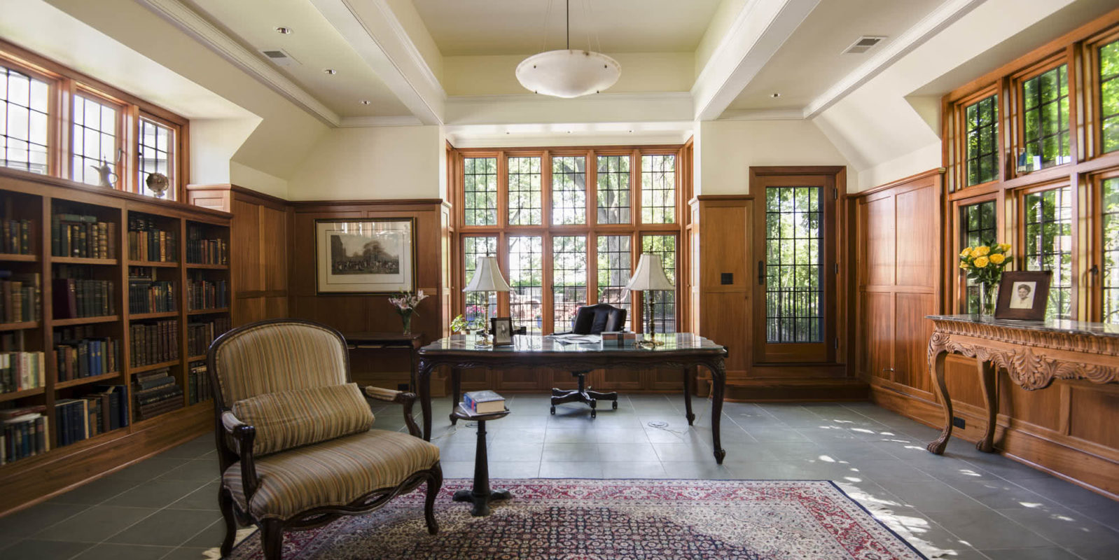
The former screen porch—relegated to a far corner of the house—felt dark and unfriendly. But its vaulted ceiling offered an architectural opportunity and was worth preserving.
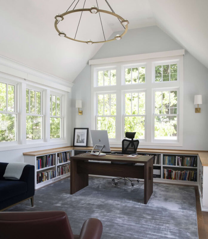
We transformed the old porch into a bright, vaulted home office. Surrounded by windows and lined with built-ins, it’s a serene, functional retreat—reflecting the project’s larger goals: more light, better flow, stronger indoor-outdoor connections, and thoughtful use of space throughout.
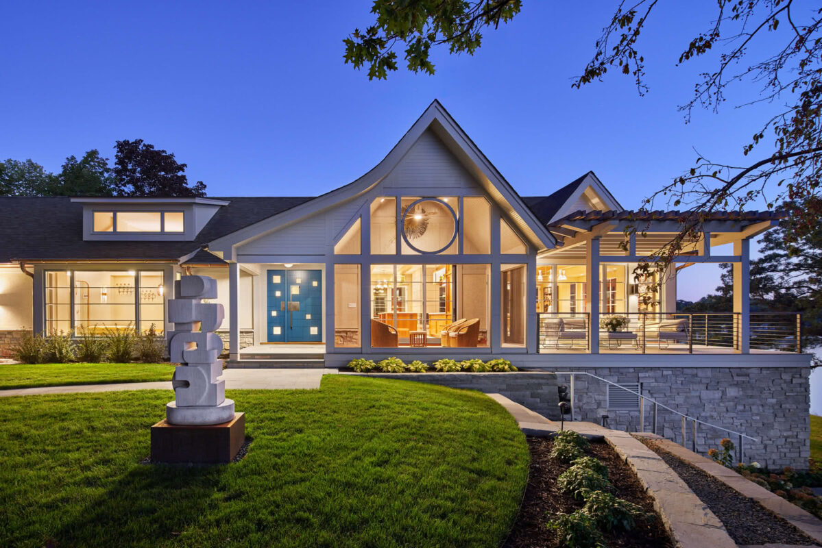
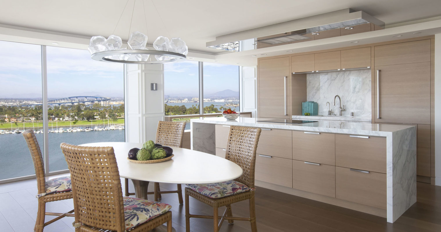
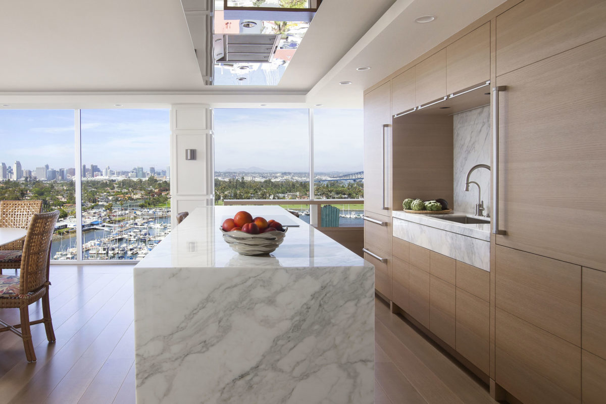
Minneapolis Oasis
Minneapolis, MN
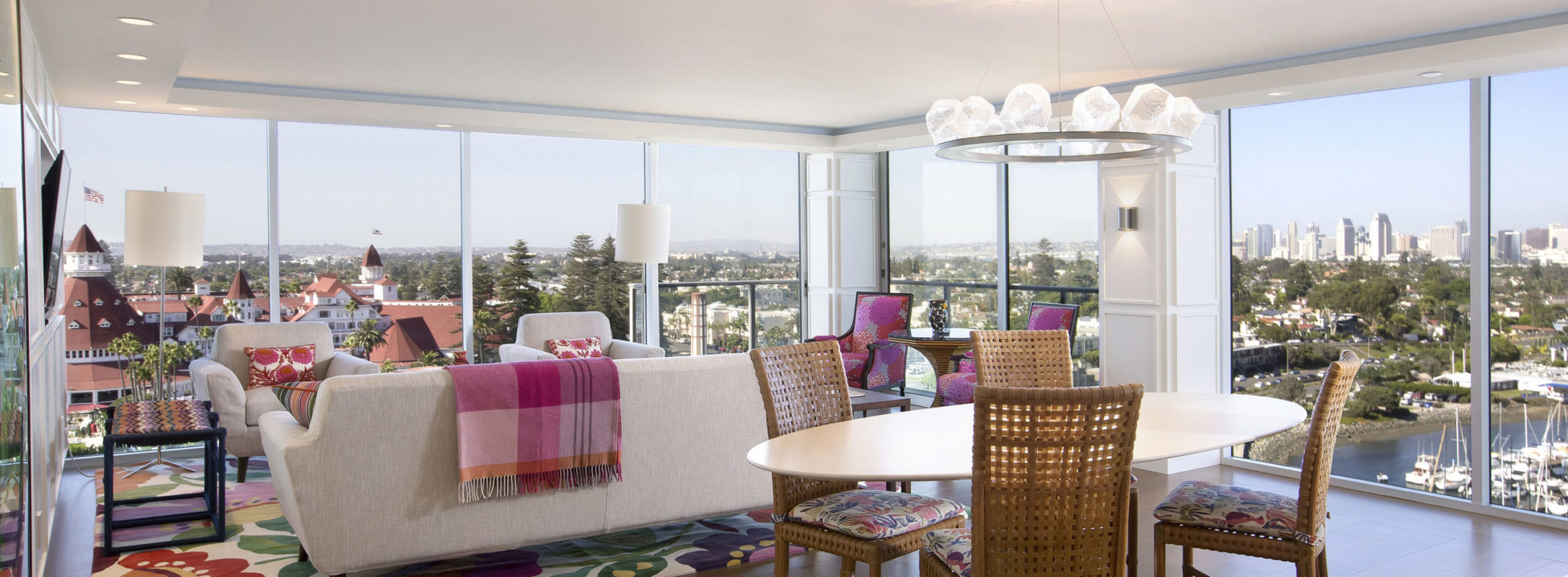
Updating this 1970s-built condo was a challenge due to sagging infrastructure, low ceilings, unmovable plumbing, limited layout options and a demanding timeline. To address the claustrophobic feeling, it needed more than refinishing.
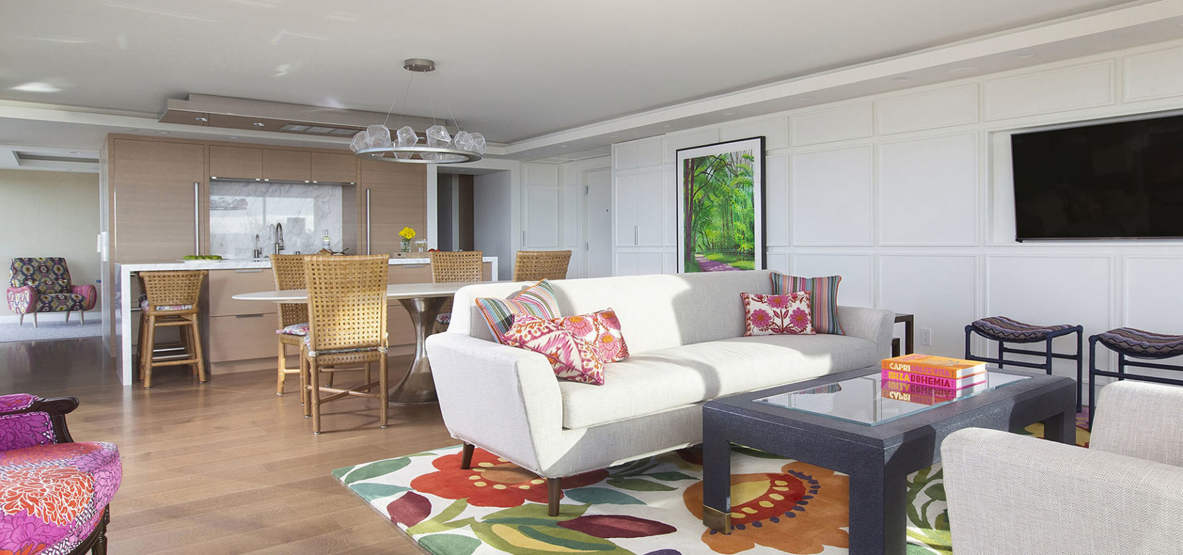
Removing kitchen walls and opening the space set the tone for the rest of the unit. We kept the material palette quiet so as not to compete with the homeowners’ own color palette and spectacular views of ocean, harbor, skyline and mountains.
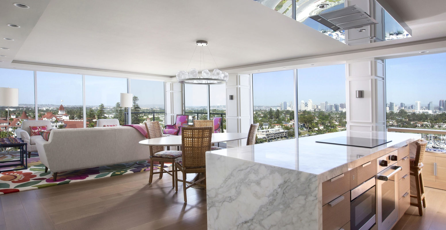
A thin, elegant soffit was the magic trick for concealing the ductwork, sprinkler system, recessed lights, and motorized shades. Chrome accents and a custom-designed, highly polished vent over the kitchen island mirror dancing water below.

The homeowners didn’t want a starkly modern aesthetic; we used raised-molding panels to add warmth and provide a textured surface for daylight to cast subtle shadows. The materials and palette also take into consideration the iconic profile of the Hotel del Coronado.
The paneling was used to create a niche for the TV, a concealed coat closet and a hidden bar. Inside, a surprise reflection of the back bay.
Removing the kitchen wall opened the view to mountains along the Mexican border, and allowed an inviting glass-walled path to the study/guest room around the corner.
Custom-designed counters and cabinetry (down to the pulls!) keep the look sleek—partially concealing the sink and hiding the refrigerator.
More claustrophobia-solves: Jambs and headers were removed to create flowing space, with doors designed flush to walls and ceiling; hinges are hidden even when doors are open.
Bedroom prior to renovation.
The sense of quiet expansiveness continues into the master bedroom. Kitchen, bathroom vanities, closets, and bedrooms are all defined by similar wood “frames,” contributing to a calm, controlled look and feel.
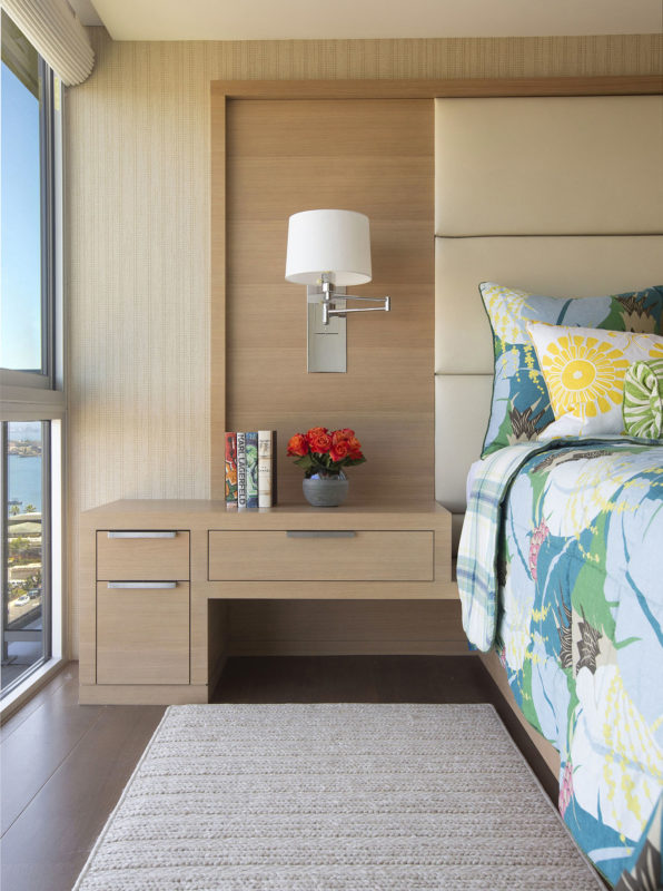
We custom-designed the bedframe and bedstand to match the clean aesthetics of the home, elongate views and maximize every available inch. Recessed into the wall, the bed provides pull-out storage on either side.
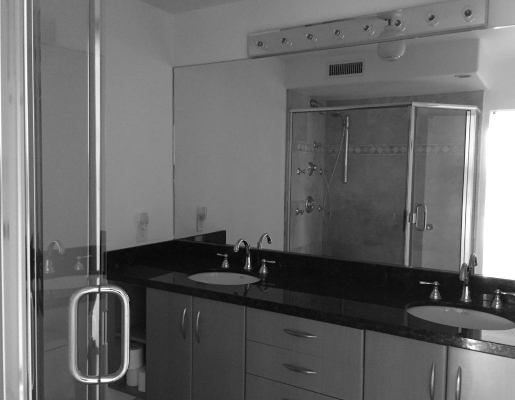
The original guest bath and master bath similarly reflected 1970’s condo design.
The master bath and walk-in closet were switched to give the bath a view through the master. Since drains are fixed in this condo building, this required inventive routing of plumbing lines: They wrap around the walls to the drain beyond the shower.
Truly a traditional kind of modern, the small space is now both more open and more intimate—complementing and interacting beautifully with the landscape/waterscape outside.
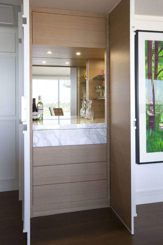
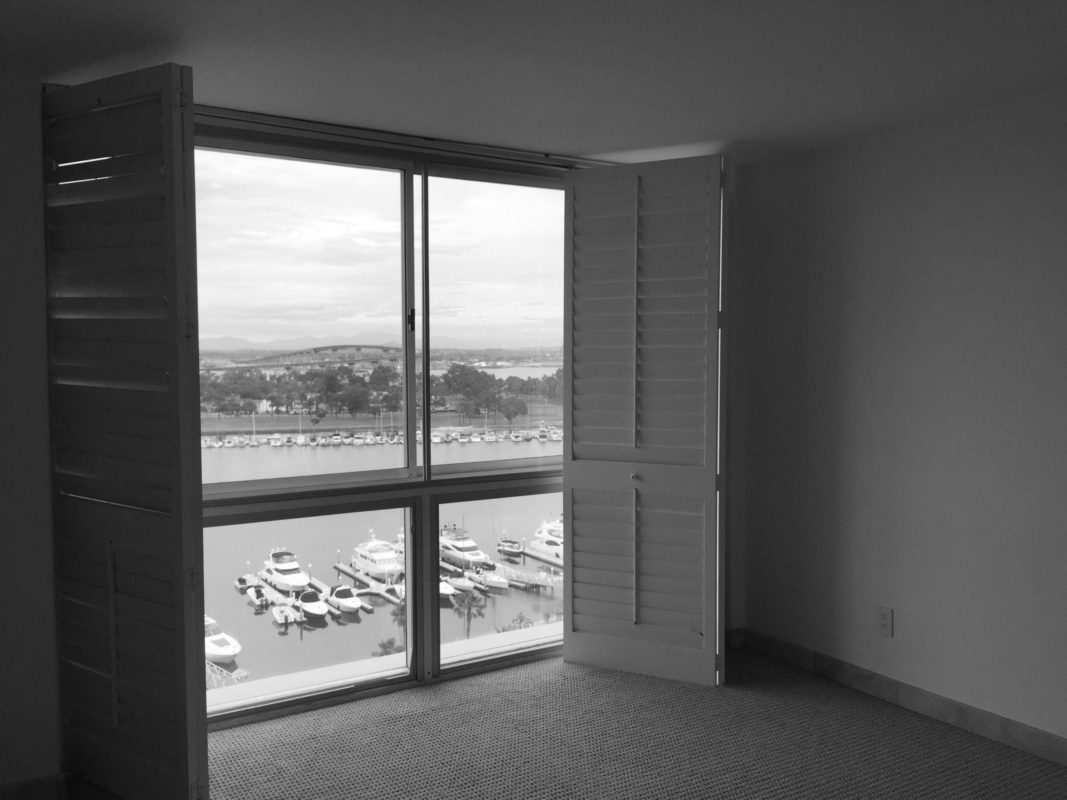
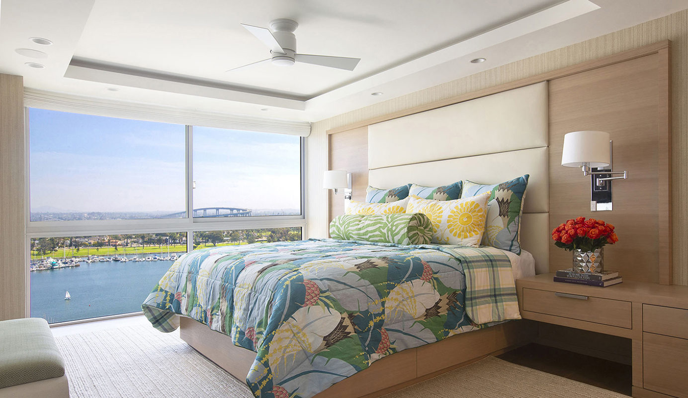
Contemporary Coronado Condo
San Diego, CA
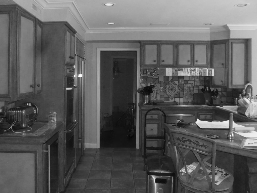
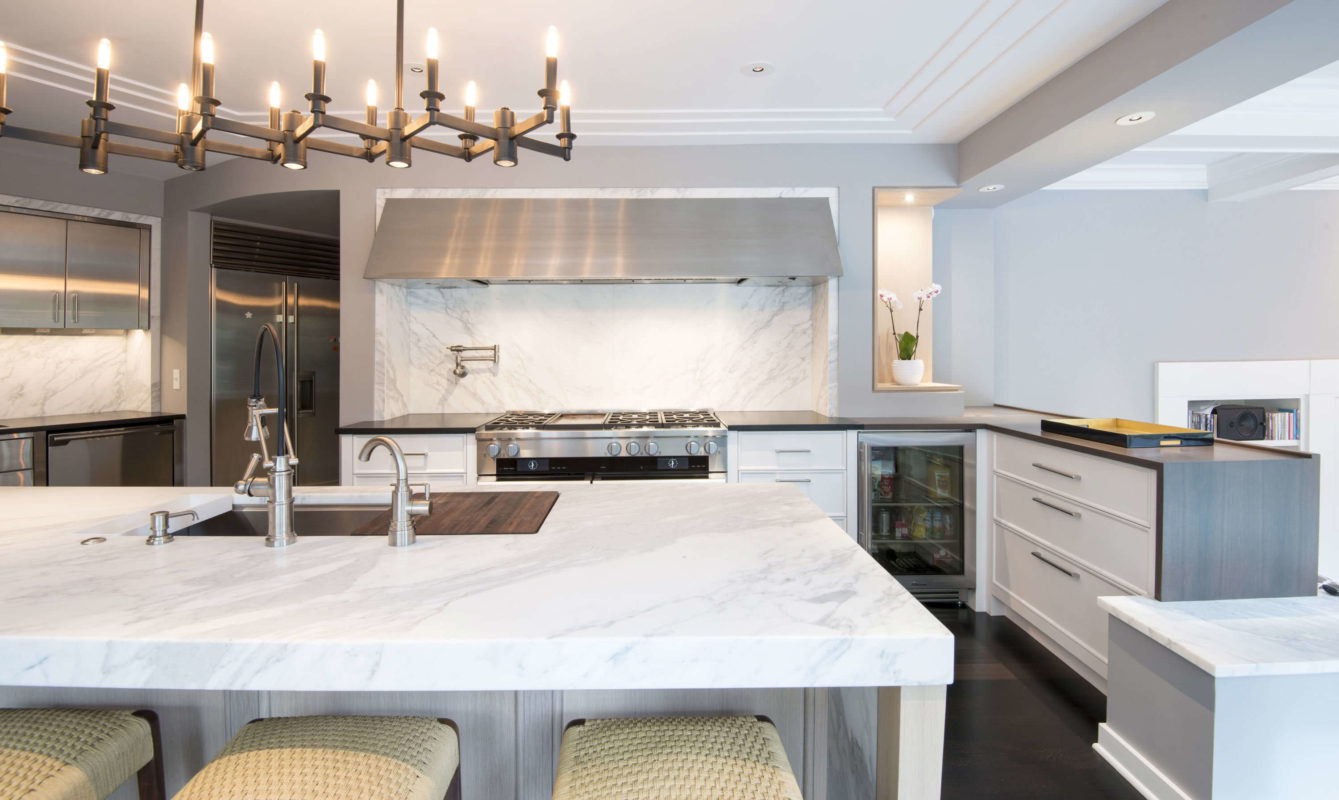
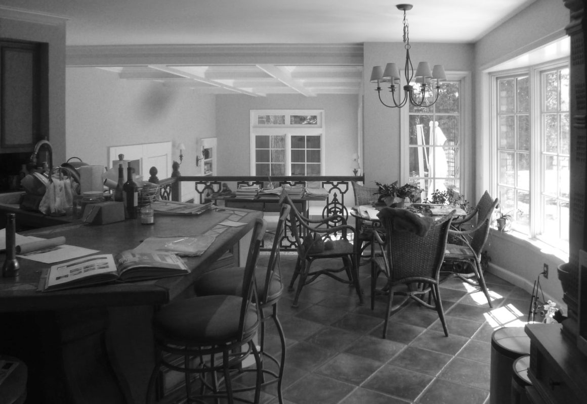
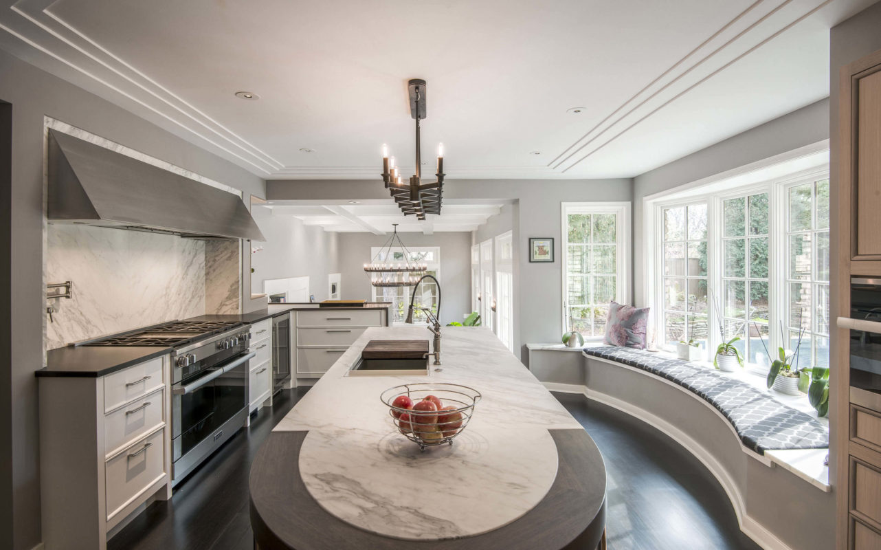
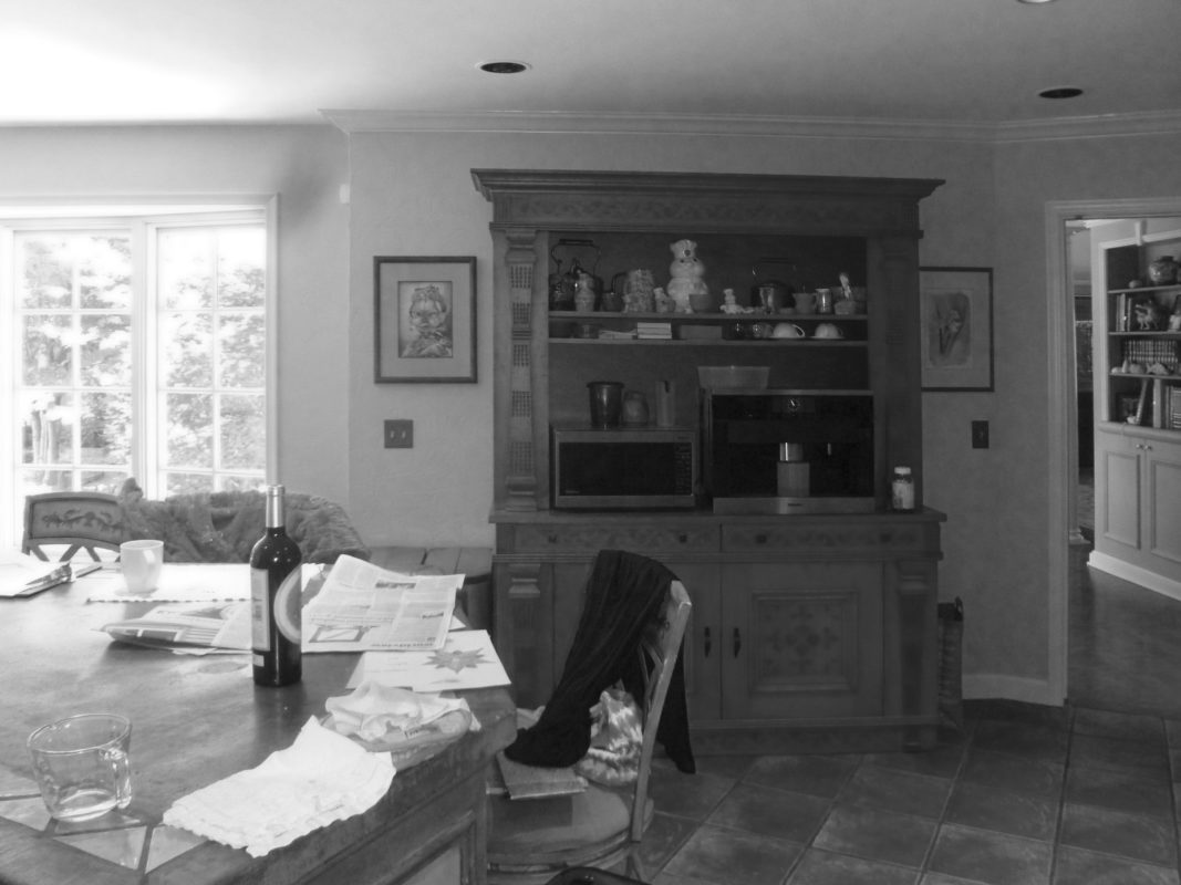
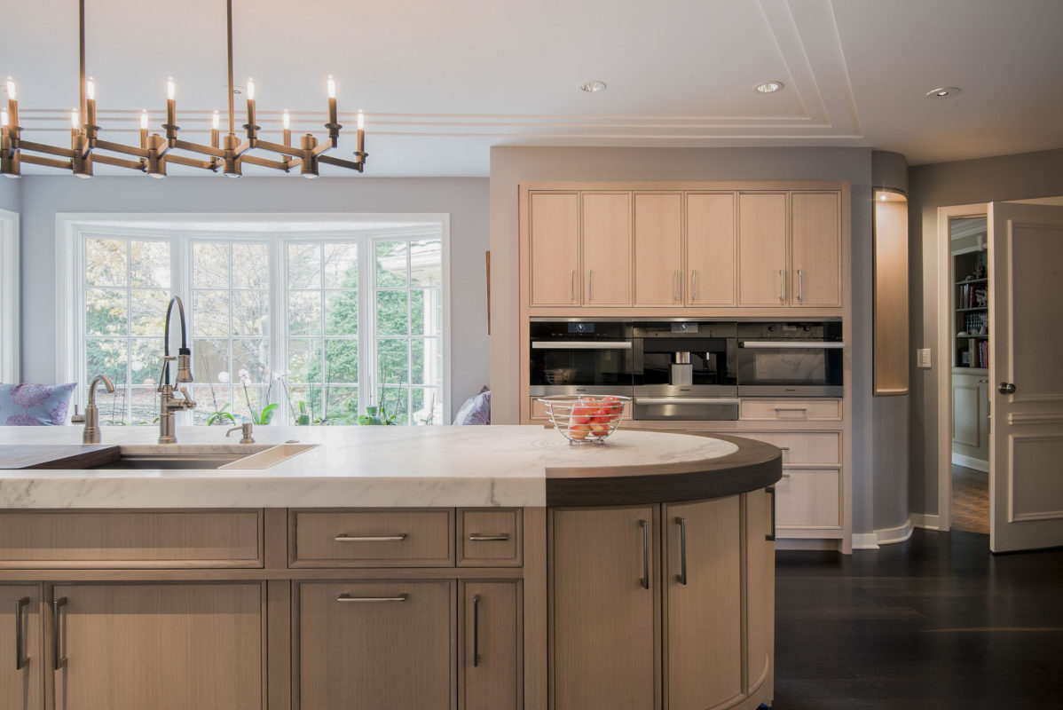
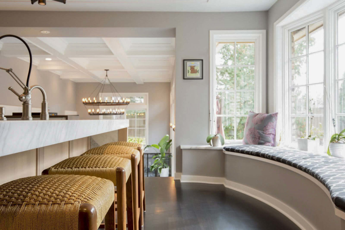
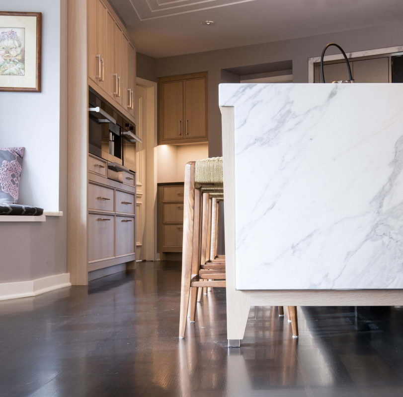
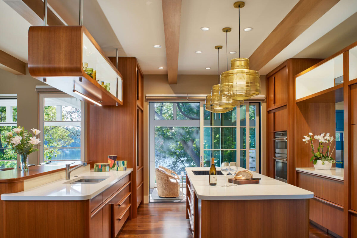
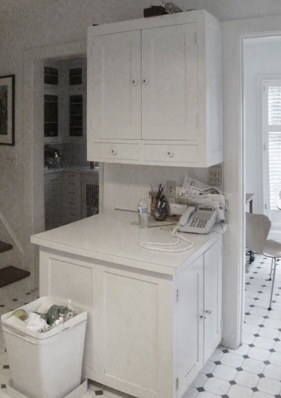
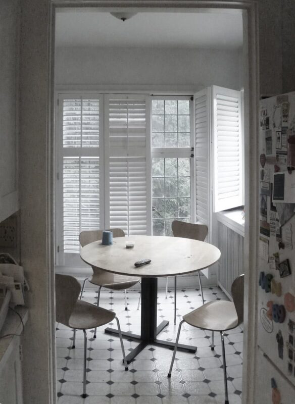
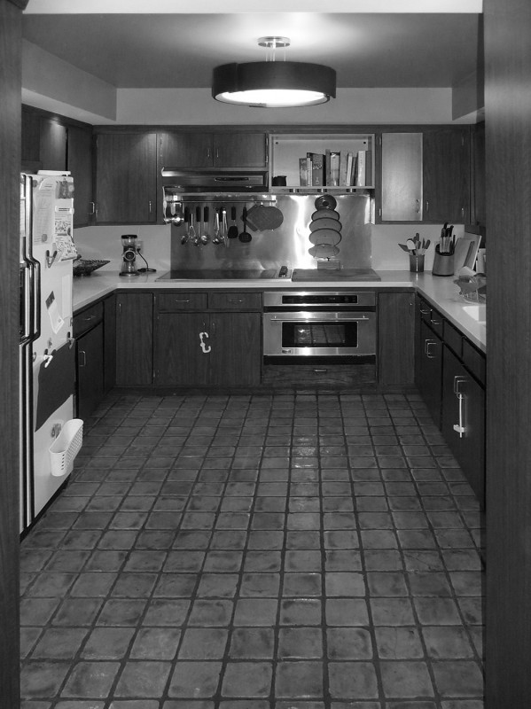
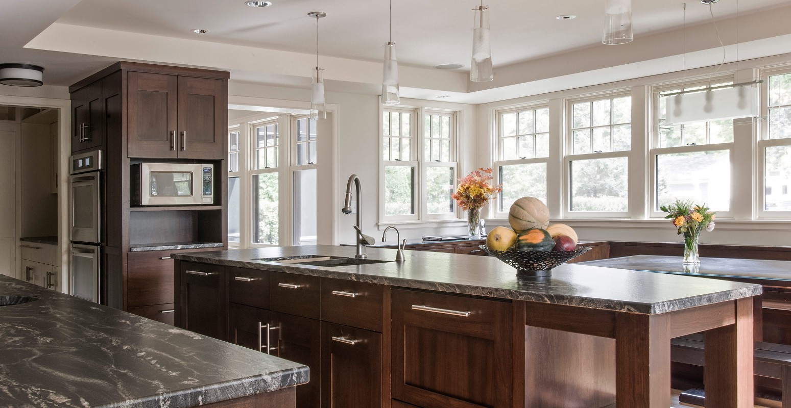
Nouvelle French Kitchen
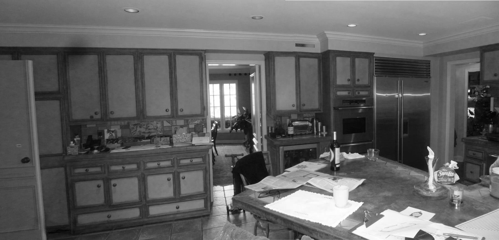
Before
Before
Transformed Tudor
Edina, MN

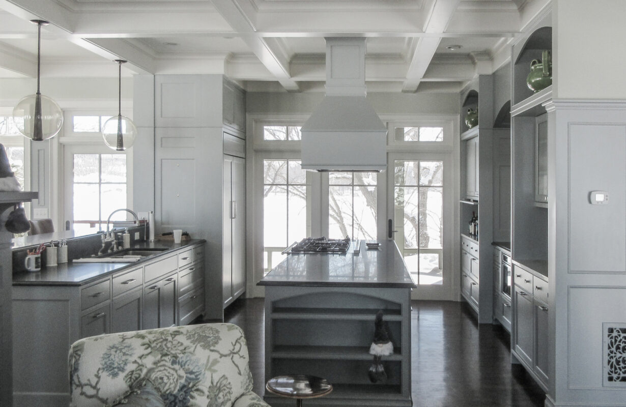
Nautical Shingle Style
Lake Minnetonka, MN
The design of the original ‘90s home left much to be desired: The flat façade lacked depth and a graceful connection to the outdoors. The sauna/porch/deck area seemed an add-on and was starting to deteriorate.
A simple terrace design assignment evolved into a significant makeover, giving the '90s light-character, Neo-Georgian-style design-build a much richer classical exterior. A range of indoor-outdoor connections enhance living and animate the façade.
A new pool house is elevated by four steps, creating a gracious entrance to the pool area. The position, length, and height of the structure not only creates wonderful indoor/outdoor spaces but also buffers a too-close neighbor.

Where trees can’t diffuse southern sun, a carefully designed pergola can provide both refuge and visual interest. The homeowners embraced the full formal Georgian aesthetic, replete with Tuscan columns.

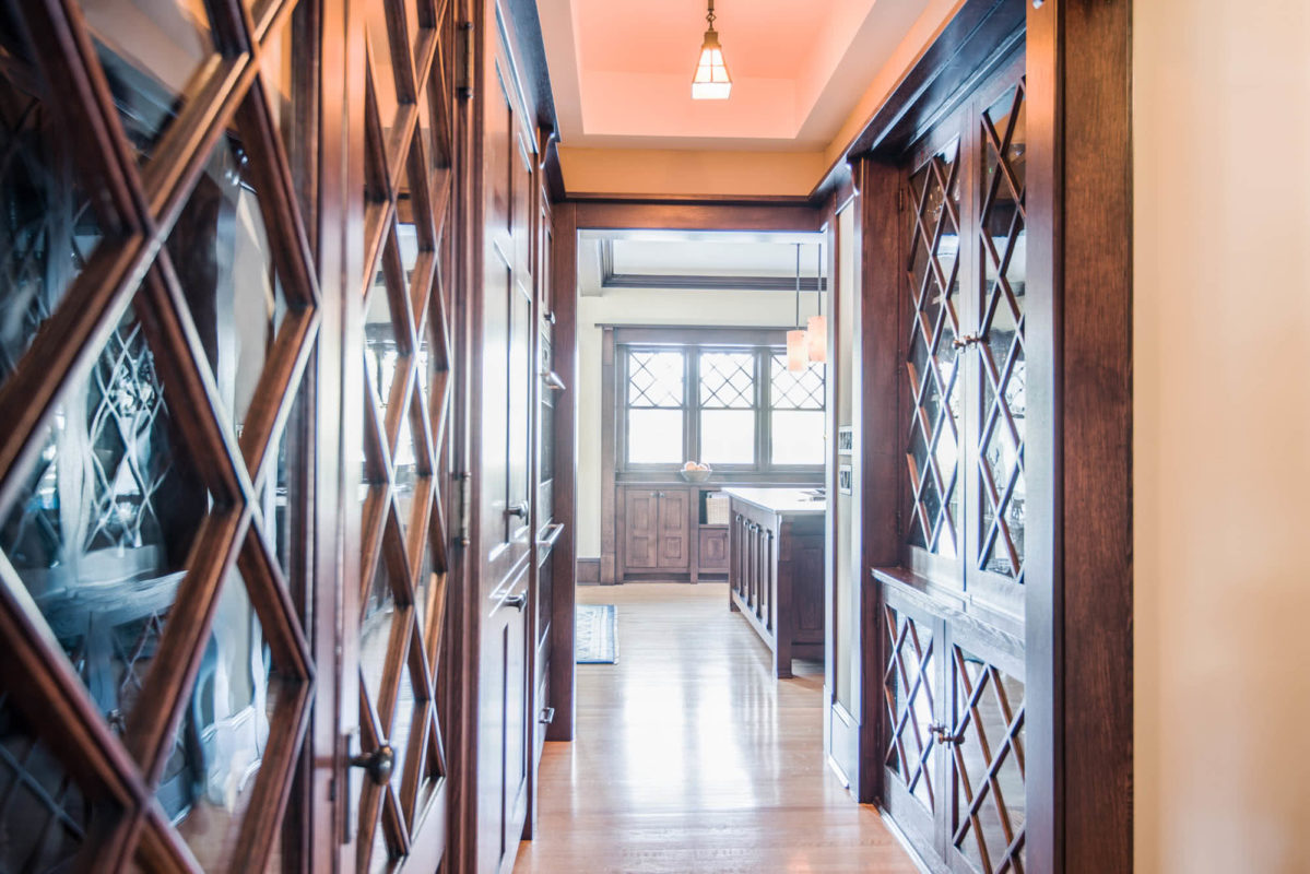
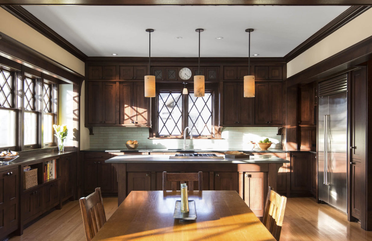
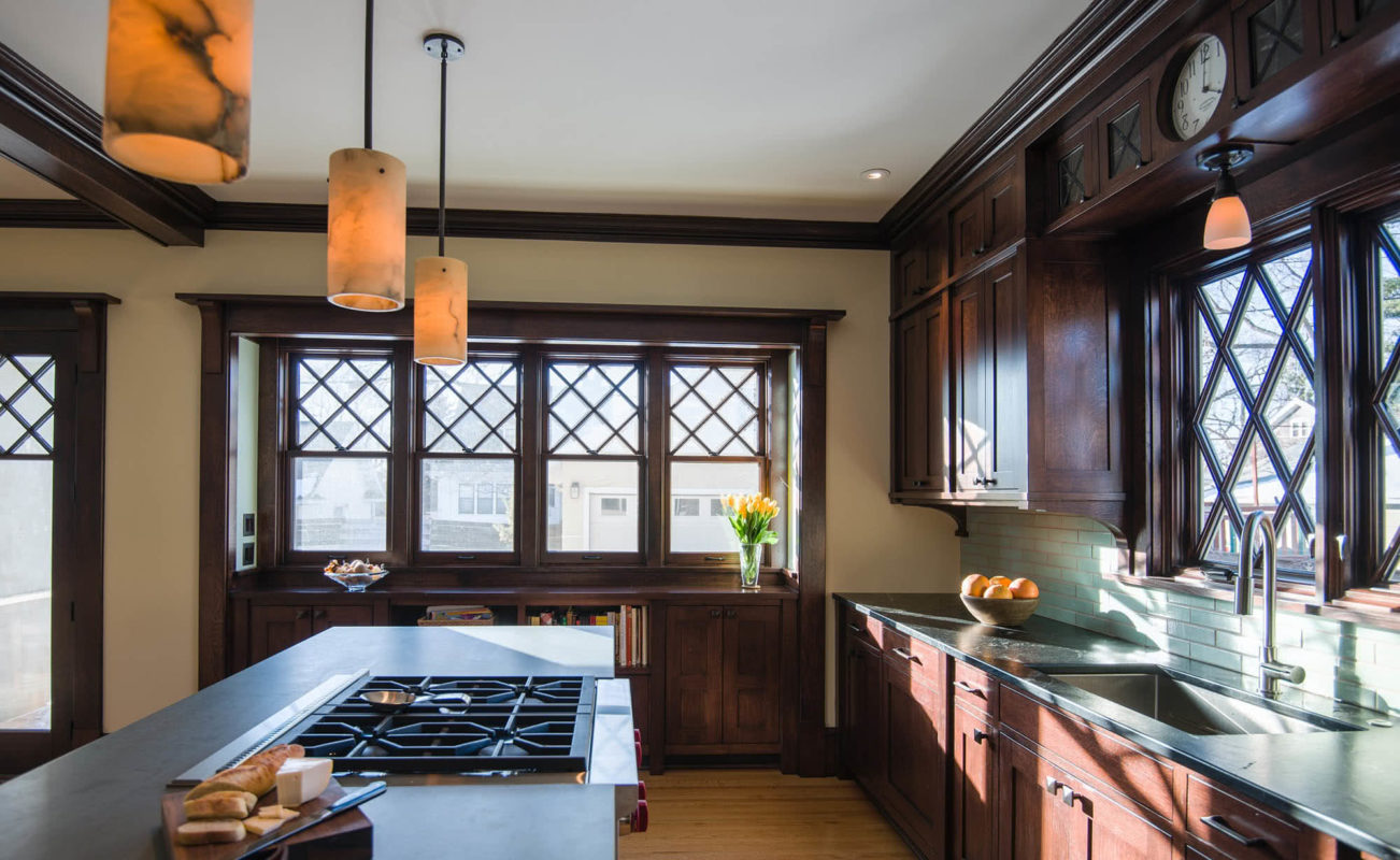
In the outdoor dining area, fat walls and thick columns add to the sense of the classical. Instead of rooms with doorways, passageways are created through space by layering classical elements and motifs, such as the x’s in the clerestory windows.
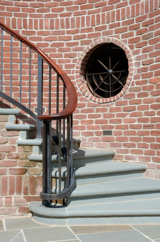
Since the original machined brick was no longer available, it was replaced with a hand-formed clay brick that allowed for special shapes. A decorative round iron element adds interest to the stair while channeling light to an area below the covered terrace.
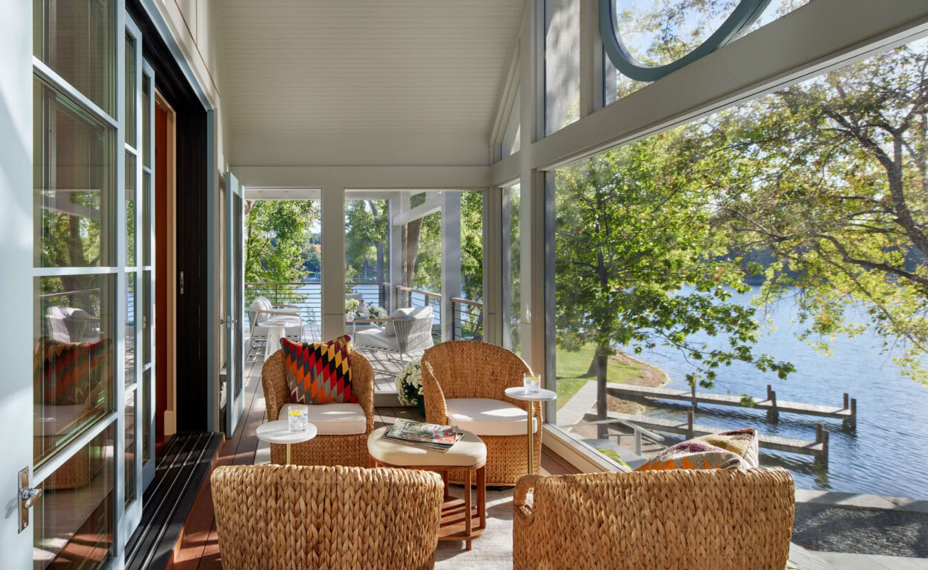
A large Palladian-style window adds height to the new barrel-vaulted screened porch. Freestanding columns positioned outside the window provide depth from the outside and offer unobstructed, wraparound views from the inside.
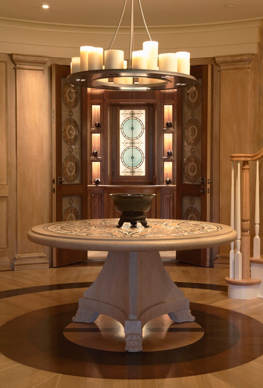
Large circular spaces can be difficult to utilize. Here, at the base of the lower-level stair, an artisan-created light fixture, table, and marquetry flooring invites guests to mingle outside the wine gallery.
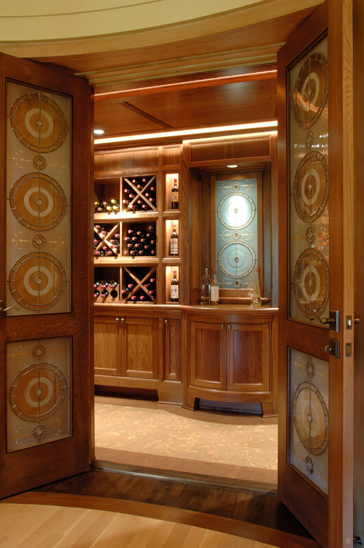
Glass-paneled doors open to an illuminated art-glass panel and the wine gallery — an intimate place of refuge from the home’s sun-filled spaces.

The original lower level lacked the authenticity and elegance the homeowners craved.

Reframing with new structural beams allowed the ceiling coffers to be raised and deepened, and large pilasters to be incorporated. This gave the great room a new depth, height, and visual texture, better matching the scale of the exterior.
Just as the pergola above filters south light to the living room, the terrace breaks up harsh sun coming into the great room. Indirect light from shallow ceiling pendants supplements and softens lighting during darker times of the year.
The fireplace—along with two stories of chimney—was moved over to achieve proper proportions and align the great room with the adjoining billiards room. Rift white oak cabinetry and pilasters frame the fireplace, adding formality and grace.

Layers of woodwork complement the ornate fixtures and furniture. An elevated area behind the billiards table provides a bird’s eye view for those waiting to shoot.
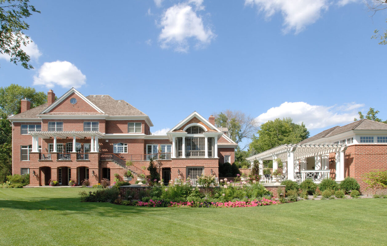
Edina Classical
Edina, MN
Originally a dark Episcopal rectory, a seamless addition created a bright family room and kitchen. A new garage and pool house are beyond the pool. Outdoors, we seek to create the comforting sense of “rooms." Here, that is created by the addition, pool house and trellis.
The conservatory-like addition banishes the gloom, infusing fresh air and sunshine into this room and the rooms behind.
Loft spaces can feel too wide open, traditional rooms too confining. Internal vistas create depth, layers and flow.

Sightlines were reorganized to give visual order and circulation to what had once been a weave-your-way- through house.
A contemporary take on traditional design and materials infuses freshness into the original architecture.
The hallway, no longer dark and brooding, draws people with light filtered through glass cabinets from the family room.
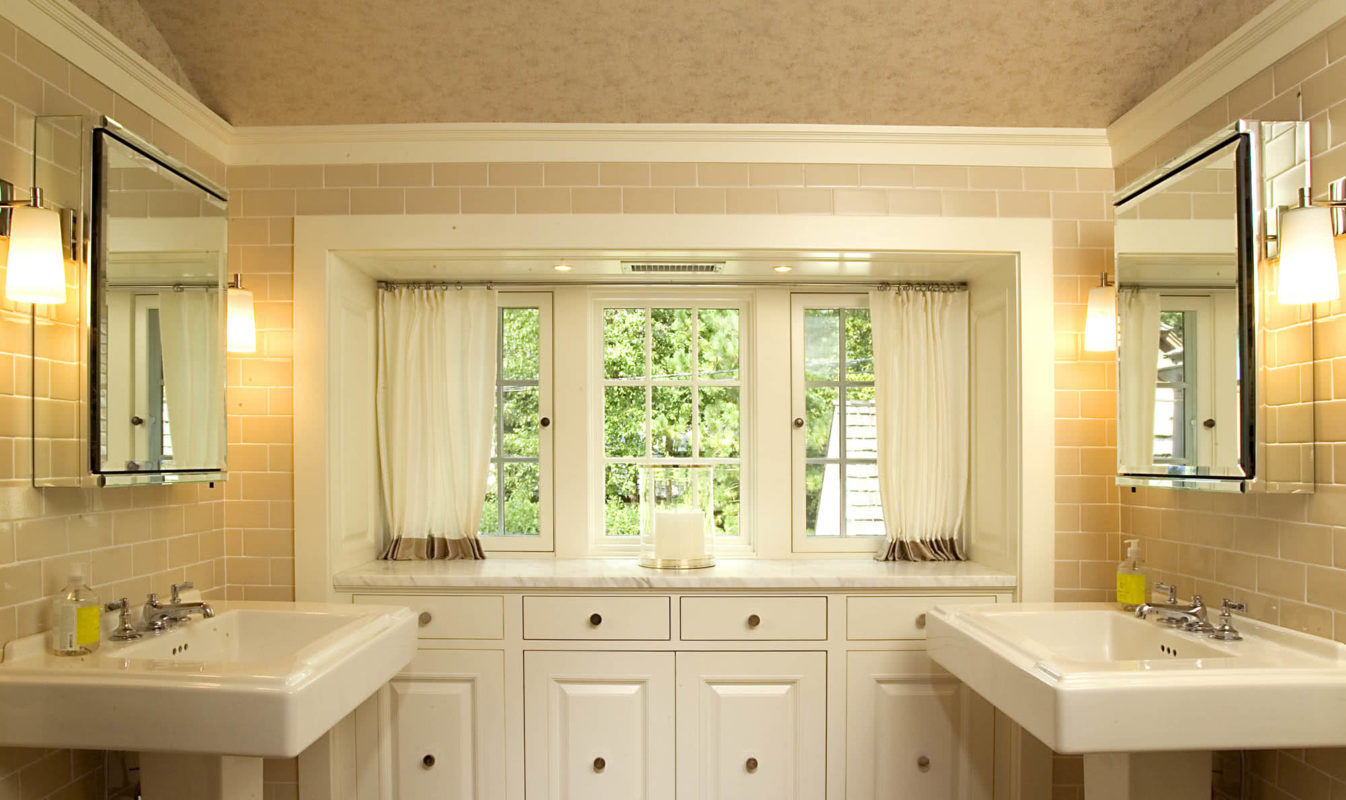
The bathroom is lifted with the breadth of windows, painted cabinetry and the symmetry of twin sinks.
Sunnyside Addition
Edina, MN
Transformed Traditional
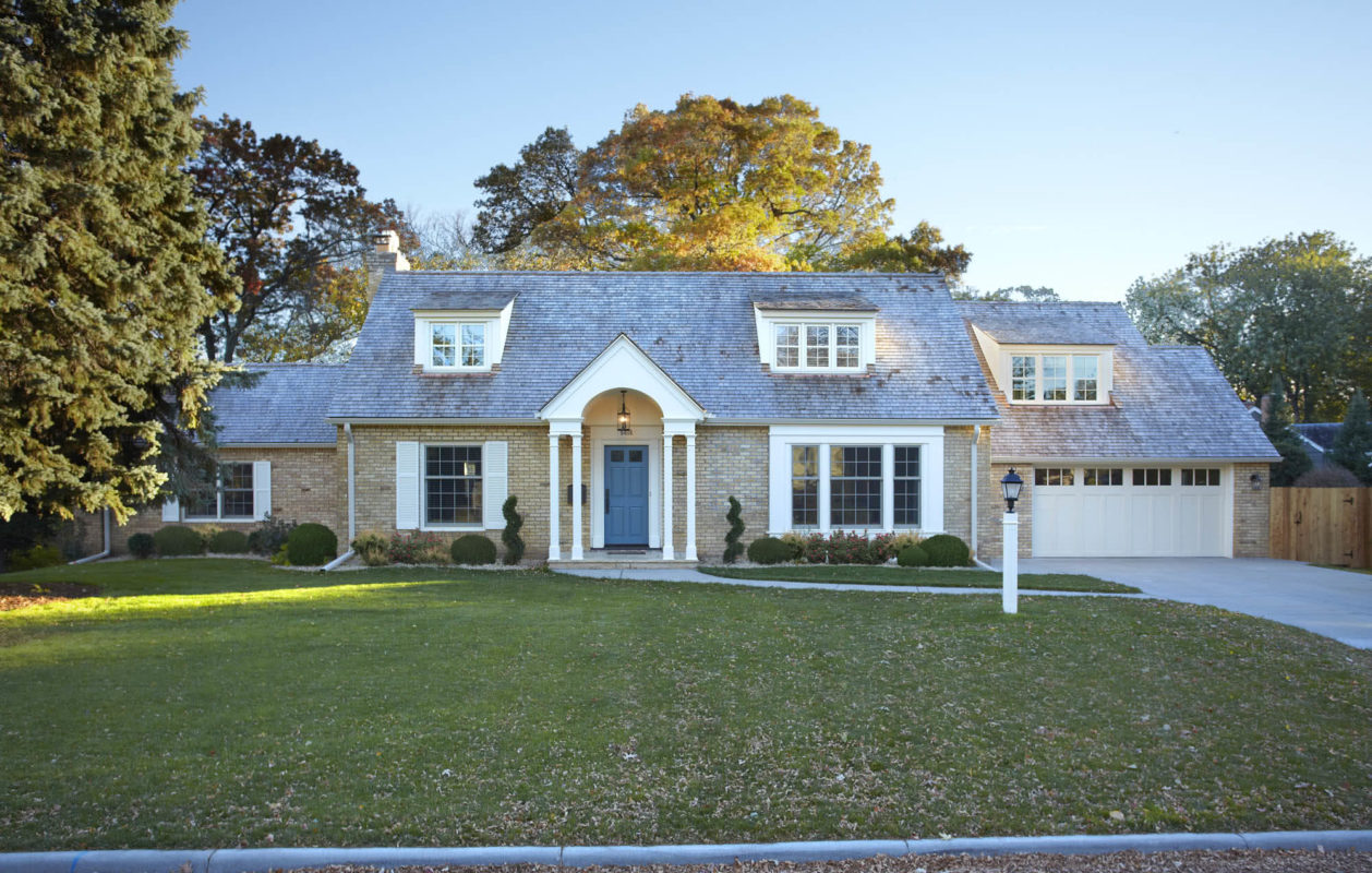
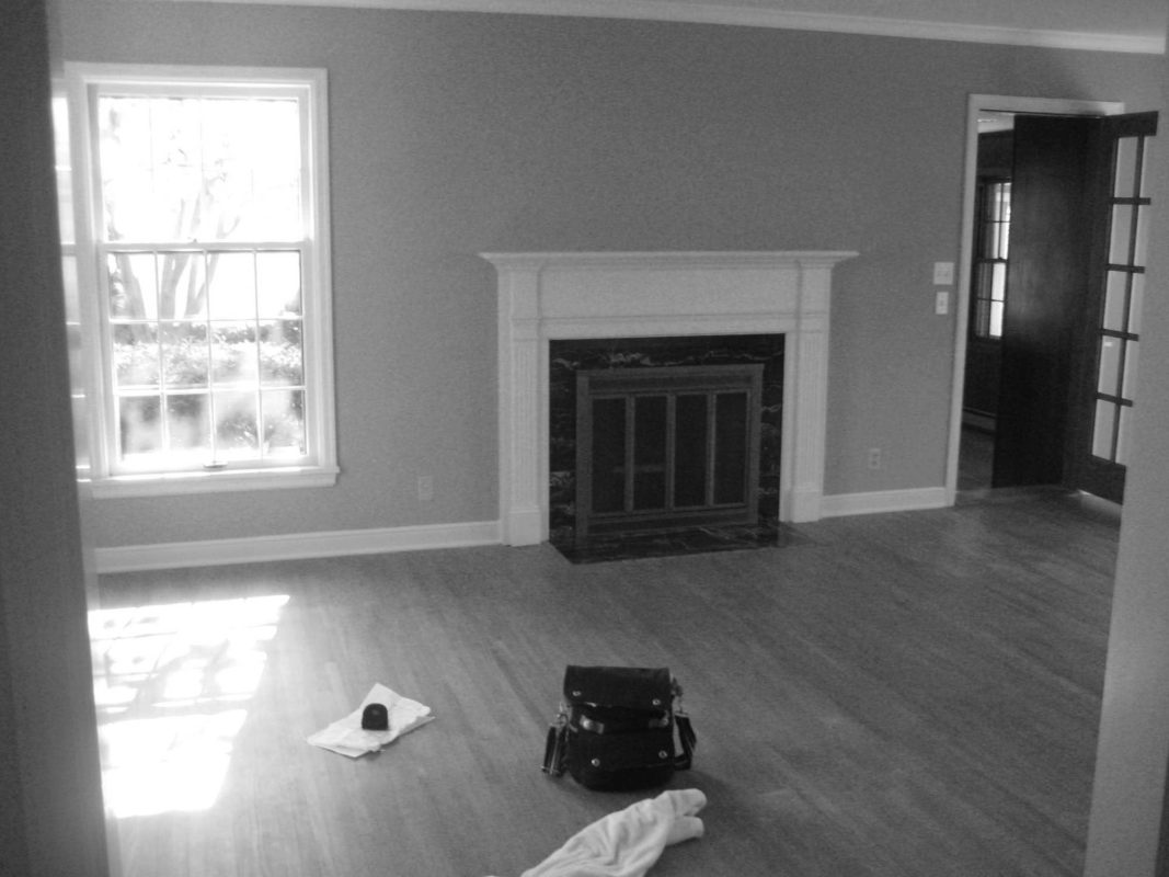
Our clients admired the exterior of this 1940’s home long before owning it. But when it came on the market, they found dark, isolated rooms. Completely gutting and redoing the interior was our focus. Due to underlying water issues, the exterior was also stripped and 4” stone veneer removed, and later reinstalled.
A new entryway and alcove above it help balance and animate the façade—a subtle move. The attic floor was reframed to raise second-floor ceilings almost two feet, and basement slab lowered as well.
The original home was divided into many dark, claustrophobic-feeling rooms. The layout required weaving through one room and another to reach kitchen, garage, hallways.
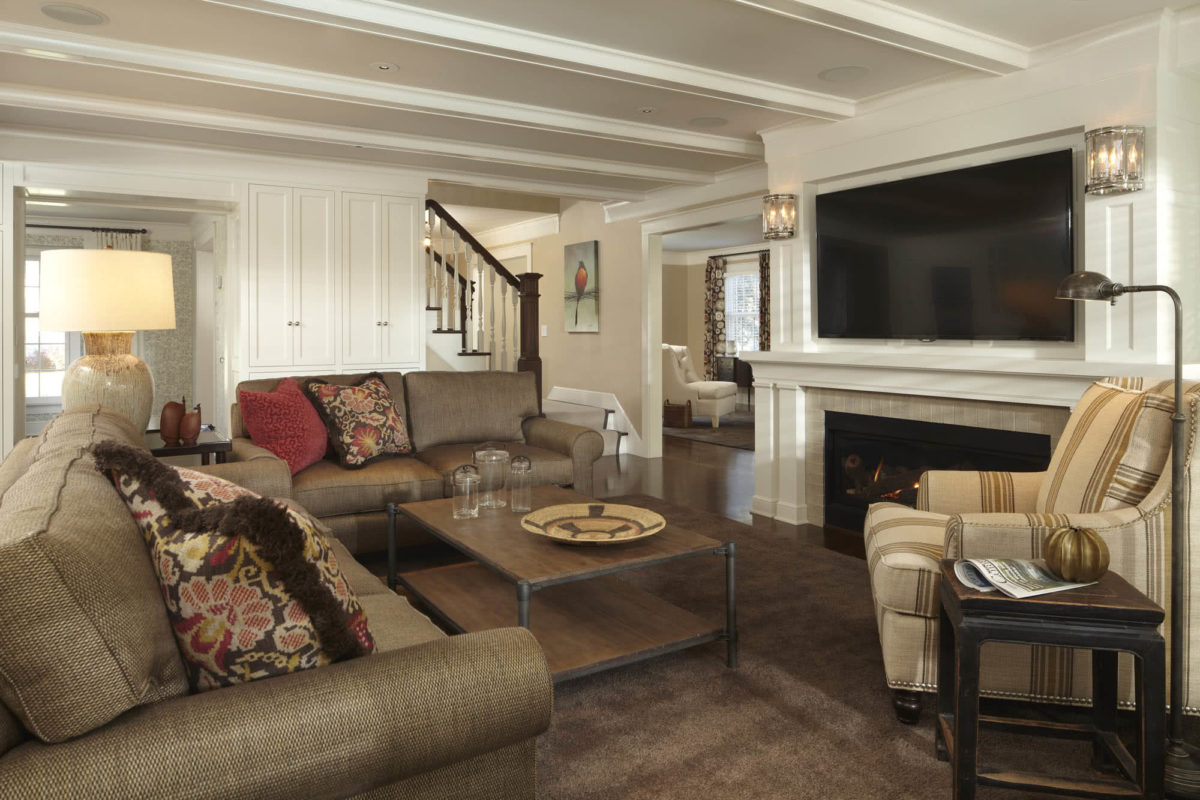
We rebuilt the original living room archways with paneling, and filled the back wall with french doors that lead out onto a bluestone terrace. Though the ceilings are not high, the expanse of glass compensates, providing much-needed breathing room.
One of the most striking changes inside: paneling went up where drywall had been, replacing the more simple 40’s expression with a bit of detail and elegance.
The texture of the paneling animates the room and even this archway, creating a frame for the alcove collection of art objects.
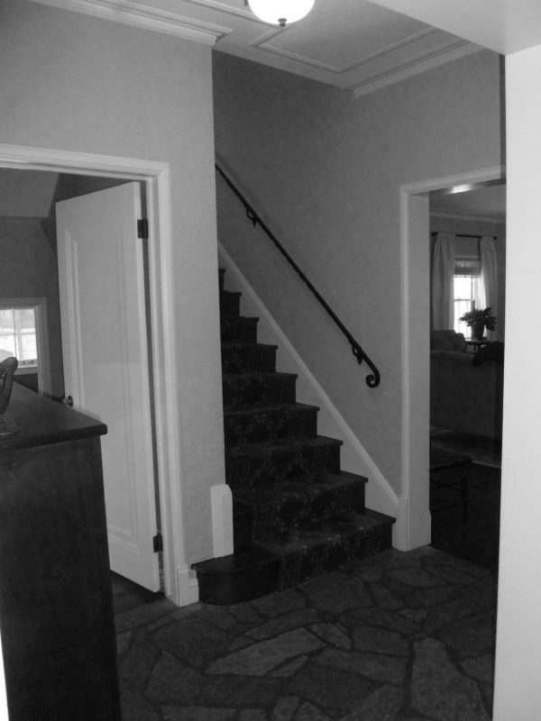
The original staircase interrupted the flow of the home, and blocked light.
We shifted the stairs several feet forward, which provided more open passageway through the house, and made possible a higher continuous ceiling plane. It also created a special spot to pause at the landing

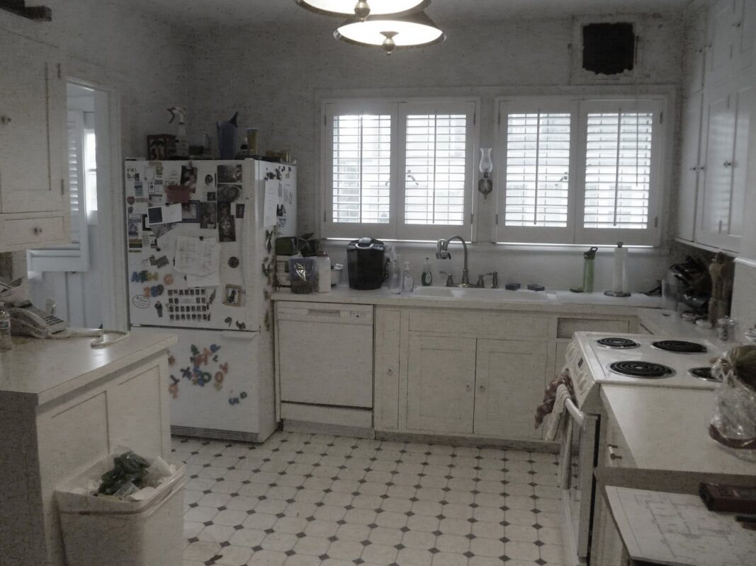
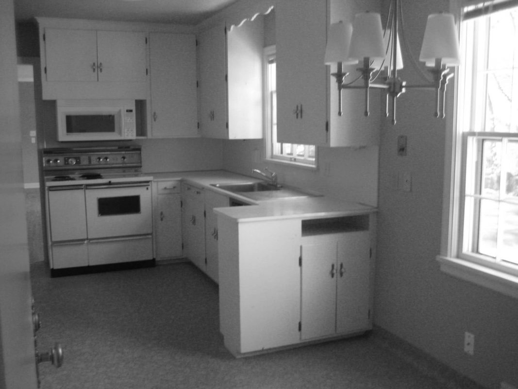
The original kitchen: dark, enclosed and only one way in and out.
A pantry now occupies part of the original kitchen; just one element of a whole-house reorganization.
Around the corner from the original kitchen, a small dining area.
We repurposed and expanded the closed-in dining bay, turning it into a wide-open kitchen with beamed ceilings and cabinet detail that echo the living room. The island creates a protected cooking zone while preserving spacial openness.
A bump out to the back of the house allowed an extra bedroom upstairs and an eating area next to the kitchen. More importantly, though—a real connection to nature, plus light from three directions.
The legs of the island are sculptural, and the twisted columns under the upper cabinets bring unique character while echoing the home’s pilaster aesthetic. These also eliminate the typical boxy corner, allowing sunlight to travel through.
The two-level back terrace created a desperately needed main-floor outdoor space where just a steep hill had been. The bluestone is set on pedestals so water carries through to drains, and the lower-level stays dry.
New stonework piers were incorporated into existing stone walls for a seamless transition
Once a spartan basement, the new, higher ceilings and warm, rich hardwood help turn it into beautiful living space. A few steps outside to the lower terrace, which is still under full tree canopy.
Transformed Traditional
Edina, MN


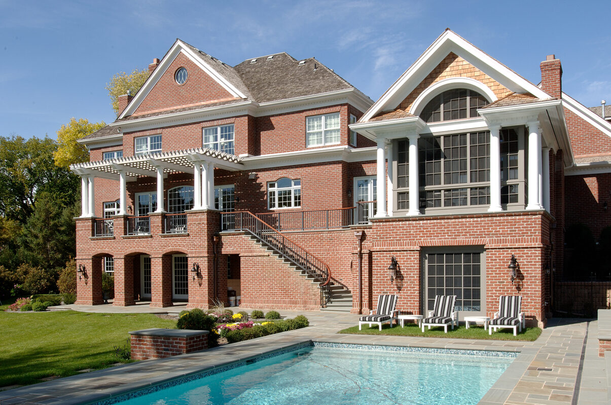
Gambrel Georgian Revealed
Minneapolis, MN

Tangletown Addition
Minneapolis, MN

The home, built on a spectacular piece of property, had some issues — including a detached, deteriorating single-stall garage; a small, almost original kitchen; and much deferred maintenance. The biggest challenge: creating an artful addition that connected the living space to the back yard.
The new garage provides a sunny rooftop terrace, room for a breakfast nook bump-out — and a graceful way to step the mass of the house to the yard, which slopes away on the garage side. A creamy stucco re-dash and new grey-blue trim reinvigorate the exterior.
The breakfast bay animates the flat stucco façade and brings it down to a more intimate scale. Steel stairs flow seamlessly from both sides of the garage — an open invitation to the yard and garden below.
The addition’s flat roof and crisp, coved eave complement the home’s simple English Arts and Crafts character; its windows echo the originals. The bump-out could have been done in stucco, but painted millwork (in a historic Arts and Crafts color) provides a warmer counterpoint, a more inviting backdrop.
The old kitchen had been upgraded only minimally (note the opening for the original stove’s vent pipe). The exterior wall to the left was removed, and the area repurposed as part of the breakfast bay.
Enveloped by light and views, the breakfast nook becomes everyone’s favorite spot for eating, homework, etc. The secrets that make it so livable: built-in window treatments for late-afternoon sun, plus thick, radiator-hiding walls that prevent back-of-the-neck drafts in winter.
In many homes of this era, kitchens were not an important design consideration, as the homeowners did not do their own cooking or meal prep.
The larger, light-filled kitchen is far better suited to the needs of a modern family. Blue accents, along with subtle details like diagonal backsplash tile and open cabinetry over the TV, brighten and add interest to the room.
The kitchen couldn’t expand inward, so space was stolen from an adjoining pantry and breakfast area to create a longer, more efficient working kitchen. Overhead beams help break up the expanse of ceiling and draw the eye away from recessed lighting.
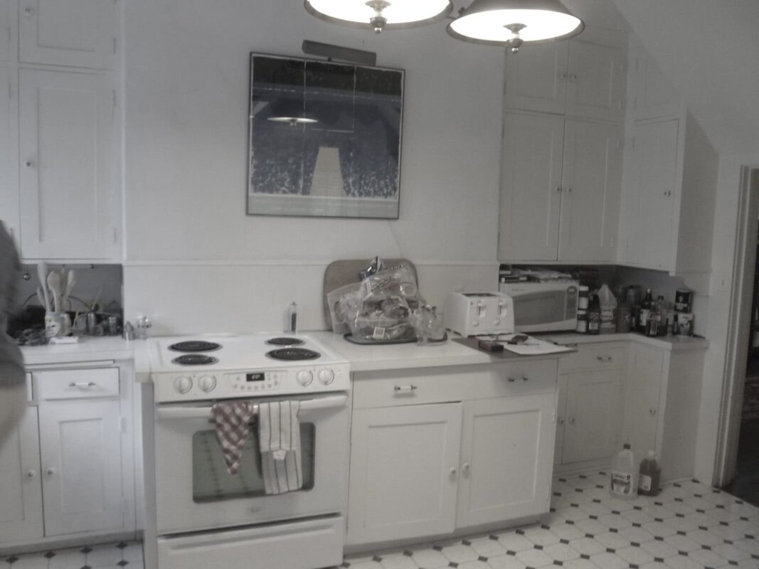
The original kitchen was awkward, cramped and lacked functional space.
The small, inconvenient breakfast nook became part of the new kitchen.
Every inch of the new kitchen is hardworking. The original “servants' staircase,” once outdated and enclosed, is now a welcoming part of the kitchen, with railings that end in a graceful volute.
The breakfast room leads to a butler’s pantry and dining room, as well as outside. The addition couldn’t be cooled with the home’s retrofitted AC system, so mini-splits were tastefully integrated, ensuring new-home comfort in a century-old house.

The butler’s pantry transitions the less-formal parts of the home to the more formal, providing pretty storage for dishes, barware, etc. Note the near-invisible air conditioning return, hidden in the ceiling as a perimeter edge to the panel.
Before
After
English Arts & Crafts Revival
Minneapolis, MN
The original 1911 cottage had charming Arts & Crafts character —but a 1980s addition at the back was a mismatch, and crucial rooms were small. The goal was to add space and livability while making it impossible to tell where original ends and new begins.
Arts & Crafts character was meticulously carried through, from exterior to interior. Leading to the house, brick from the original steps was used for risers, and vintage terra cotta tiles from a William Purcell design were installed to embellish the chimney.
At the front entrance, the door from the porch to the living room swung right into the seating group.

Incorporating part of the porch allowed a more gracious entry and open stair. Reusing the original windows and front door—and building a newel and railing to match the one at the landing—make the architecture look untouched since 1911.
A sunroom had became a highly used, default family room. But while it brought south light, it was small, un-insulated, and directly exposed to the neighbor’s kitchen.
The sunroom was expanded into a true family room. Understanding the logic of the home and underlying Arts & Crafts principles helped us design a new space that looks like part of the original house.
High windows continue to bring in coveted south light, while cabinetry screens the close neighbor. Mirrors integrated into the cabinet bounce more light deeply into the room.
Openings from the new family room to existing living and dining rooms were widened to make the original rooms feel larger—further blending old and new. However, they still feel like distinct, classic, embracing rooms.
For the new hallway, original diamond-patterned sunroom doors were reinvented as closet doors (left). White oak cabinetry (right) was relocated from the living room. A fresh stain ensured seamless integration.
The 1980s addition at the back of the house.
The new kitchen was modernized, but detailed in an Arts & Crafts manner. Slate countertops and local hand-made tiles would have been used in 1911. And TEA2 worked with Pella to replicate the original diamond-paned windows.
Custom cabinetry incorporates leaded-glass fronts and a built-in, renovated Arts & Crafts clock on the south wall.
The back of the house, before.
Sweeping the existing upper roofline into the new gable was essential to making the family room addition seamless.
Eaves and rafters were designed to match exactly, including custom boards longer than the current standard.
Craftsman Addition & Restoration
Minneapolis, MN
Oak Knoll Transformation
Minnetonka, MN
The homeowners consider themselves stewards of this 1920s home that needed restoration. The first thing to re-think: a 1980s room and fireplace addition that mismatched the classic architecture and blocked views. This unlocked great potential.
The original facade was bland and tired.
A new, dramatic street presence, with french doors to the front terrace, better reflects the home's architectural origin.
The old steel windows leaked badly, disintegrating the studs. The 1980s window bay was out of place.
The rhythm of the windows is replicated in the addition/renovation, adding light and warmth while seamlessly creating separate spaces for a couple with different styles.
New steel windows were cost prohibitive. We worked with Marvin to create an alternative, with lead caming on both sides of the glass.
The wall-length bookshelf with transom windows above provides privacy from a nearby house and plenty of book space.
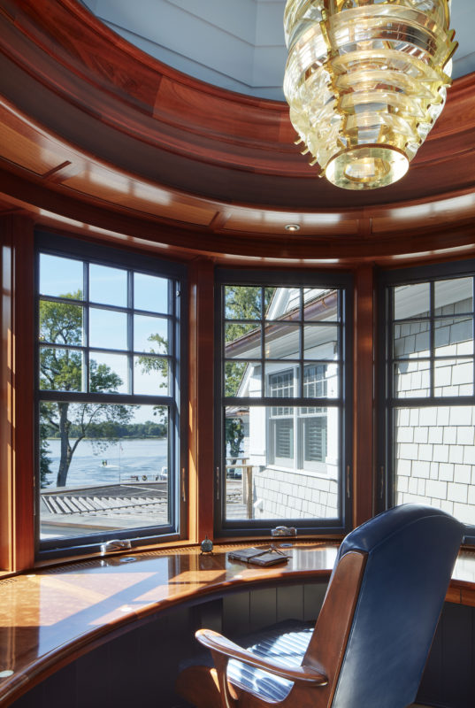
A reader and classical music lover, the homeowner now has a stunning space to engage his passions.
New windows maintain the lean, crisp openings and minimalist styling characteristic of the English Country era.
English Country Addition
Minneapolis, MN
This traditional saltbox was charming, but had lots of small rooms—not built for the way families live today.
We took over an unused first floor bedroom, doubled the size of the living area, opening it up while keeping the feeling of traditional spaces.
The request for a large TV over the fireplace led us to create a broad, classic hearth. Heat and electronics in close proximity require careful planning.
The old kitchen felt cordoned off and confining.
A horizontal steel beam was required for support across the ceiling. Wrapped with millwork, it becomes integral to the design.
Surrounded in millwork and light, the kitchen feels less ‘kitcheny” and more like real living space.
Pantry and full-height cabinetry provide storage and perpetuate the clean, uncluttered feeling of the rest of the house.
Minnehaha Woods Renovation
Edina, MN
Originally a post-war Colonial, the owners wanted a complete change of style and color palette, without breaking the bank.

We reinvented the house's character by taking the basic form and evolving it into a new look.
A wood shingle exterior replaced the lap siding. Eaves create shadow and depth, breaking up the home’s original boxiness.
The original internal kitchen was dark, and small for a family of six. We took over an unused bedroom to enlarge it.
A big expanse of windows was created to provide uninterrupted views to the large and lovely backyard.

The architecture was developed traditionally but given a fresh look by carefully marrying a dark-wood contemporary kitchen and eating area.
An island and a butler’s pantry provide storage, freeing up kitchen walls to develop their own personality.
The kitchen leads to a newly opened-up den where the dark paneling was removed.
Touches like an old-school chalkboard (found by the owner) link the house to the past—and coordinate schedules for a busy family.
St. Paul Transformation
St. Paul, MN


Deephaven Revival
Deephaven, MN